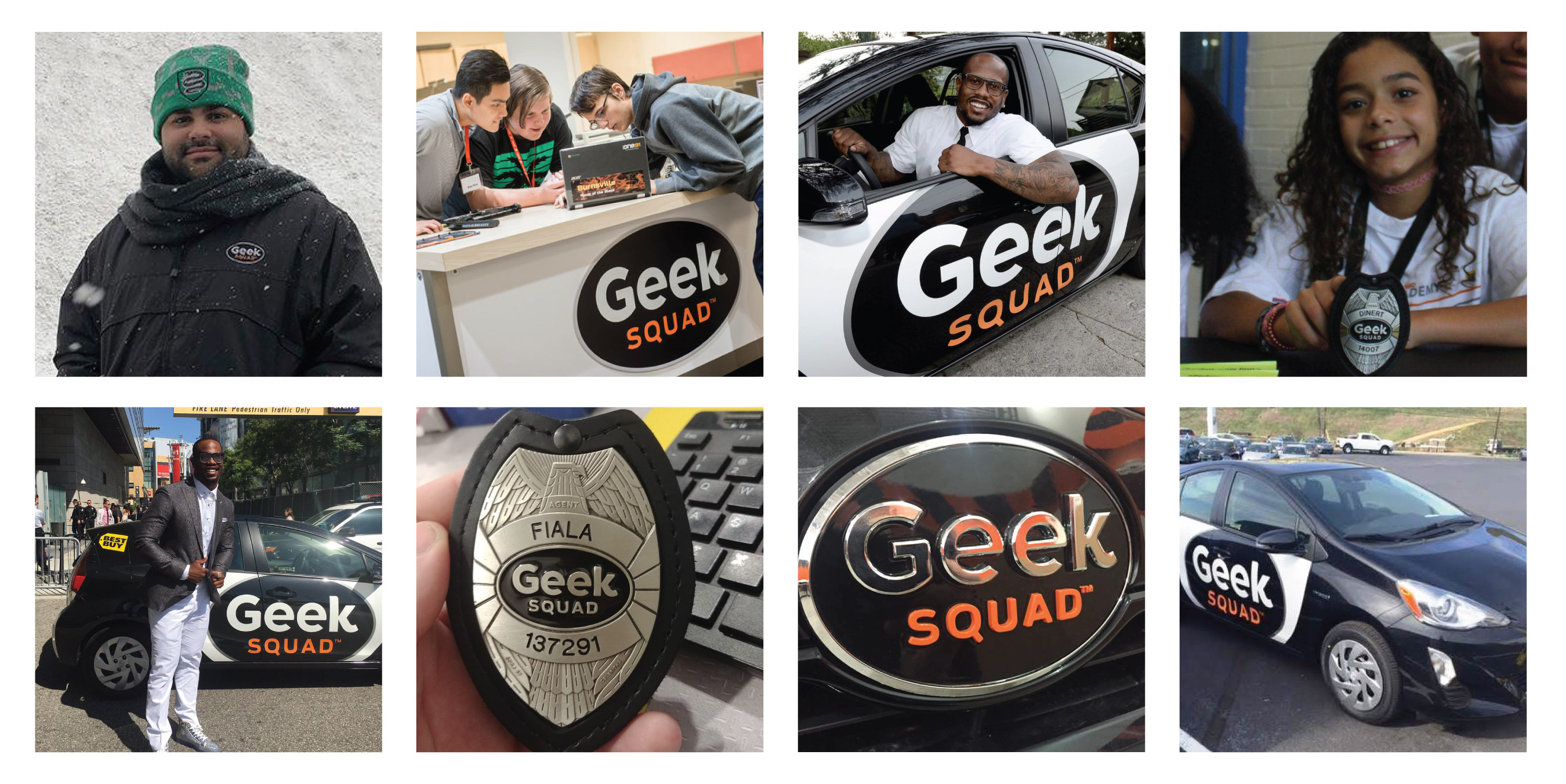
Geek Squad, a Best Buy company, is a much-loved international brand with over 24,000 employees worldwide. The legacy Geek Squad brand identity was over 20 years old and highly valued in the marketplace; however, the mark was beginning to look noticeably dated and was unable to meet the increasing legibility demands of modern small space digital applications. It was also no longer able to accurately represent the brand promise of excellence and know-how for which Geek Squad is famous. Replace was brought on board to revitalize the brand identity to better represent Geek Squad technical supremacy. We were honored to help communicate the modern evolution of this beloved service brand.
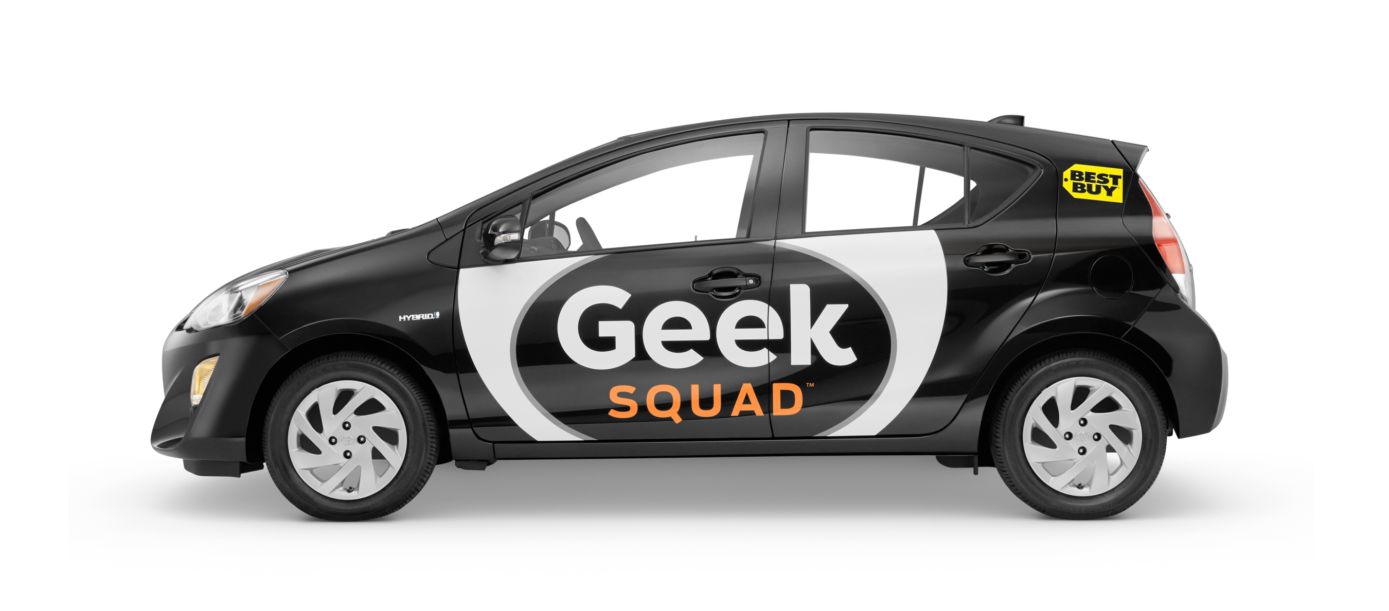
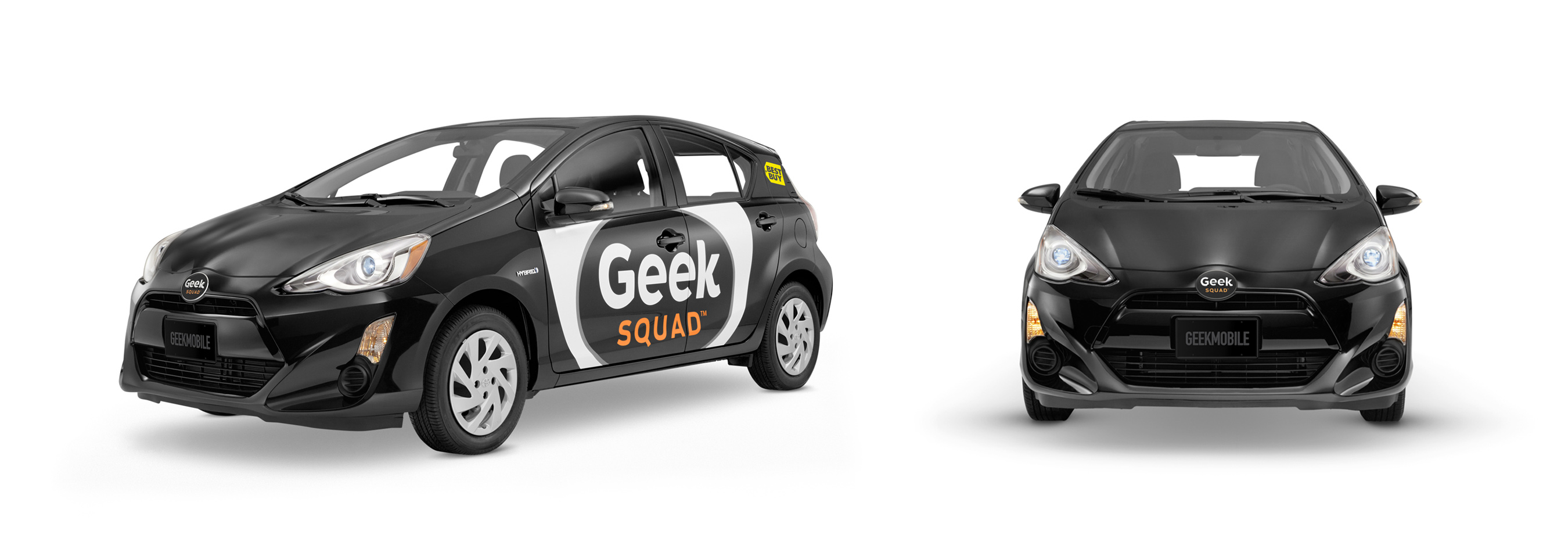
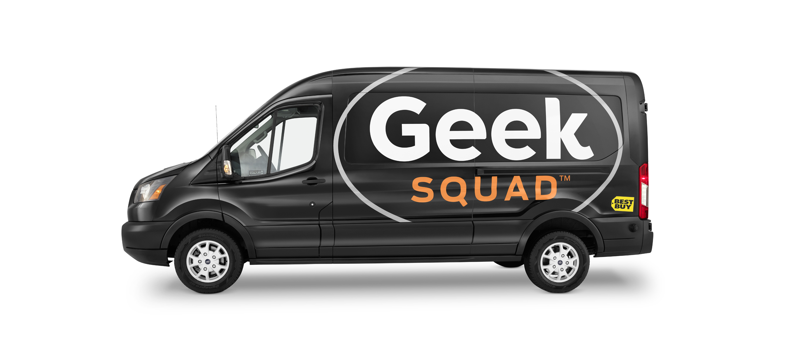
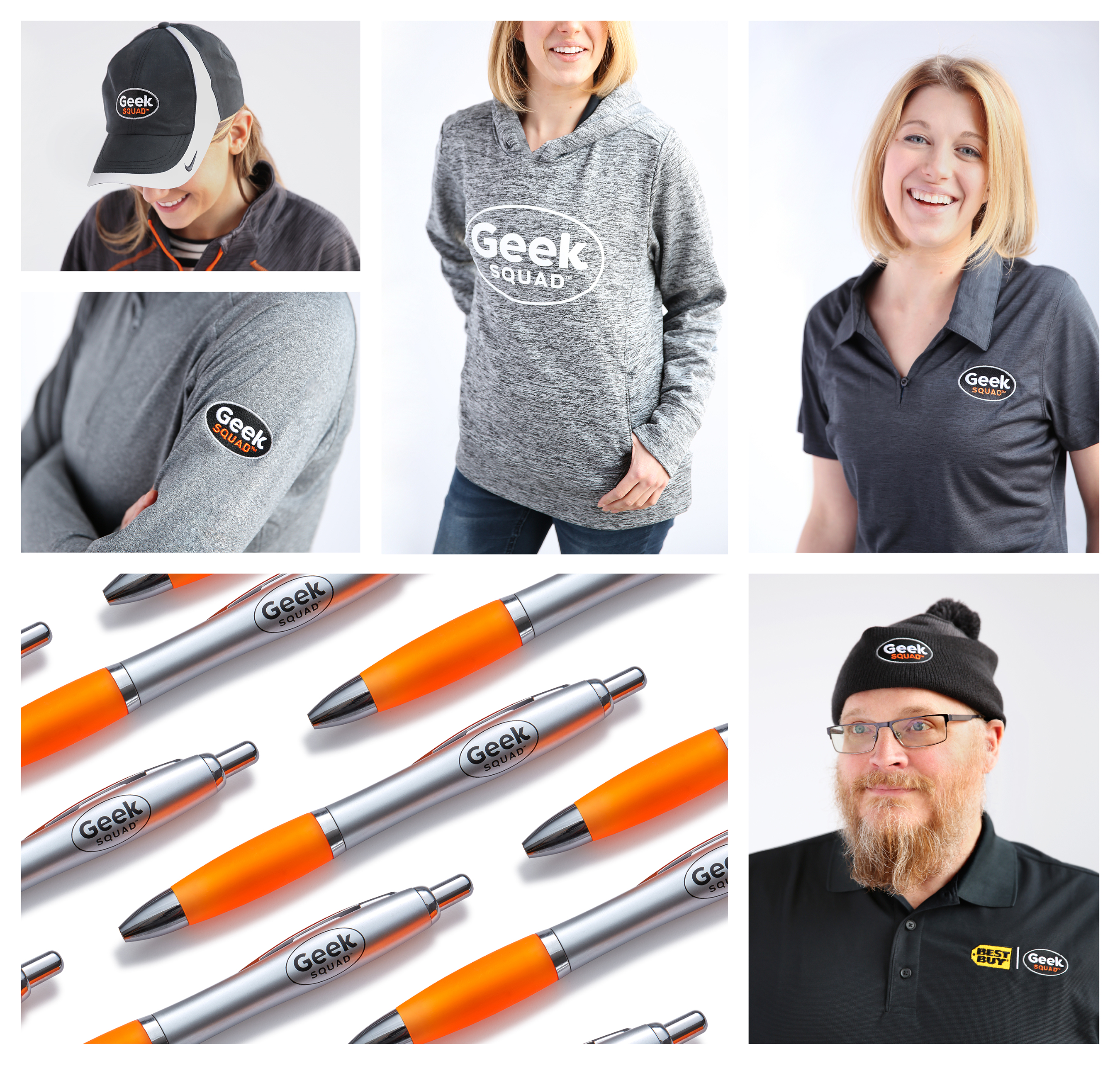
The new, fuel efficient fleet of hybrid Geek Mobiles was the first opportunity for brand application. These high-performance vehicles are one of the most recognizable brand ambassadors for Geek Squad.

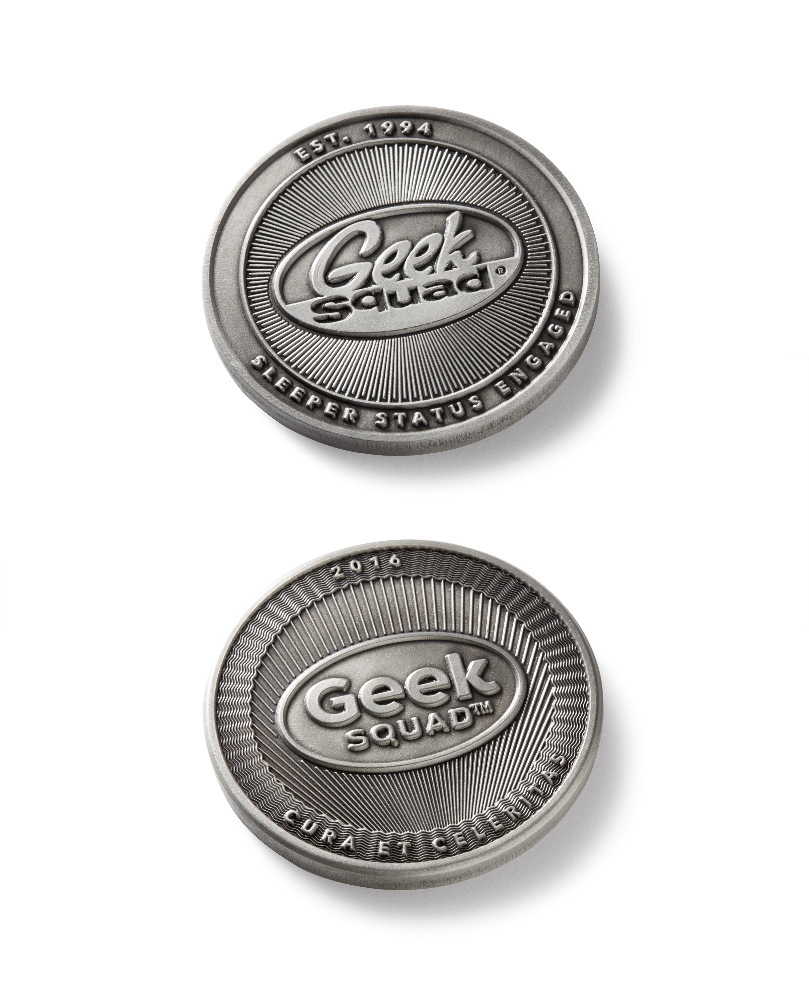
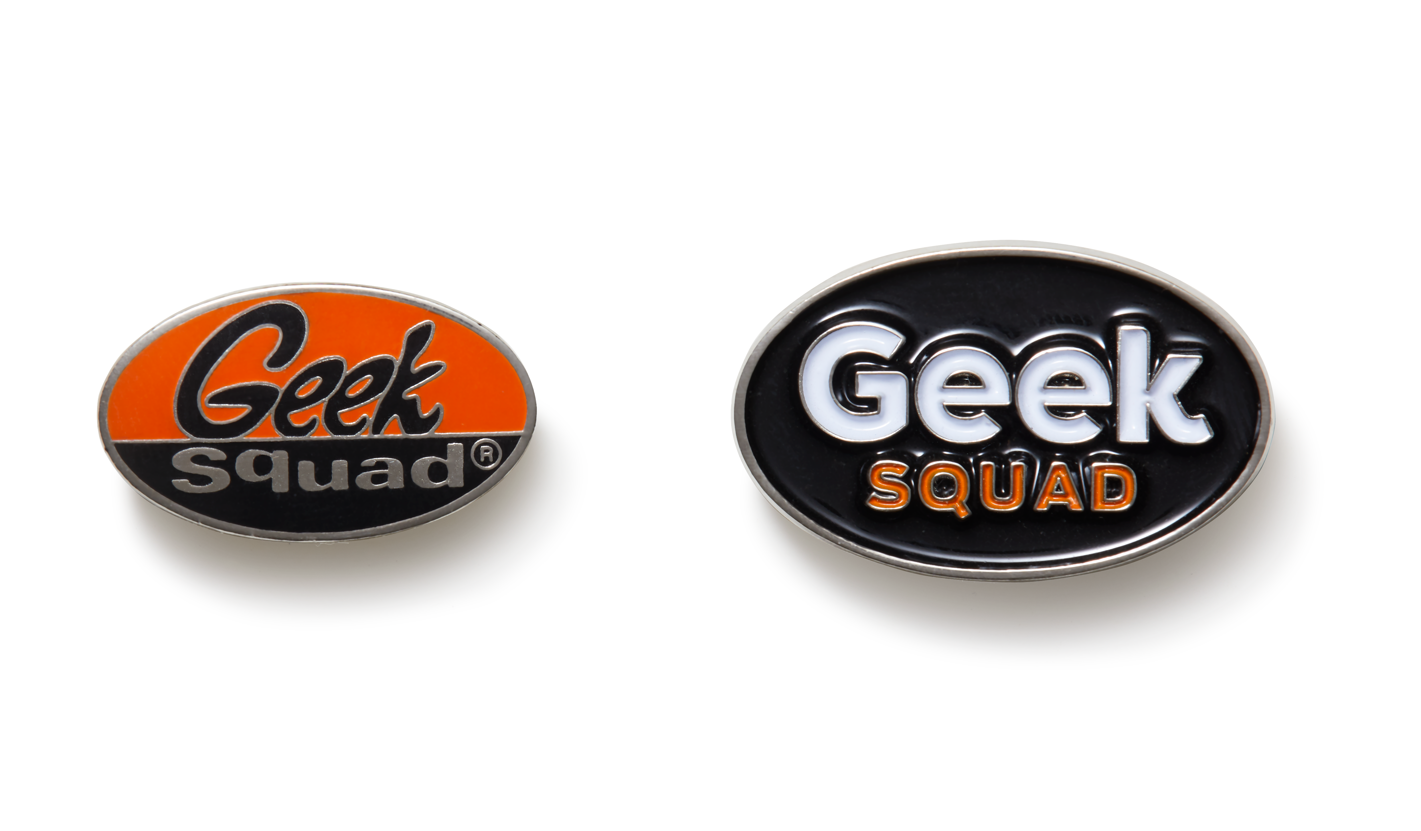
The goal was to modernize the logo without losing hard-earned brand equity, recognizability, and character. While embracing the existing oval shape, Replace used contemporary, customized typography that was carefully architected to be hyper-legible under demanding technical circumstances. This design work was created to capture the same fun, approachable nature held by the original logo.
The new typographic solution, a bold sans-serif, utilizes strong geometric shapes that speak to trustworthiness and technical know-how. It also reflects the dynamic innovation and unique charm of the Geek Squad brand. The characters themselves are playful, optimistic, and unique. This speaks to the approachable and authentic brand voice of Geek Squad. Since this new mark was optimized for maximum legibility, it thrives in small-scale environments and pulls the brand further into the expanding digital conversation. The end result is a sophisticated brand identity that Geek Squad agents, fans, and clients can utilize and champion for decades.