ITALIAN INSPIRED, MINNESOTAN MADE
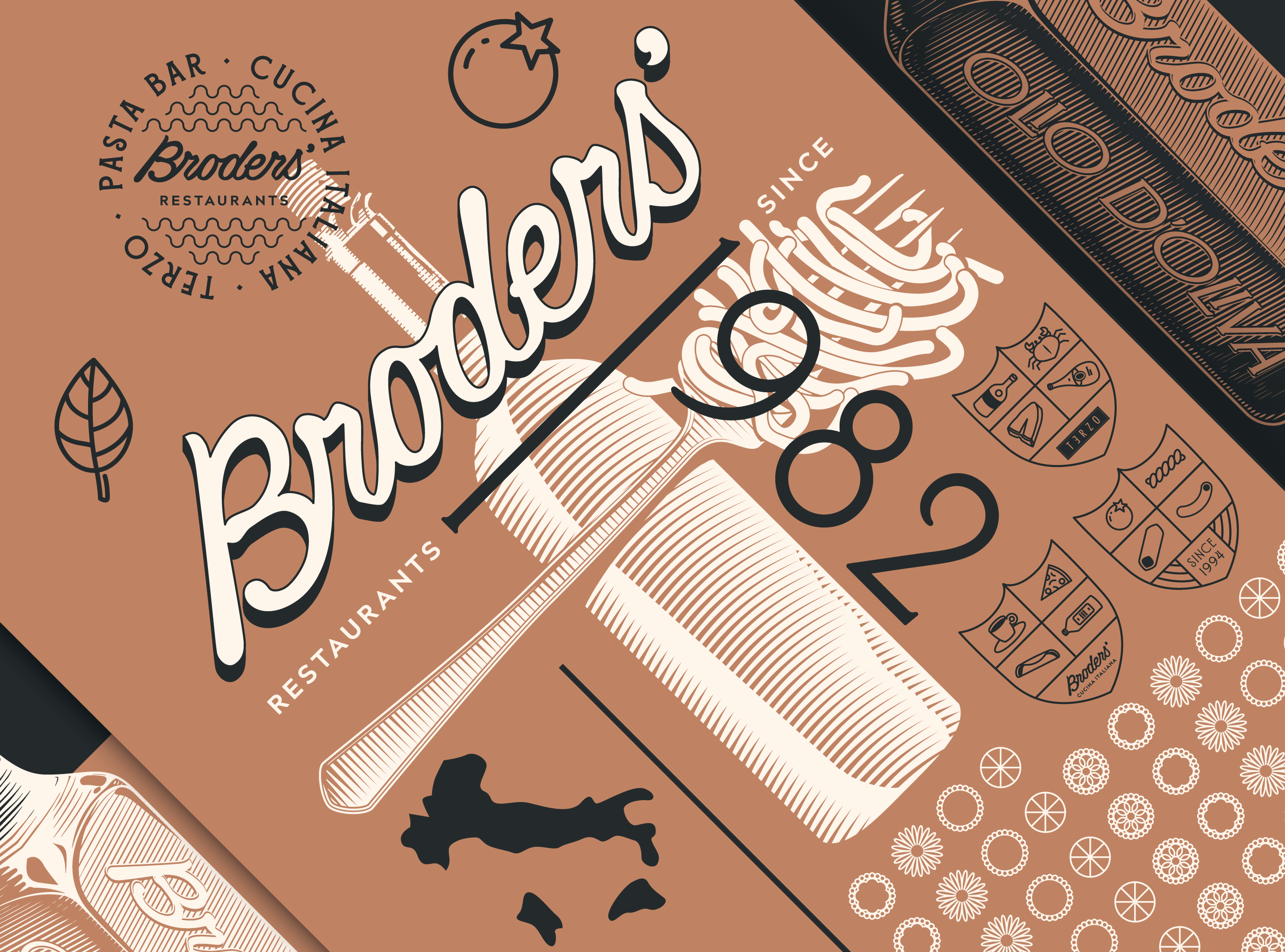
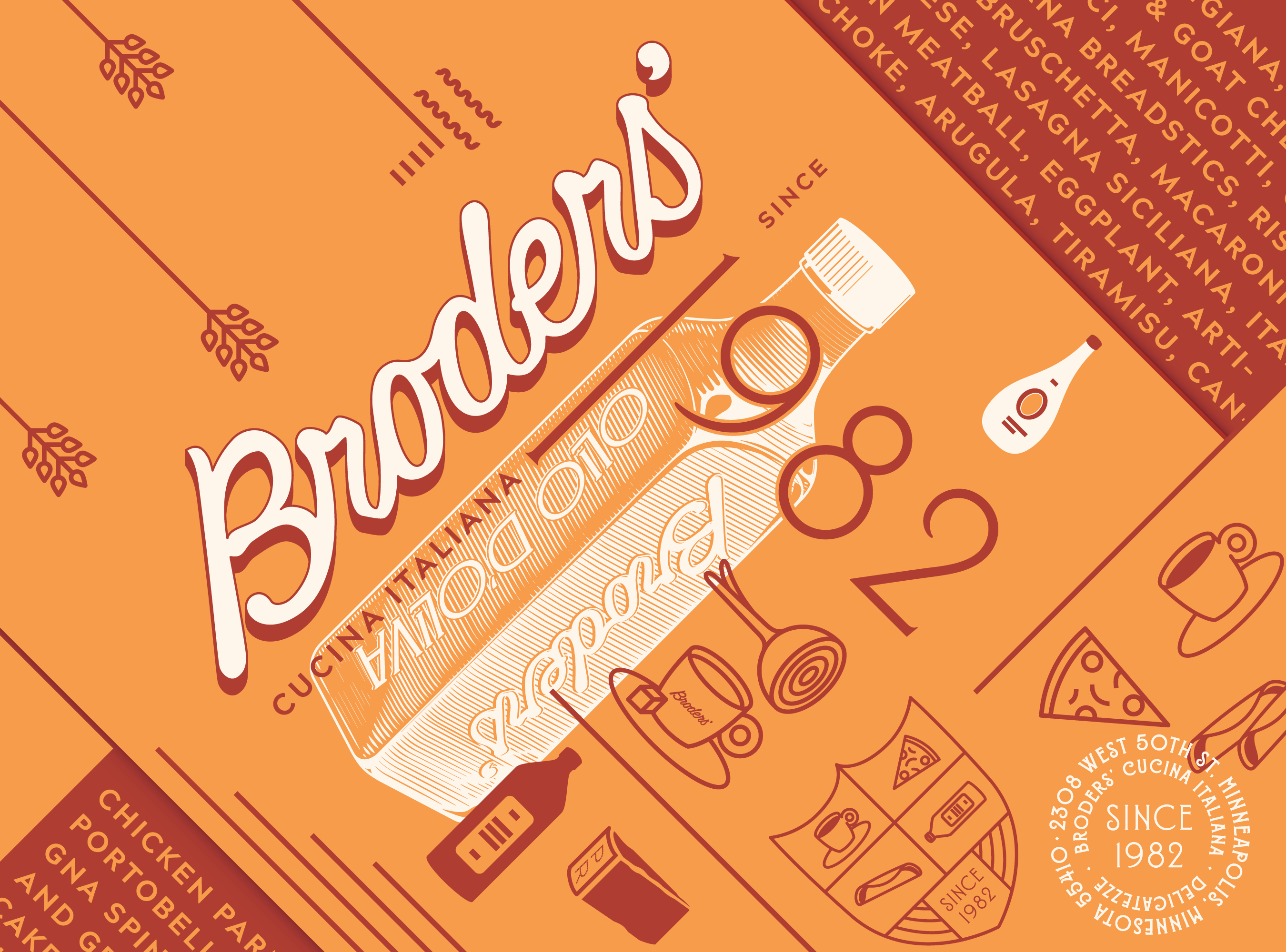
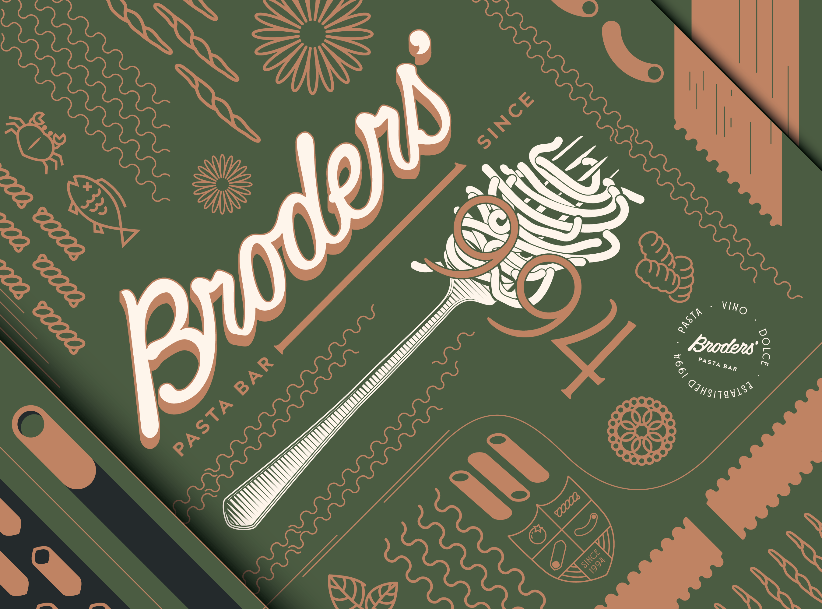
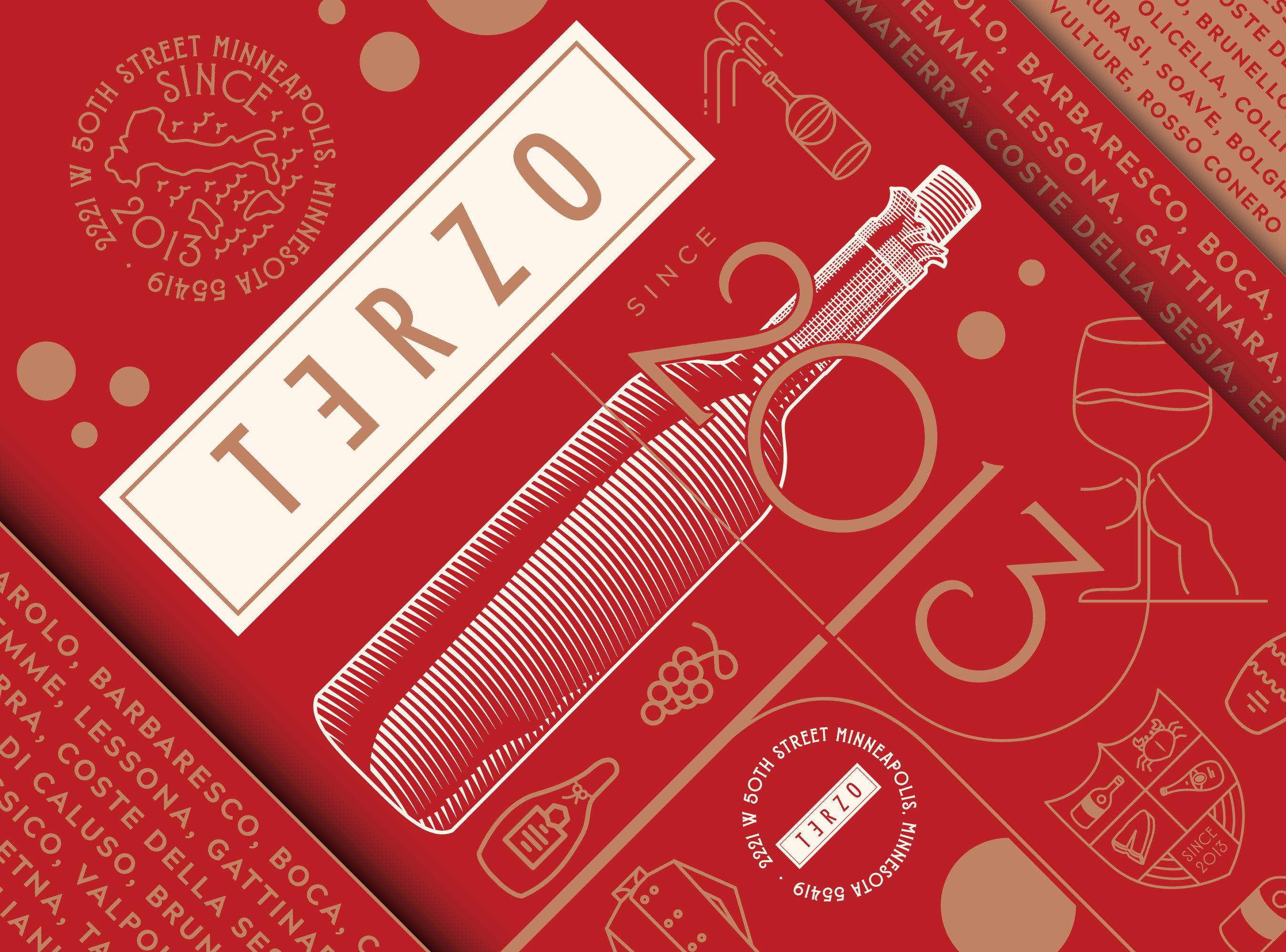
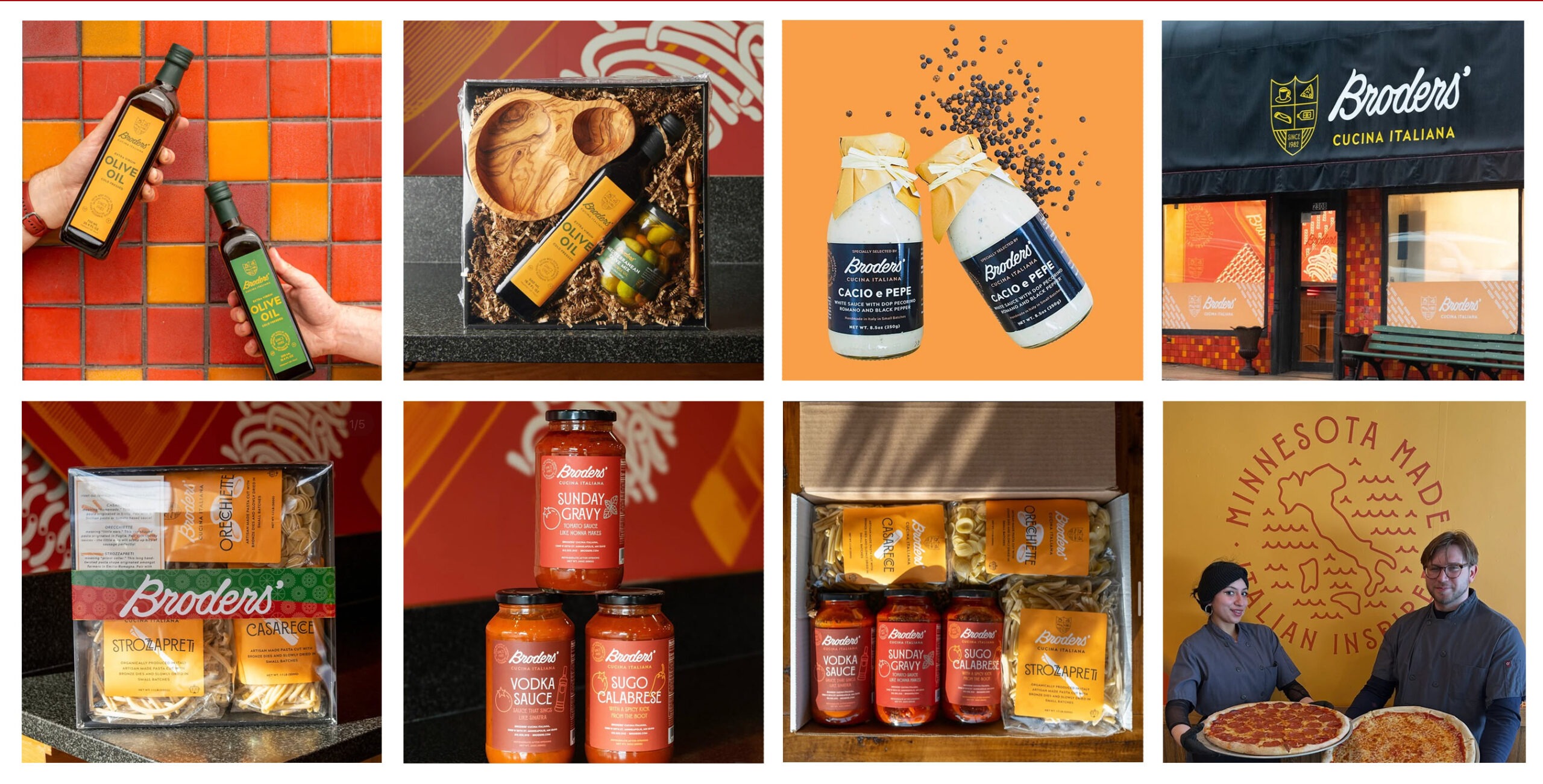
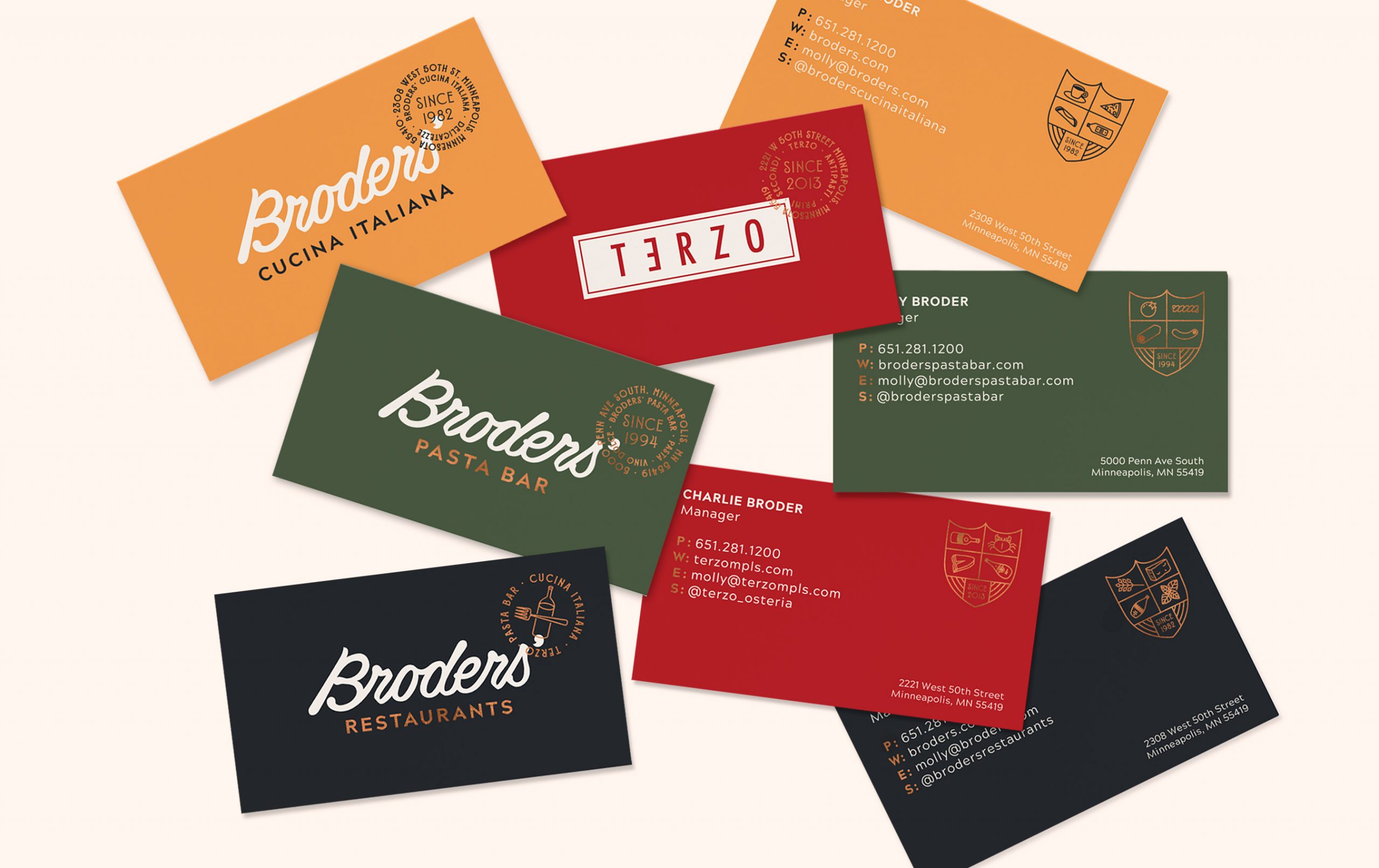
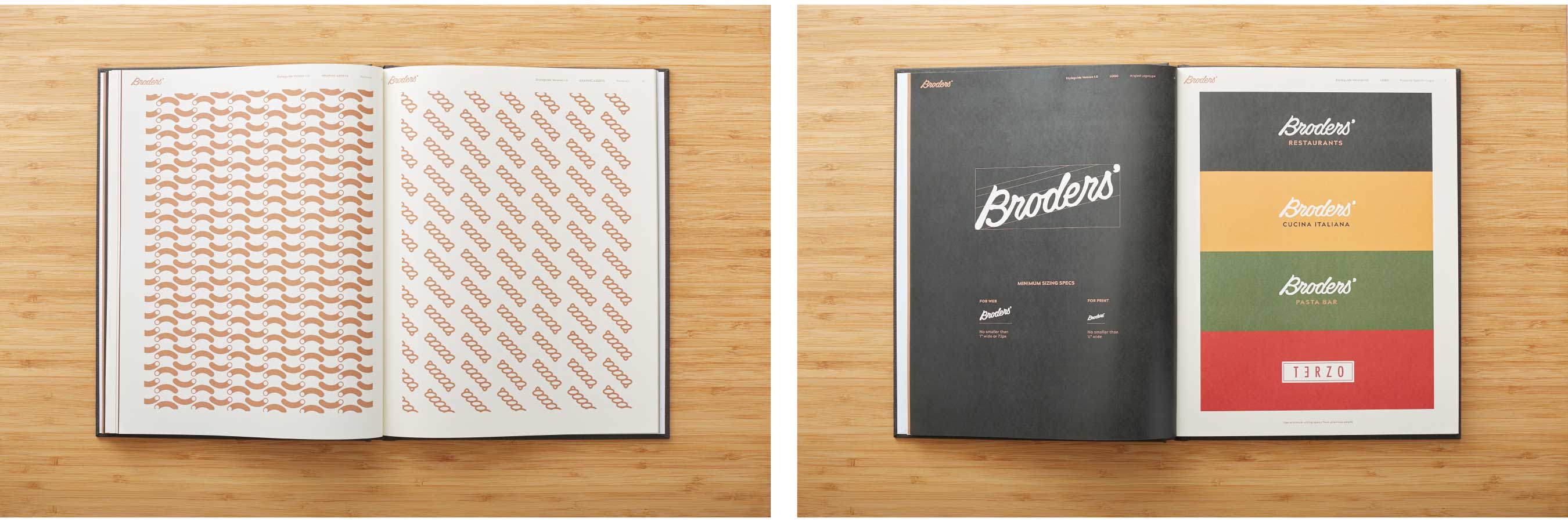
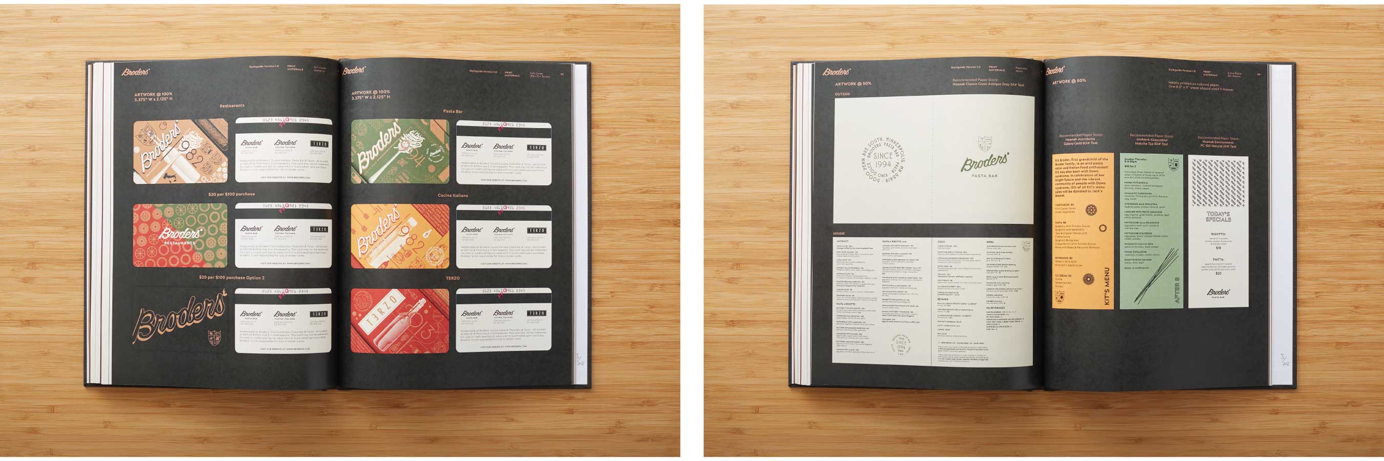
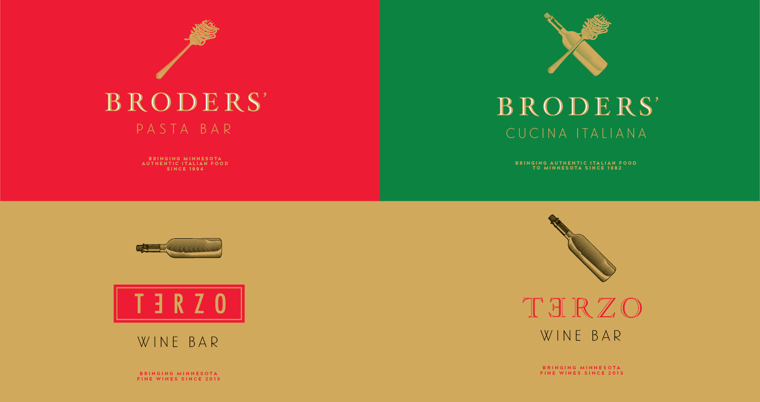
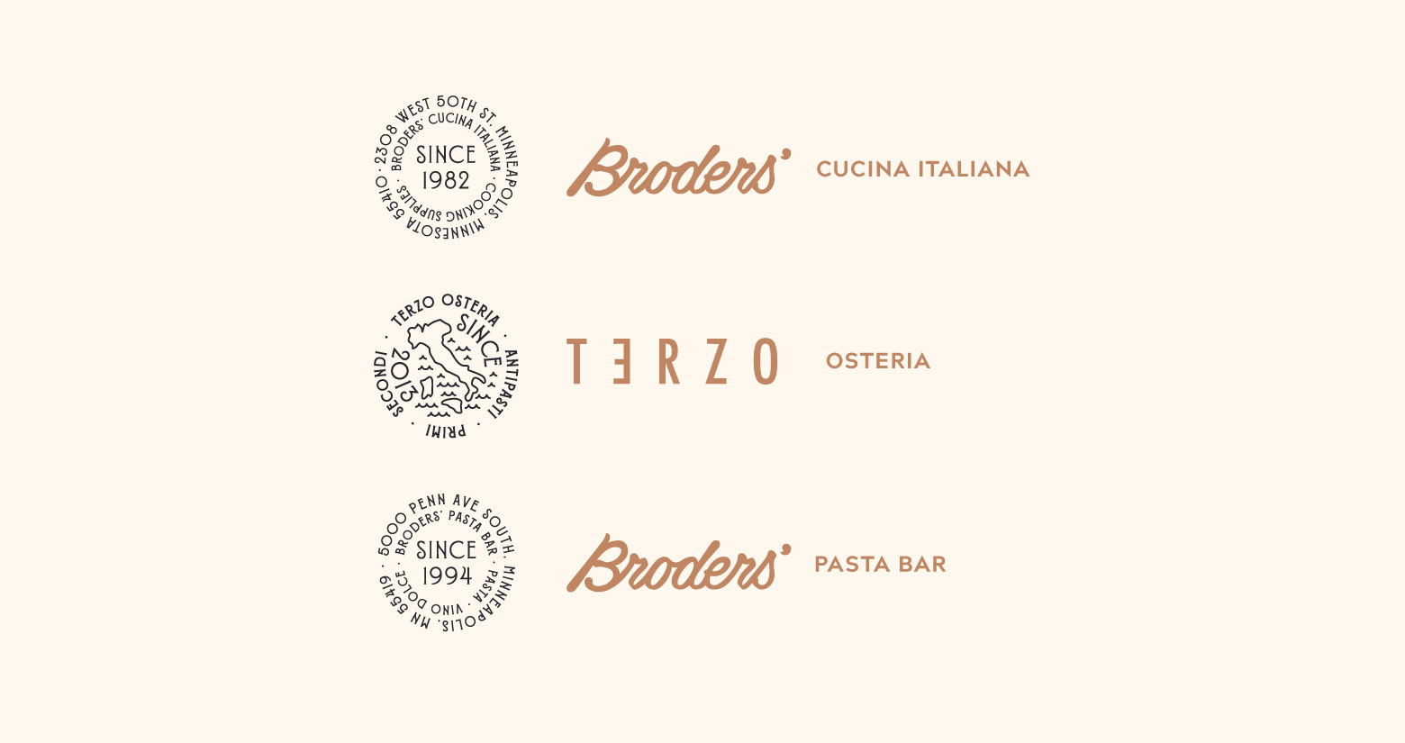
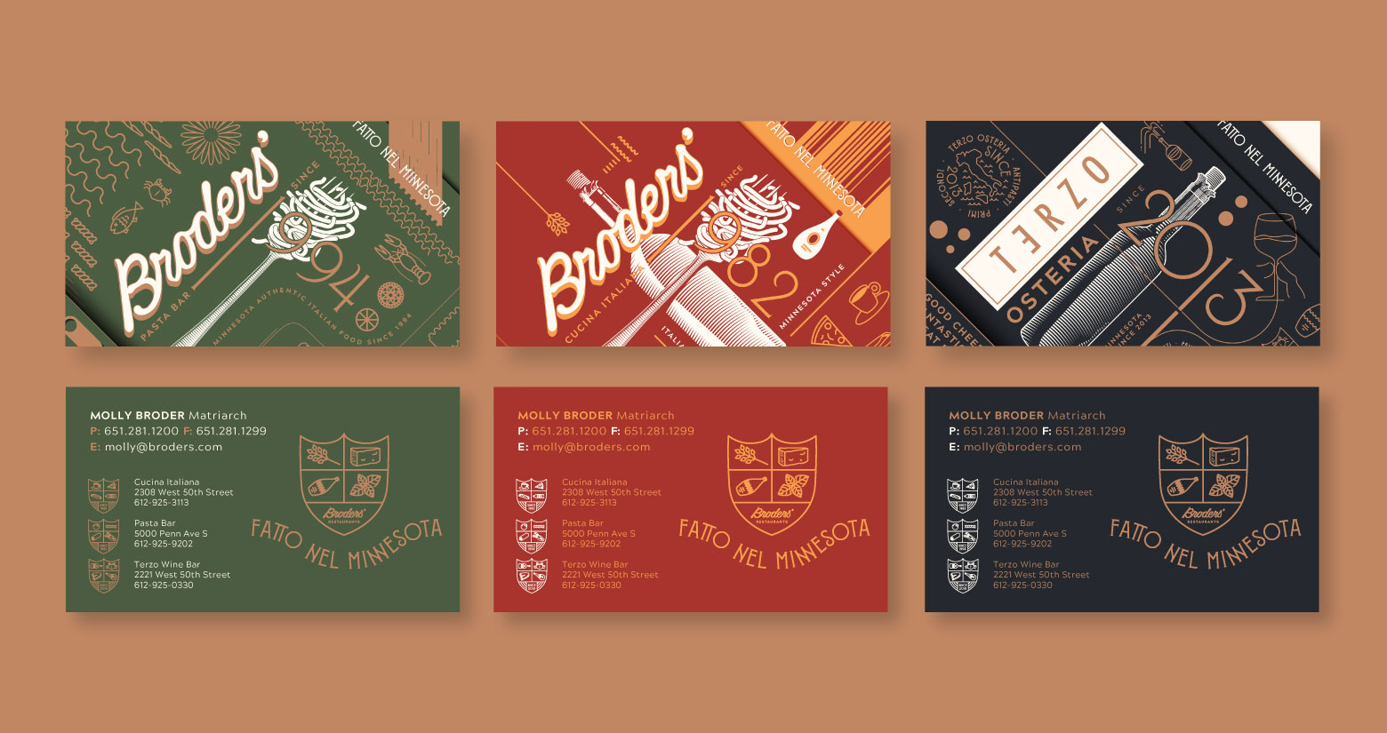
The Broders family came to Replace looking for a way to unify their brands. Owning three different restaurant properties in the same area, they needed a way to unify them all together while making sure each had it’s own unique flair.
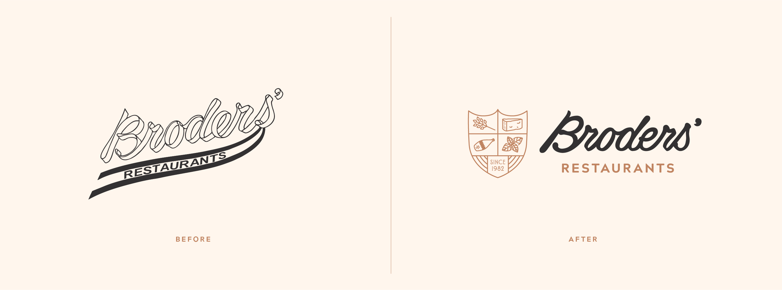
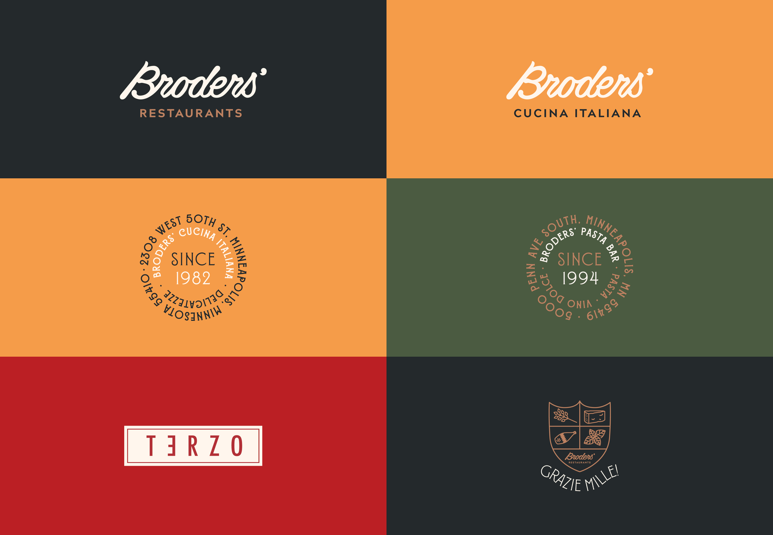
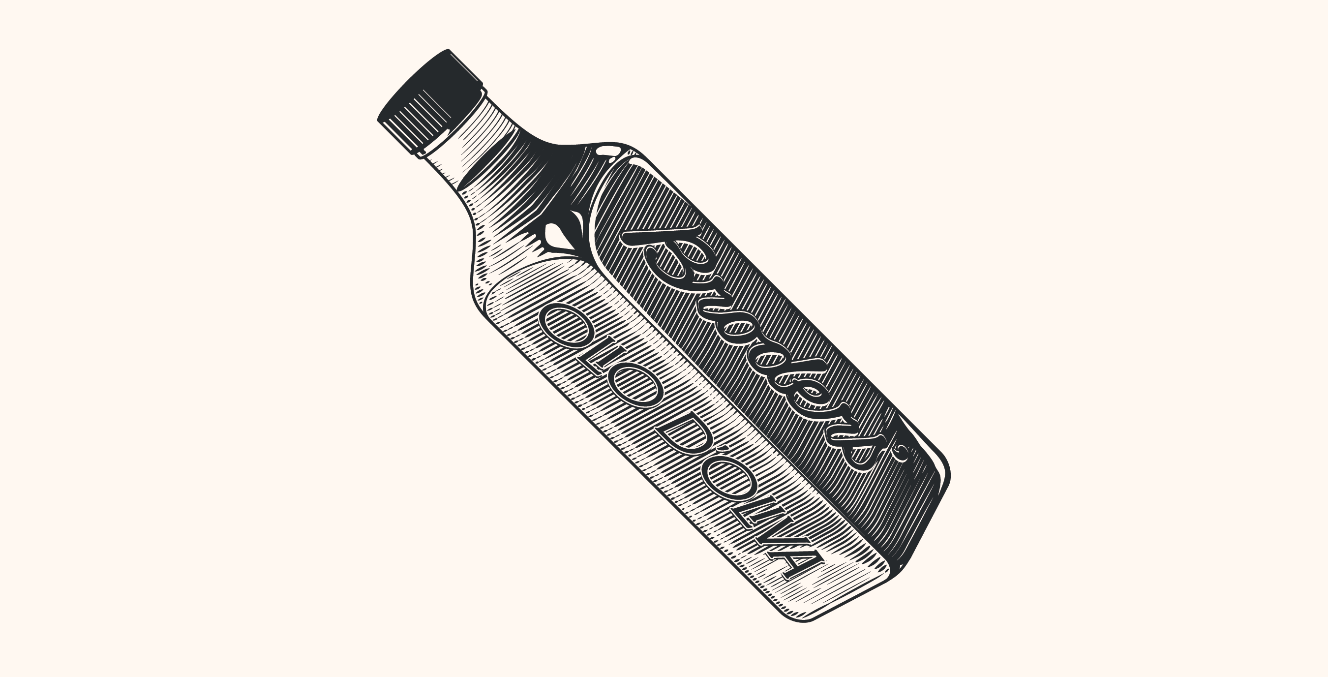
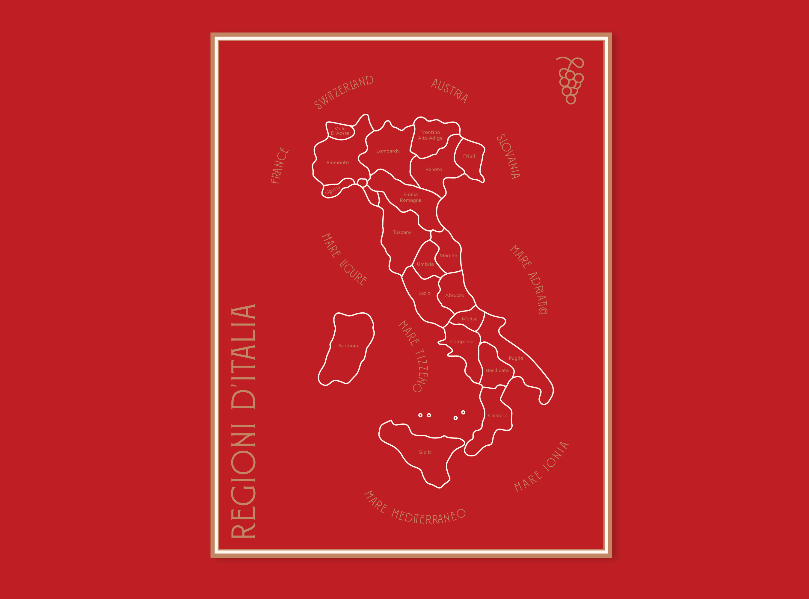
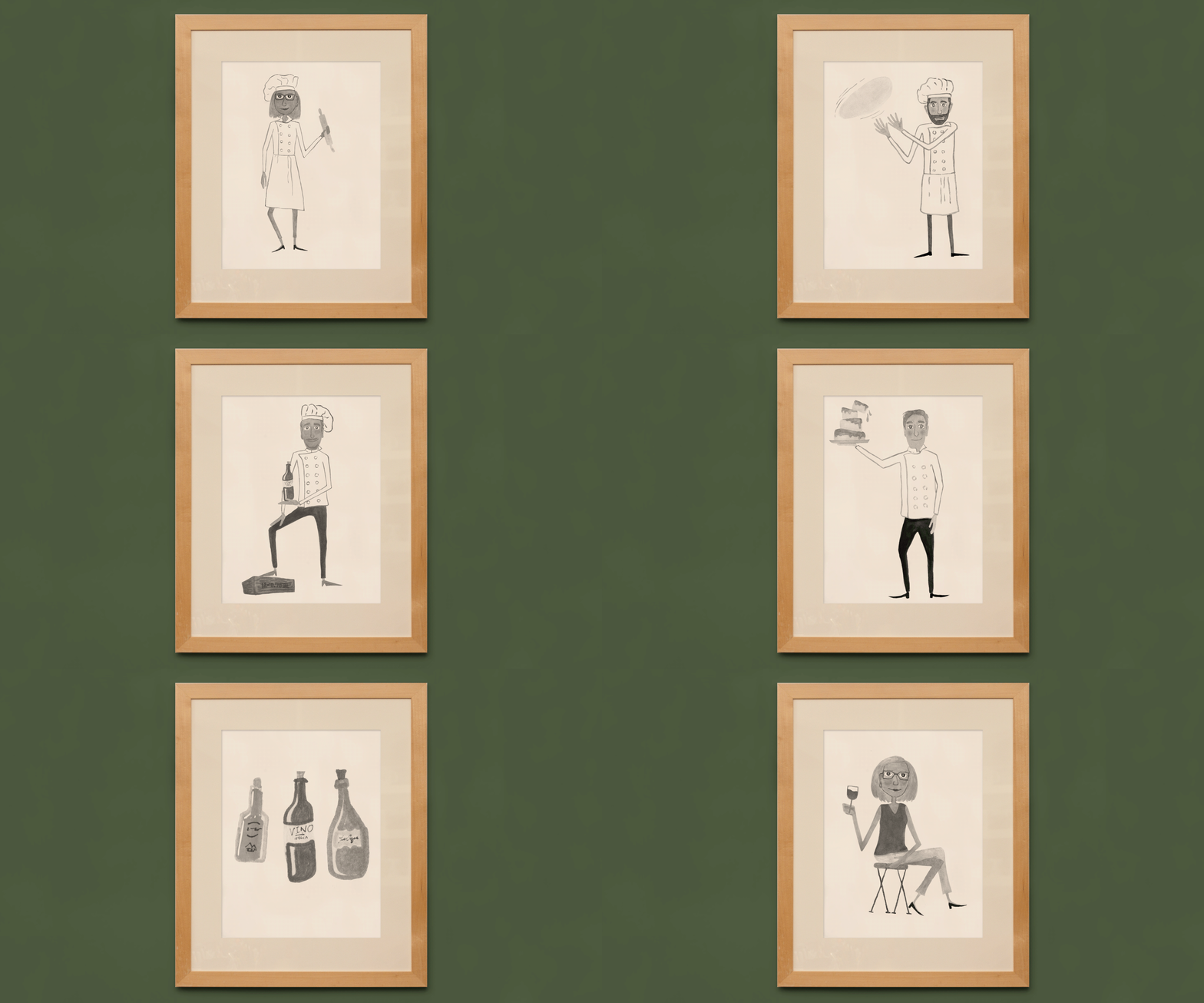
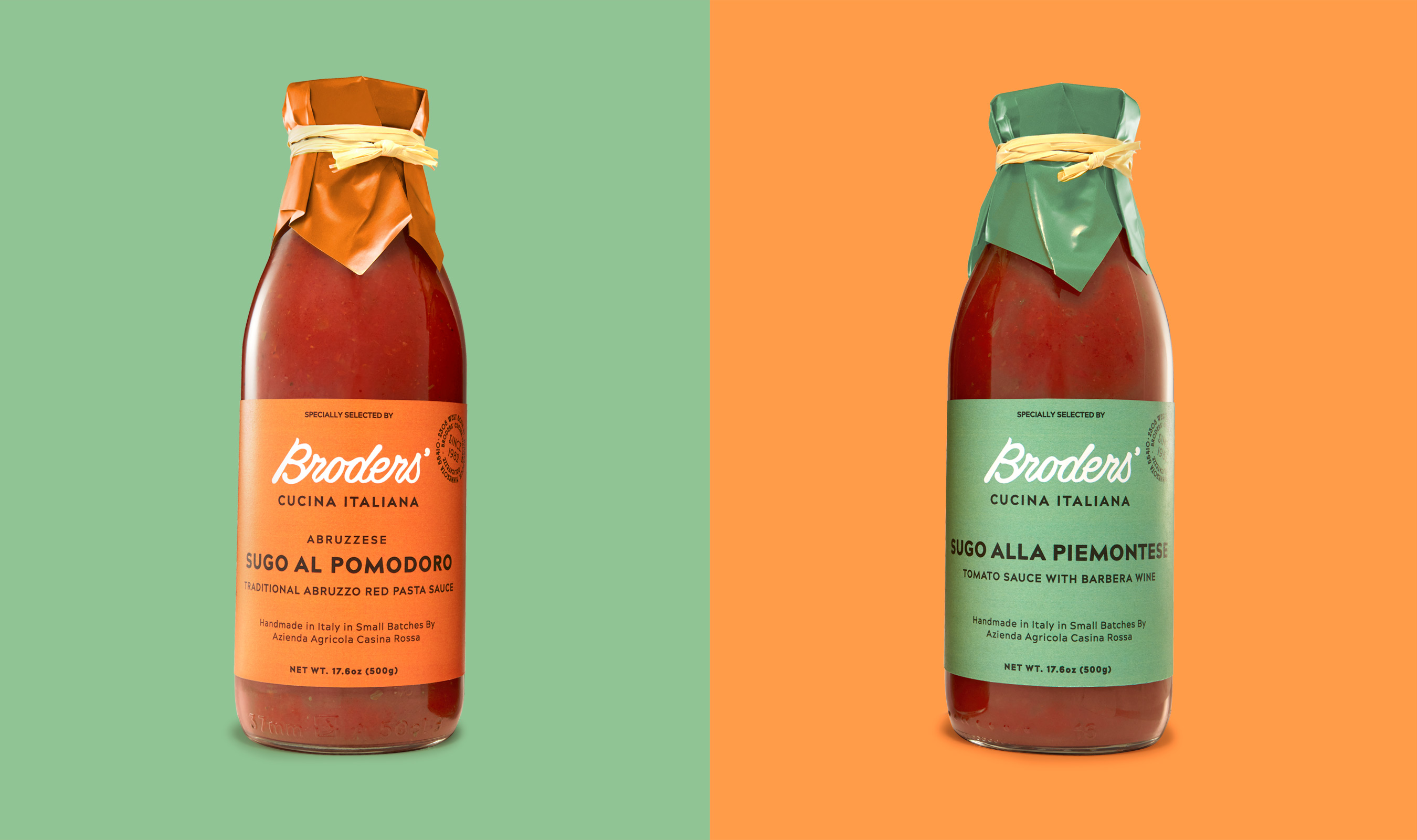
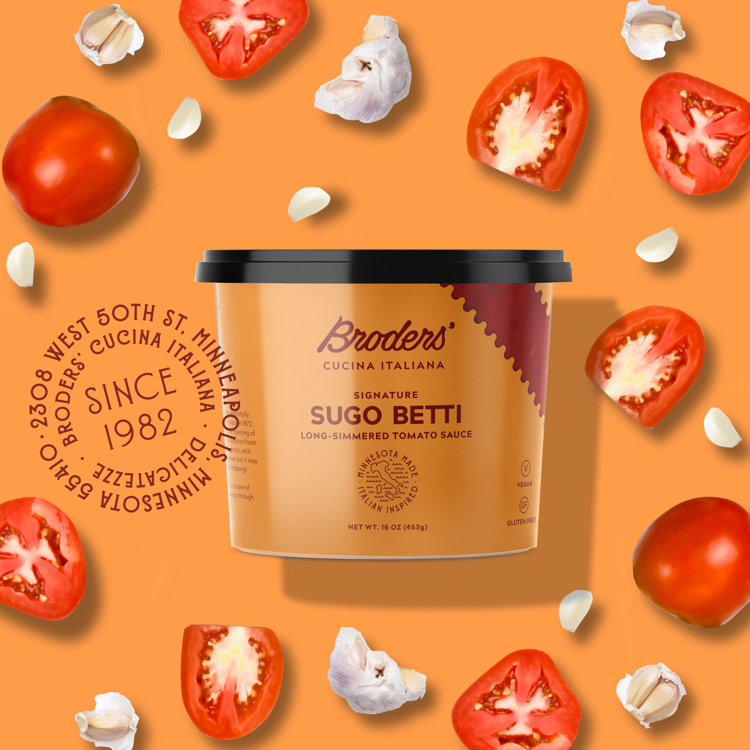
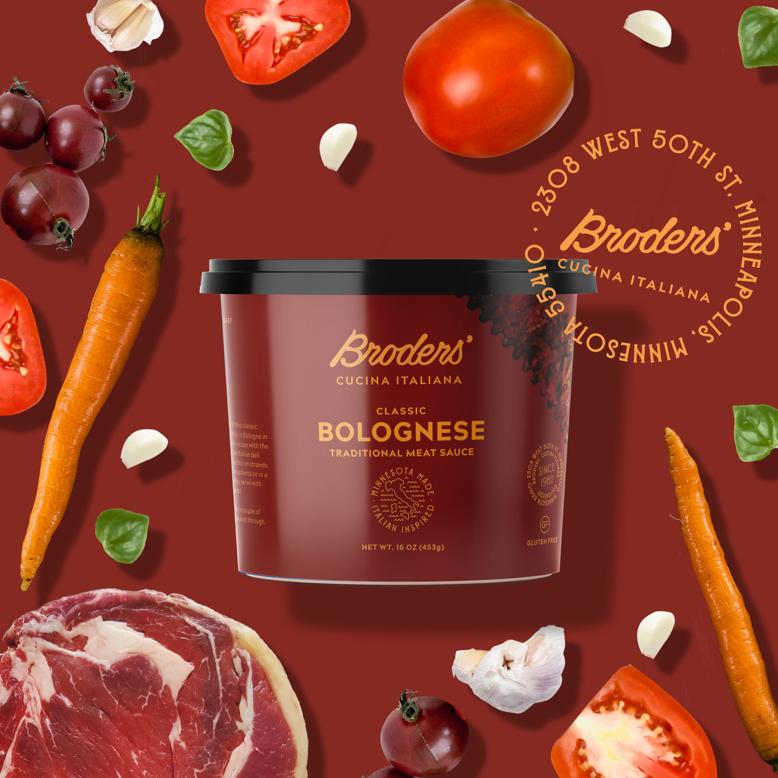
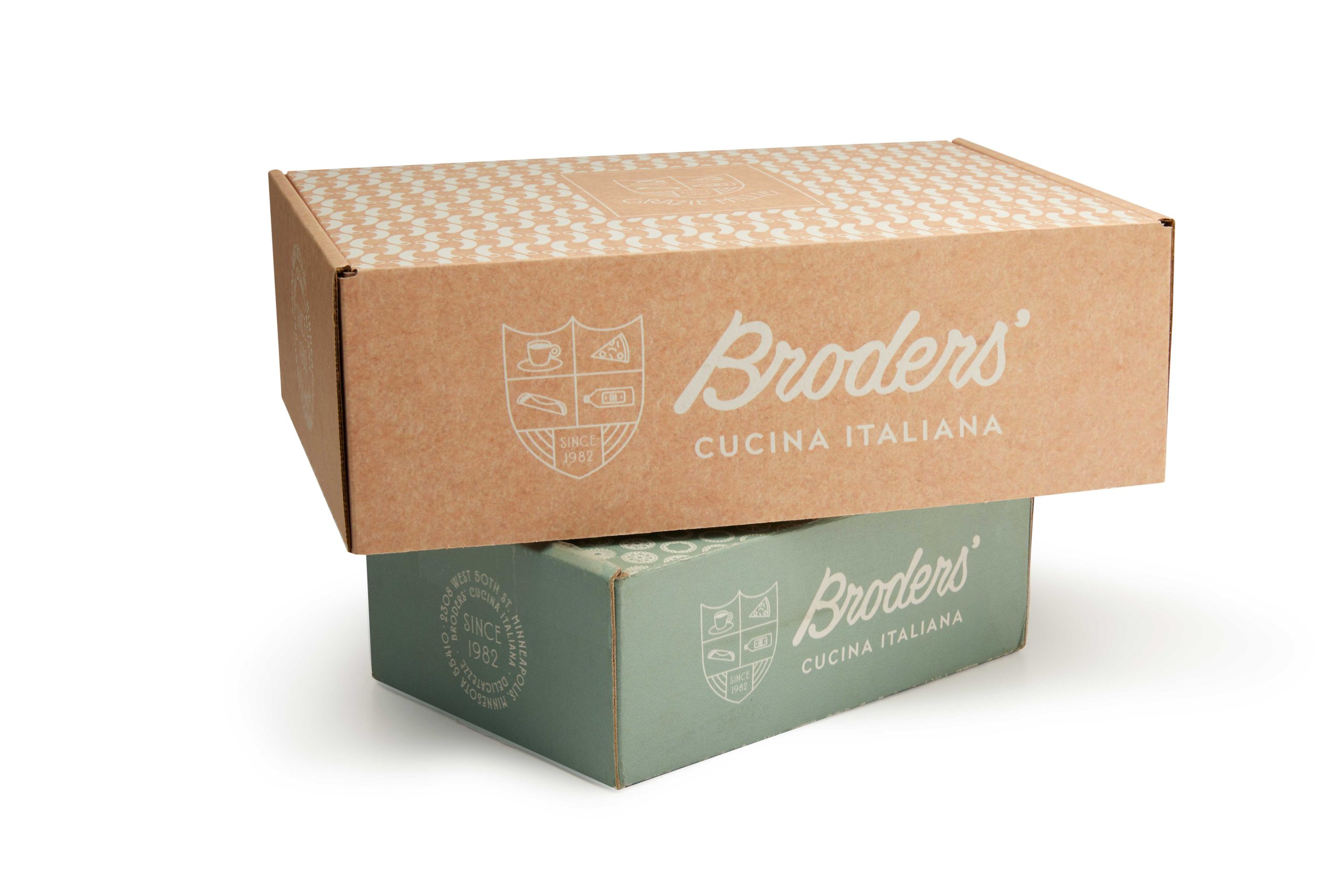
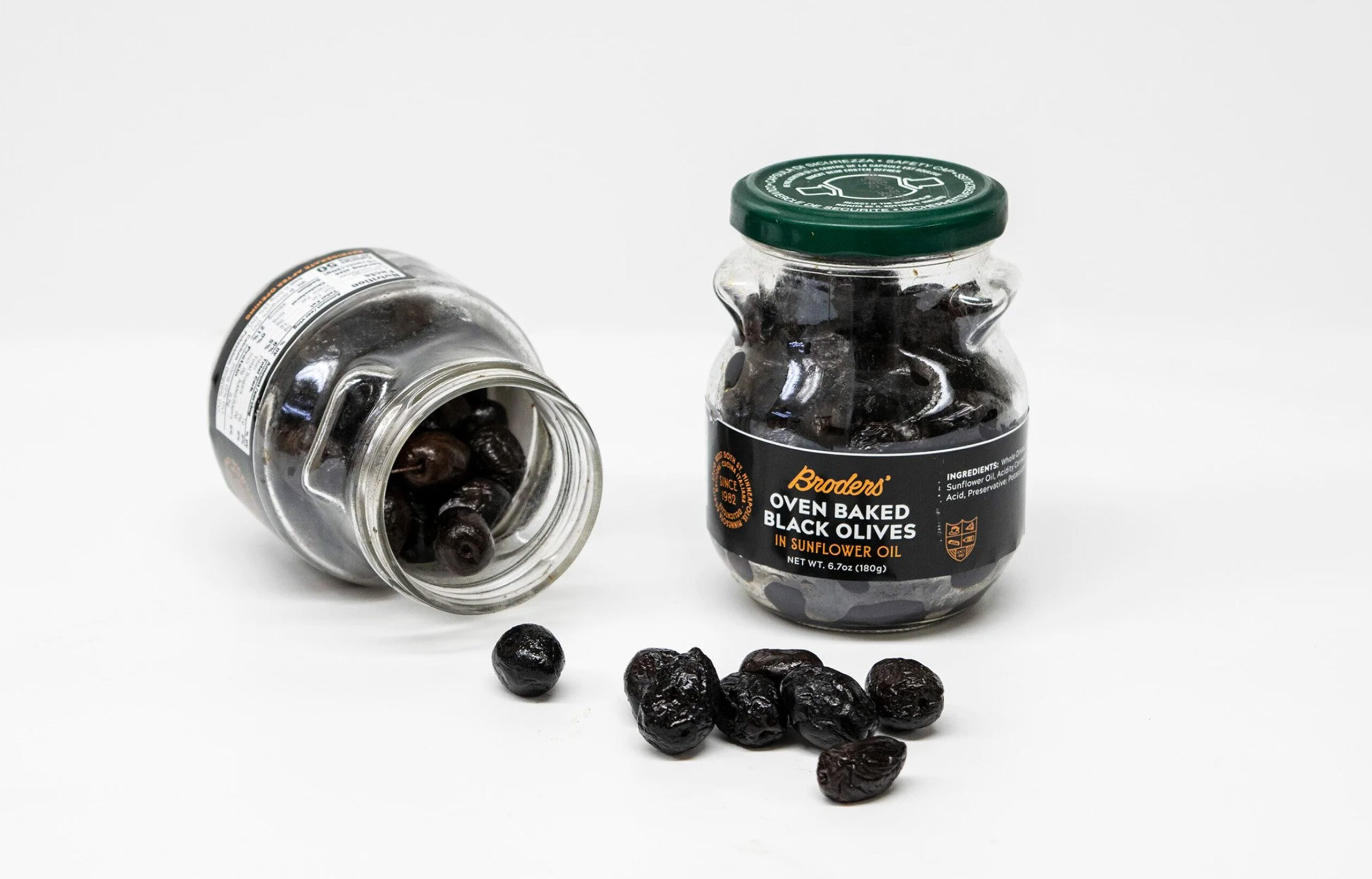
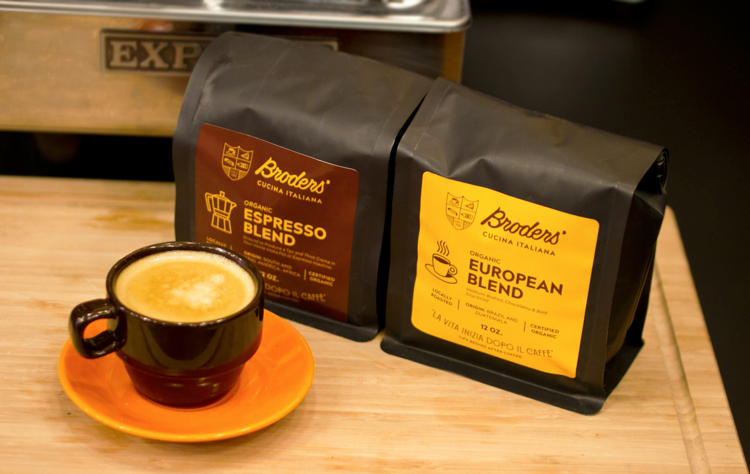
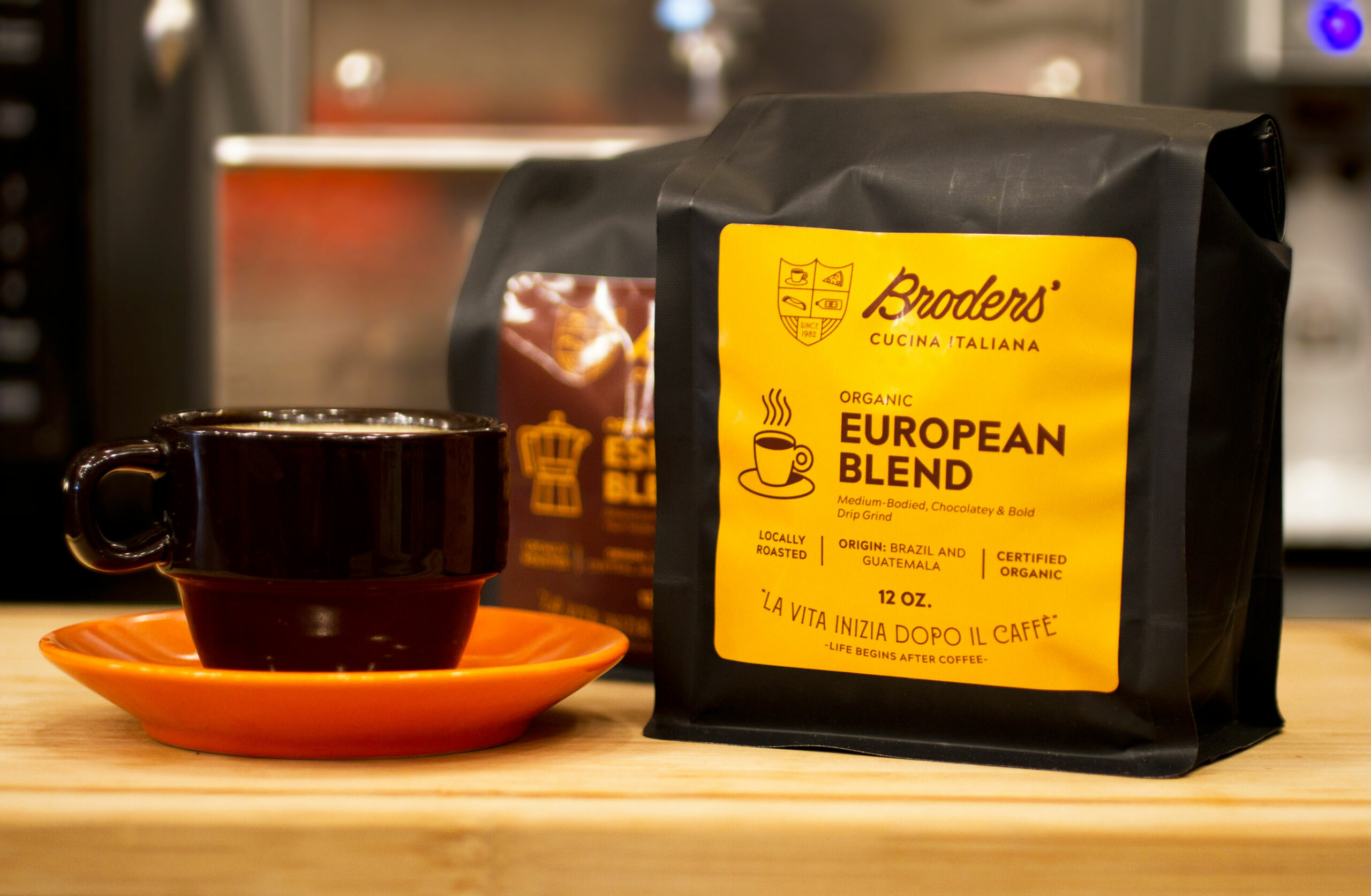
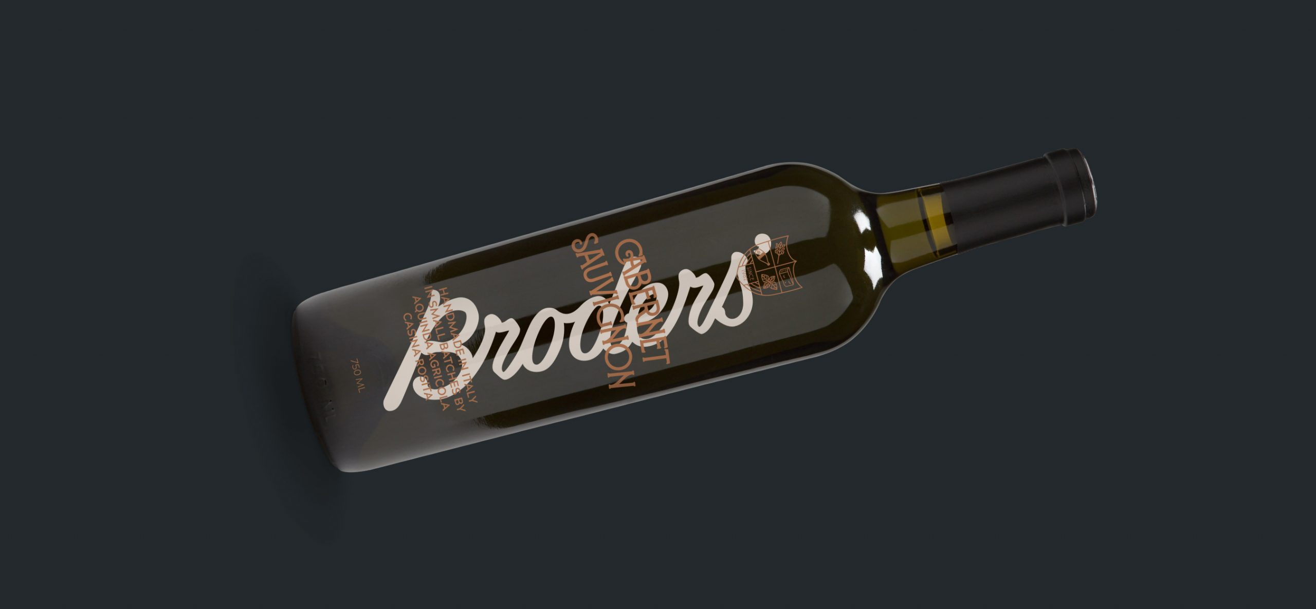
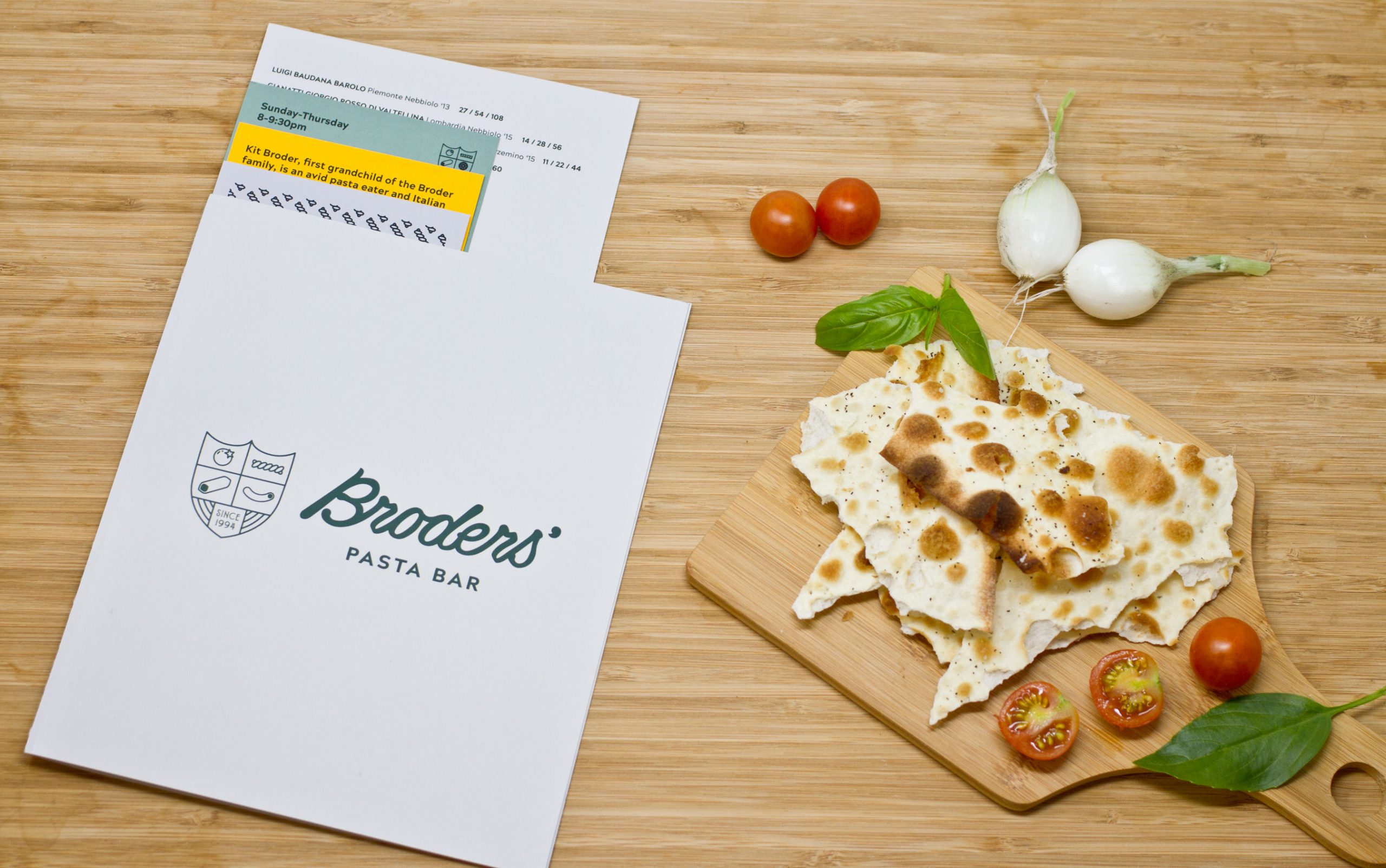
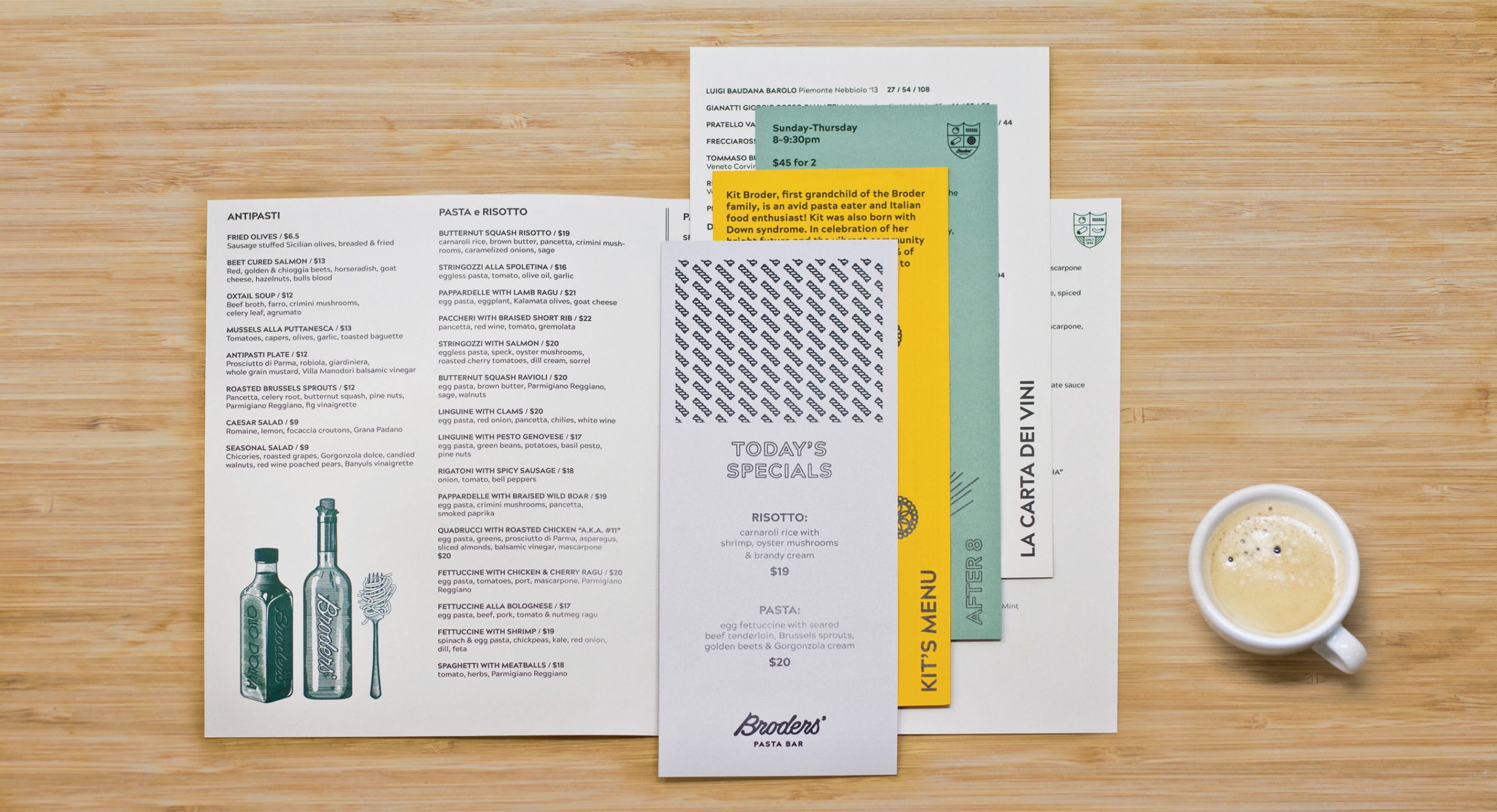
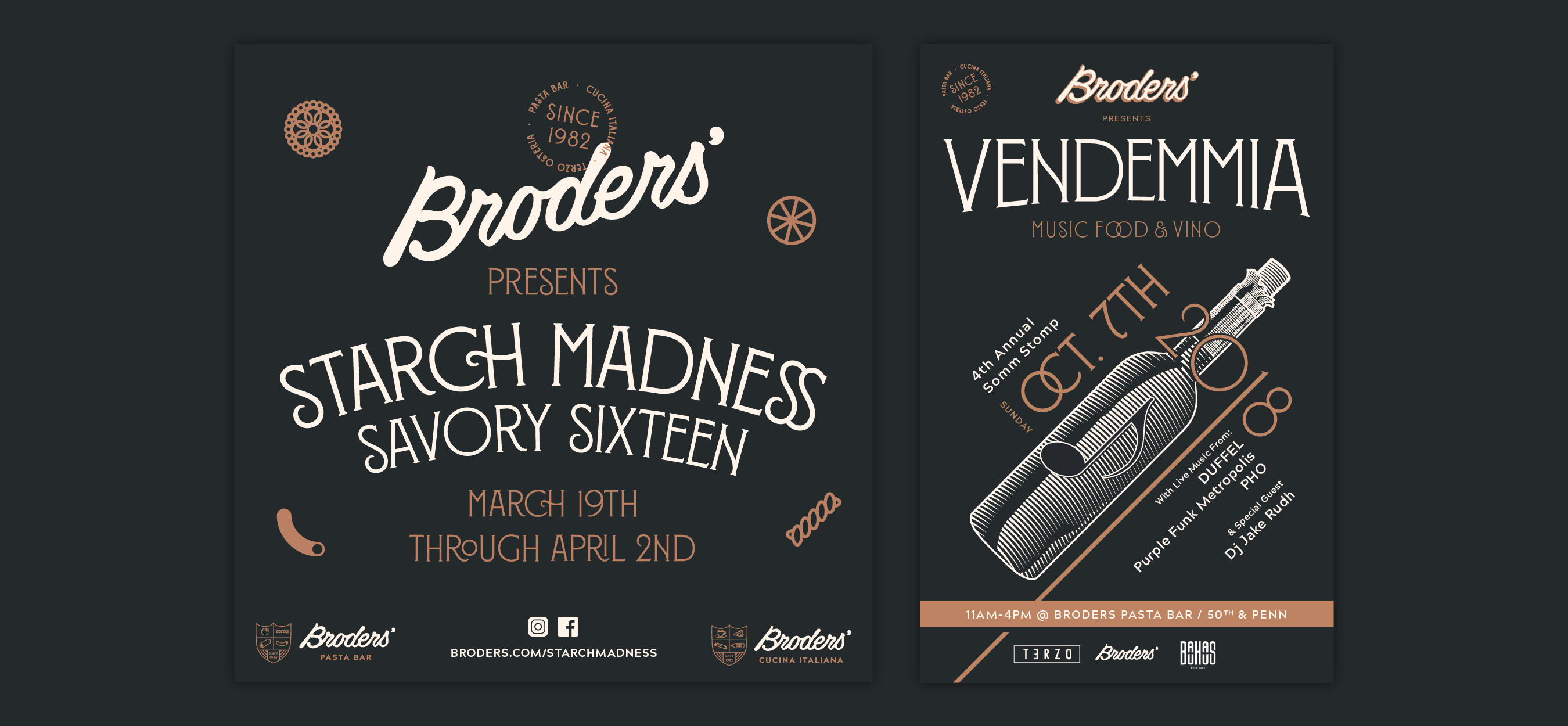
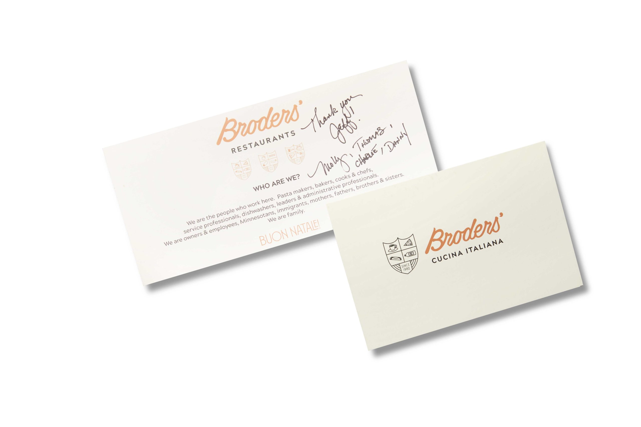
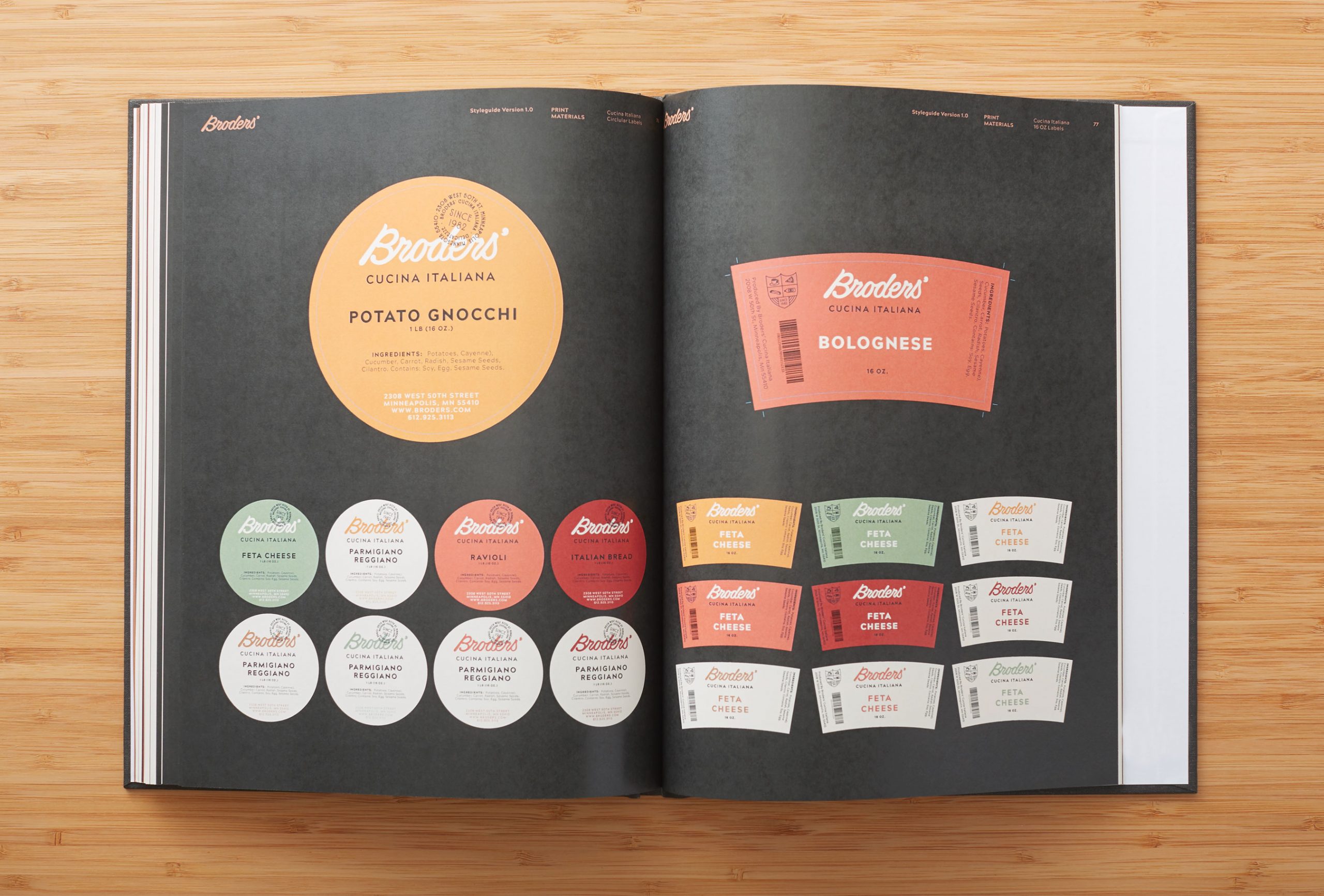
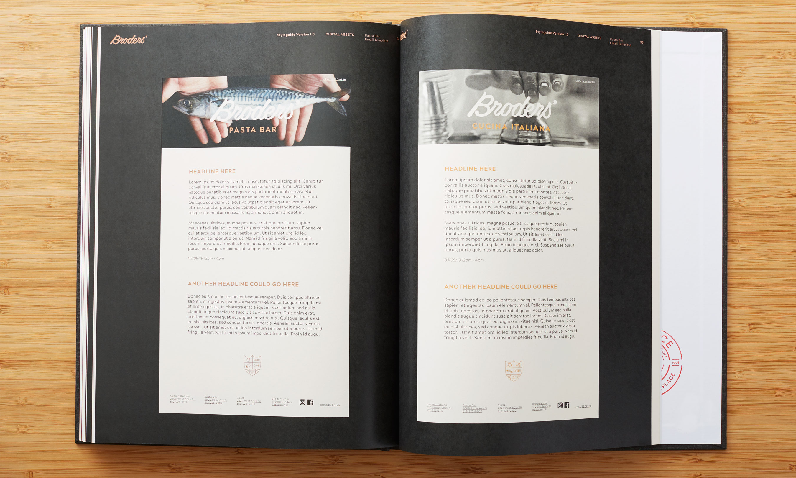
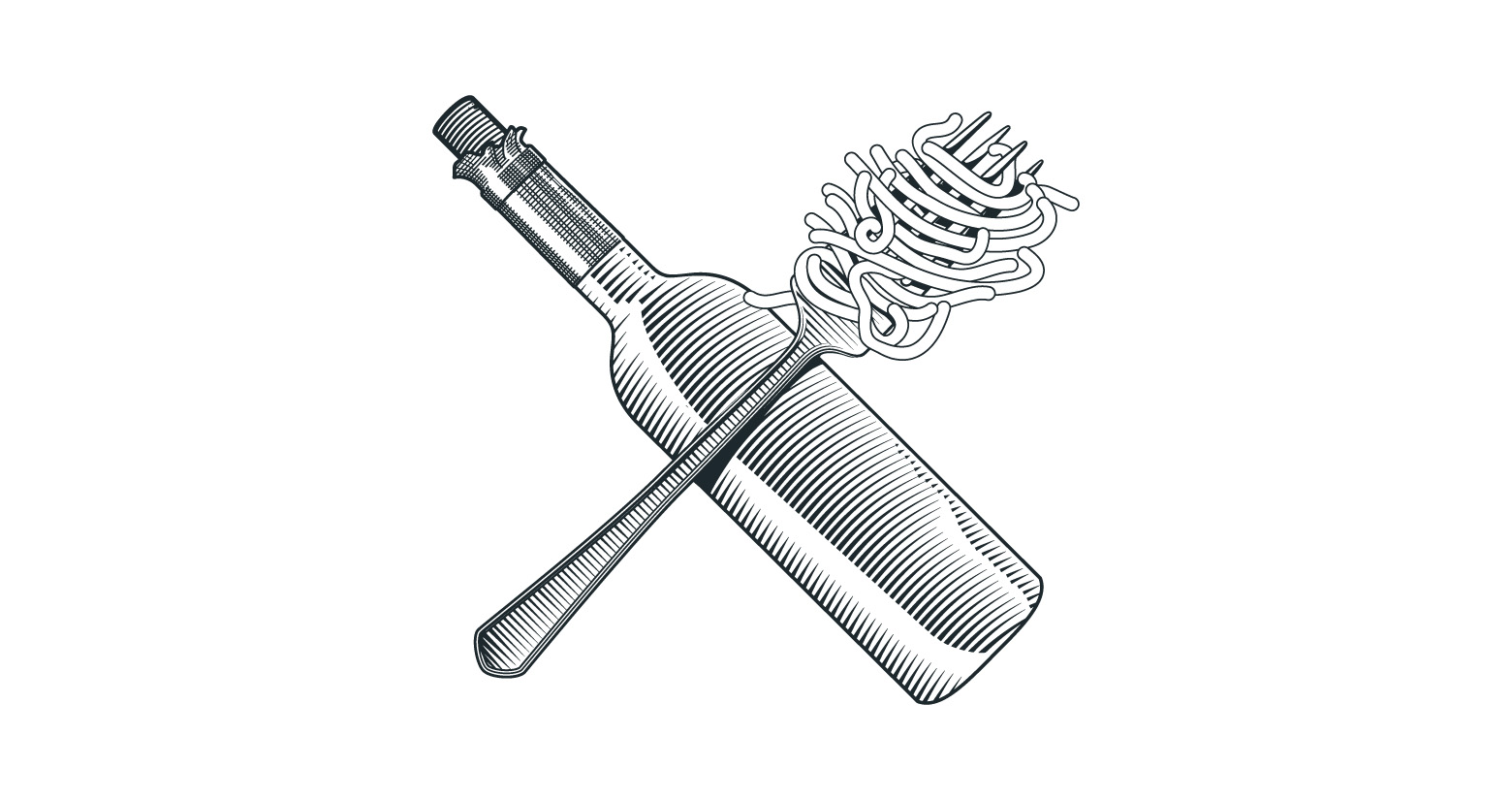
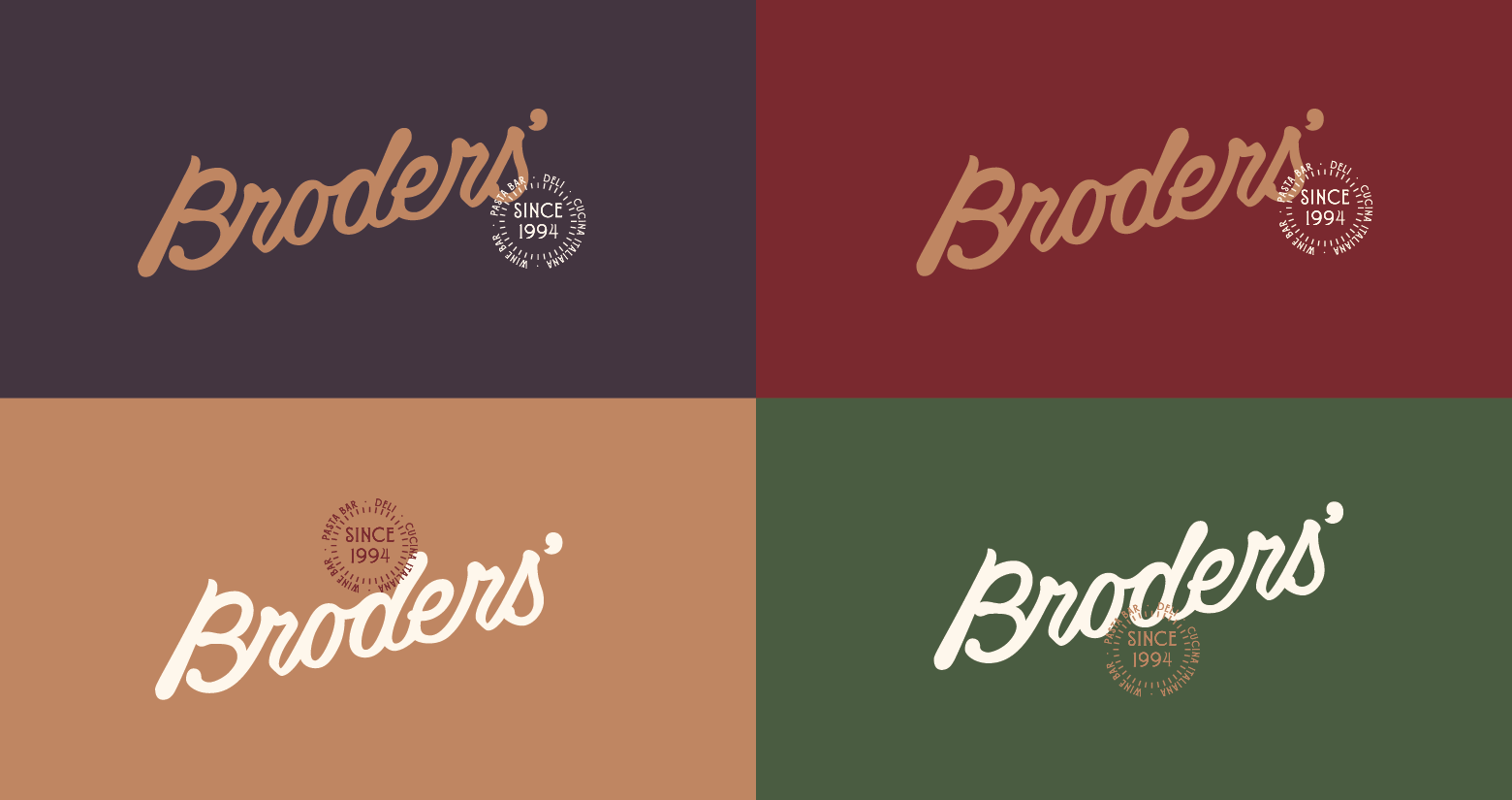
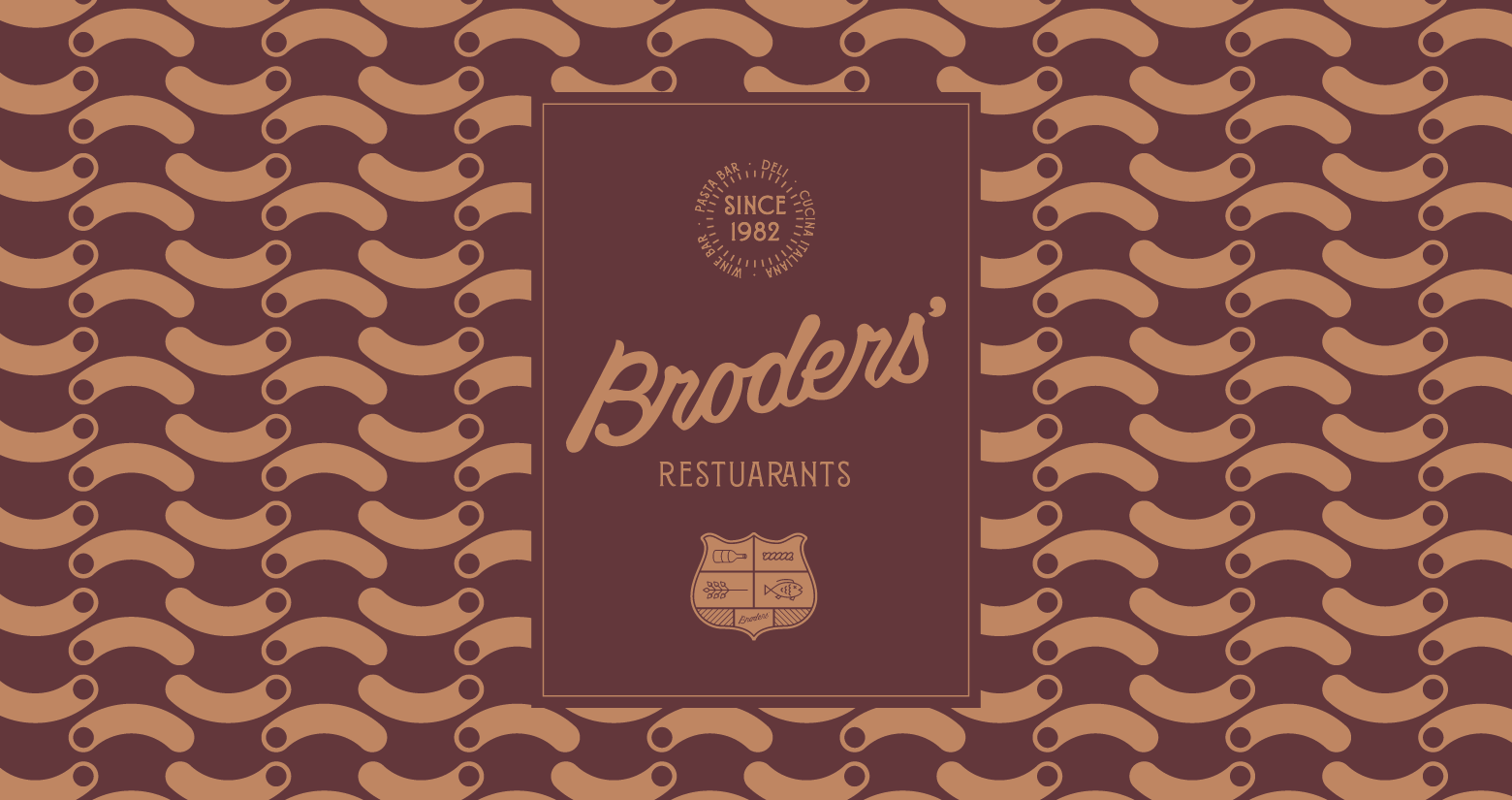
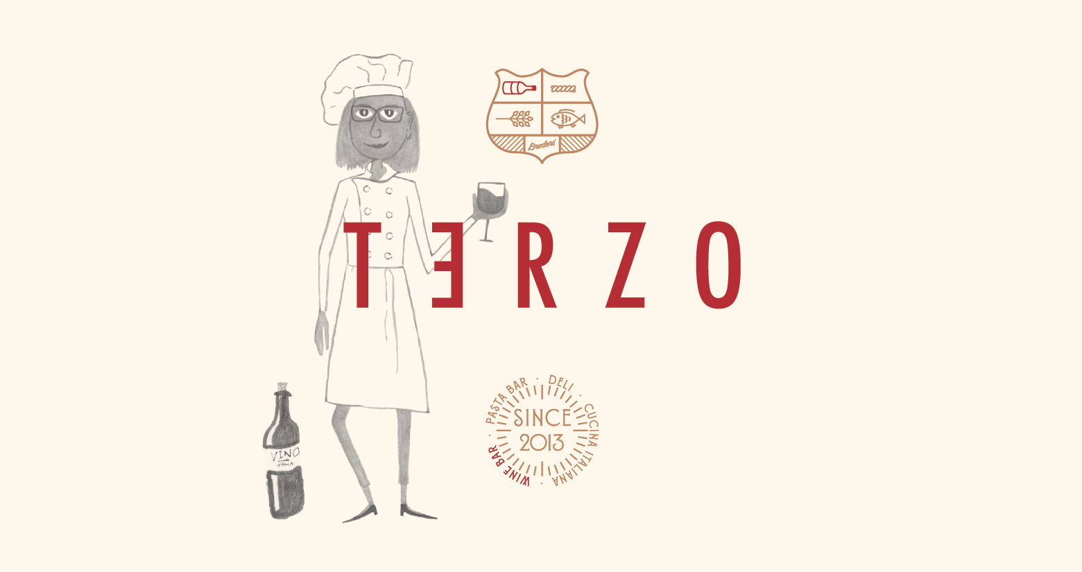
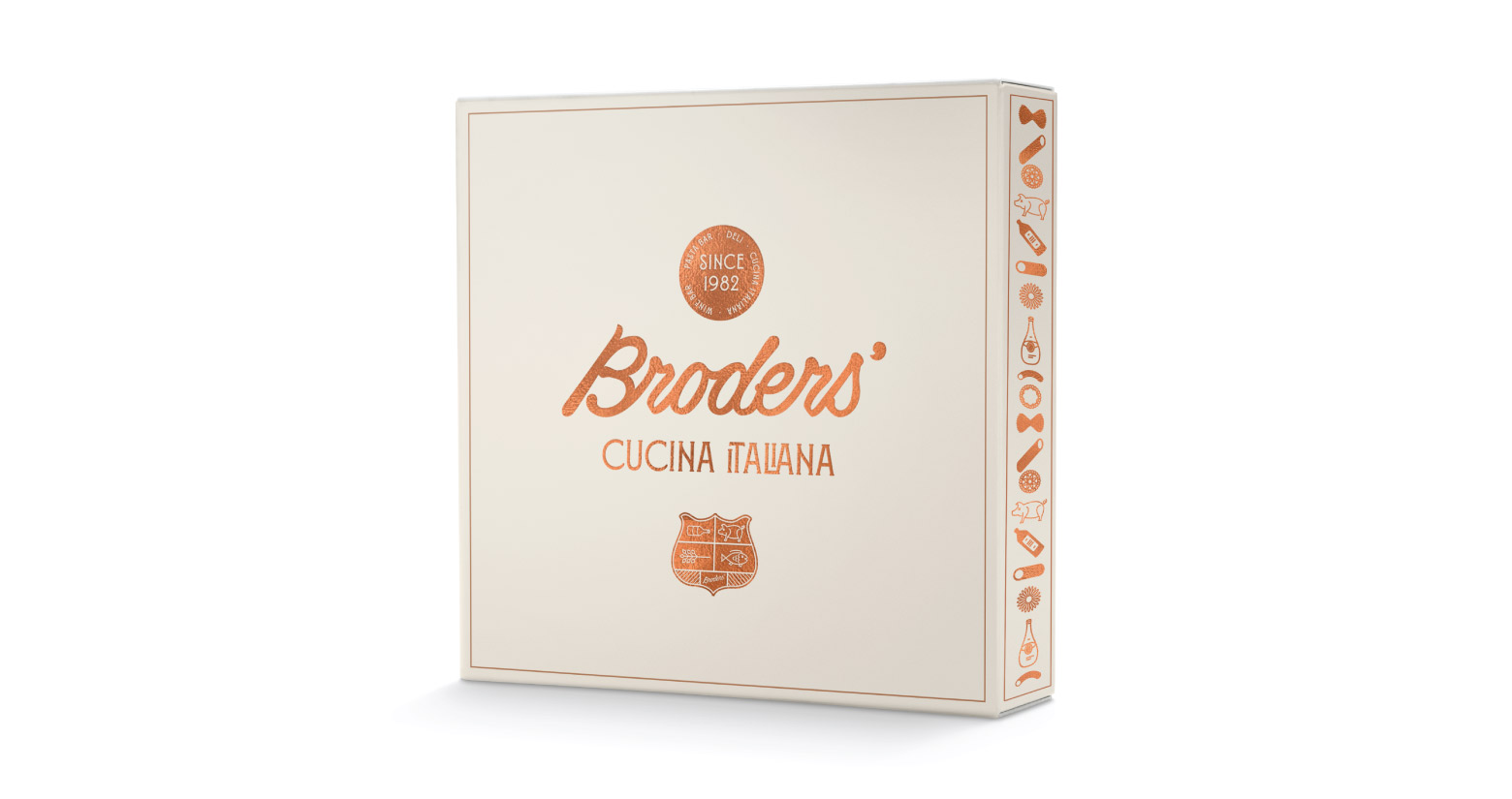
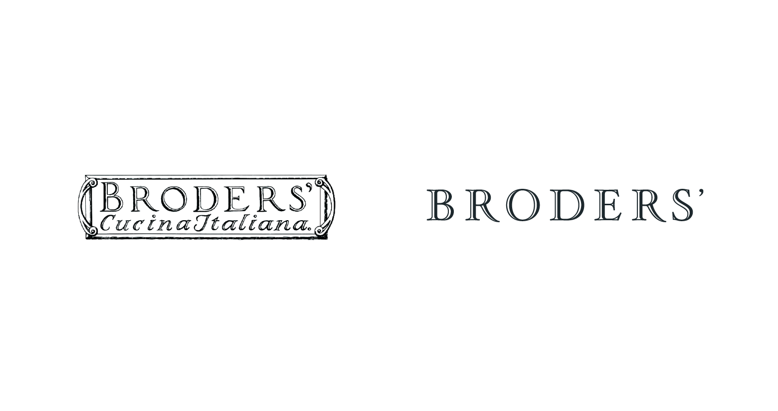
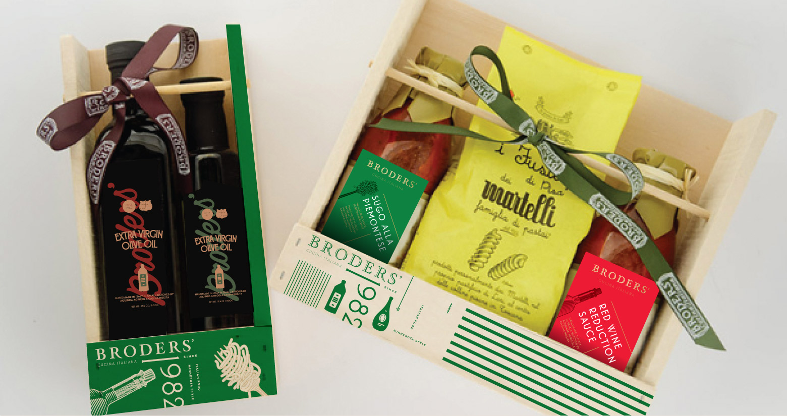
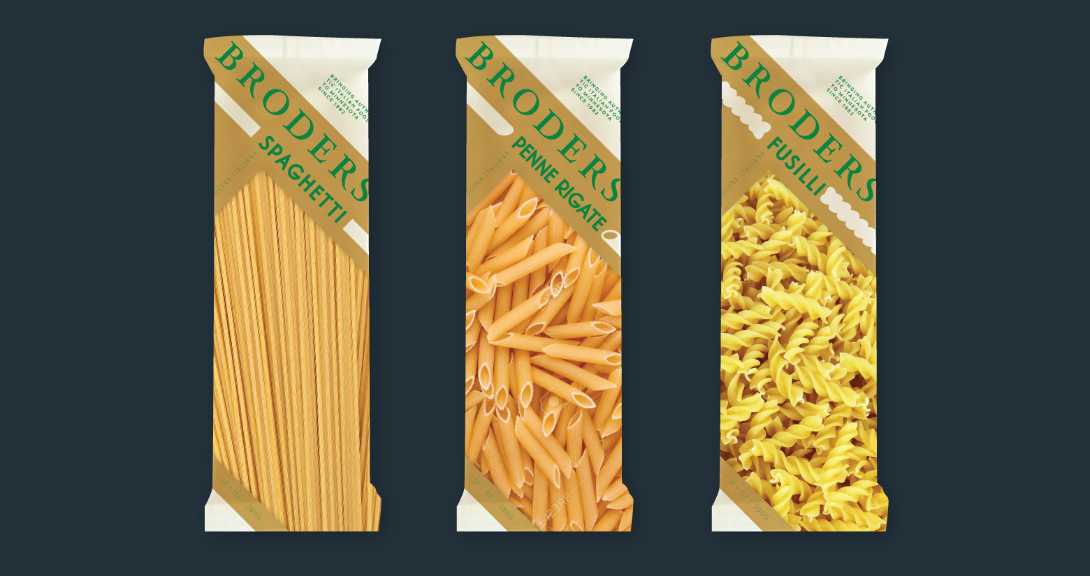
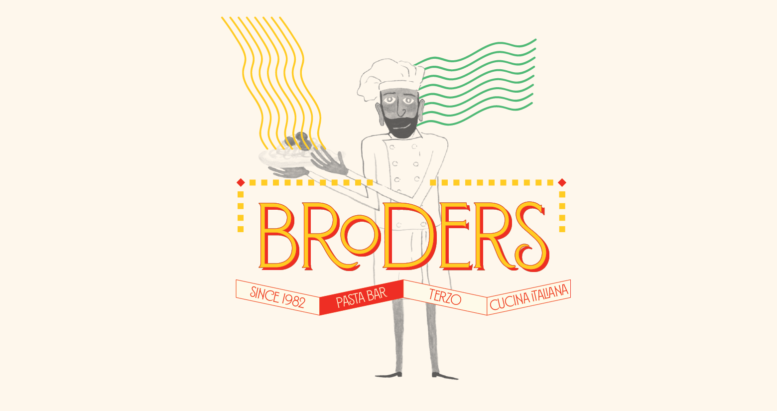
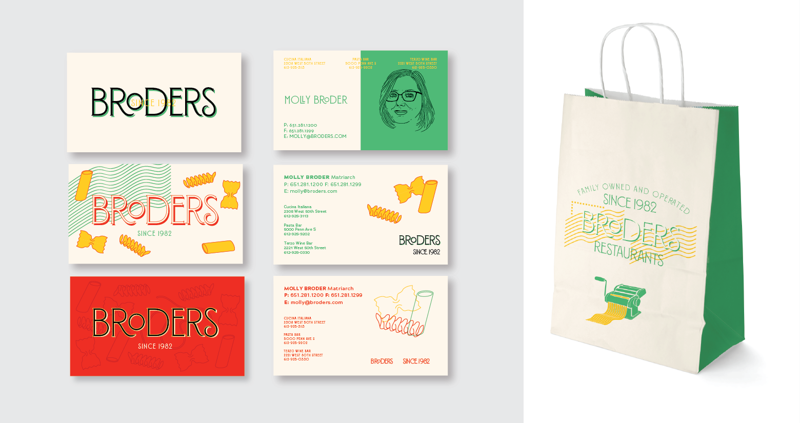
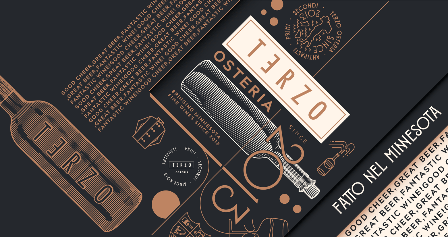
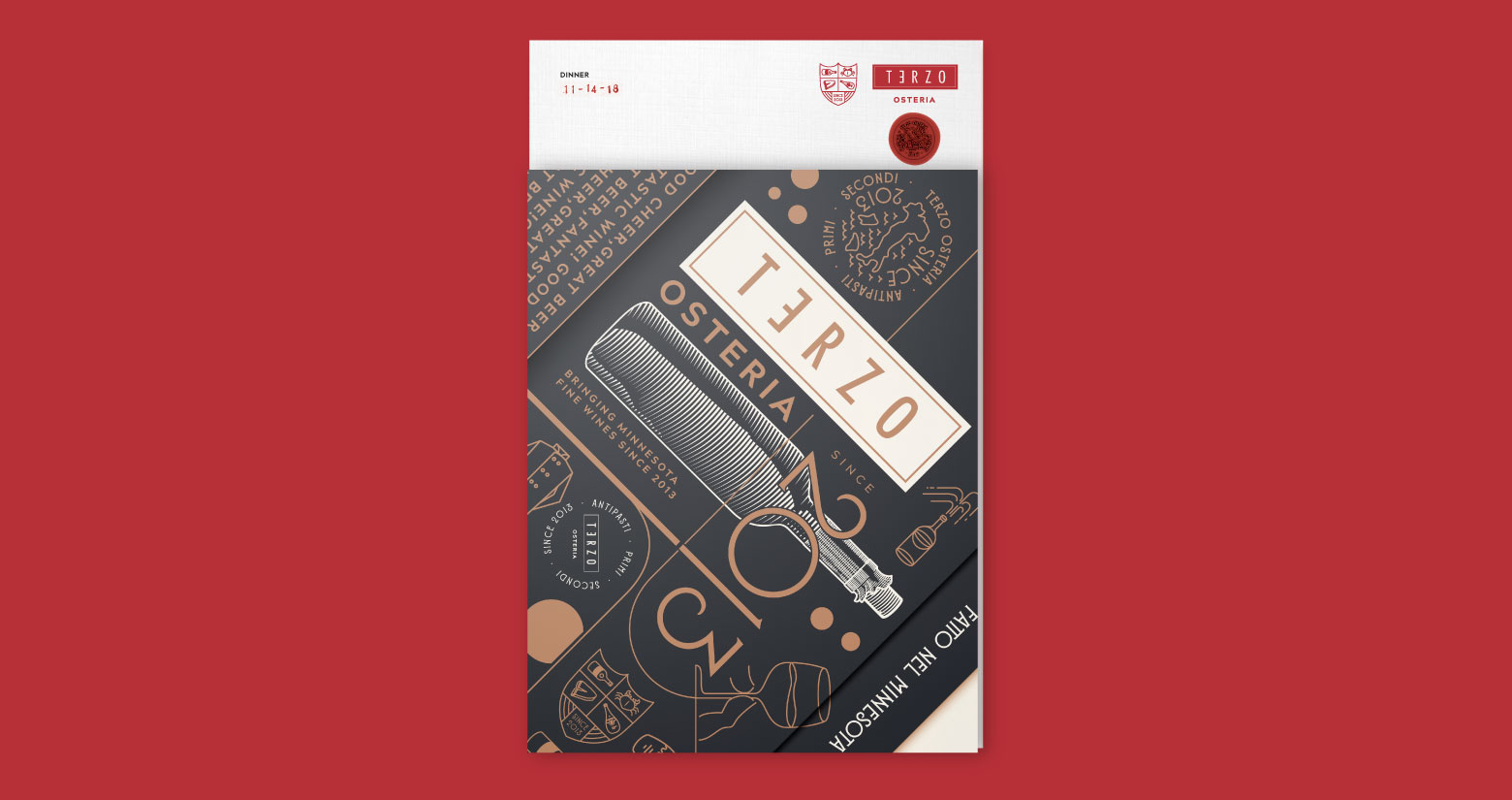
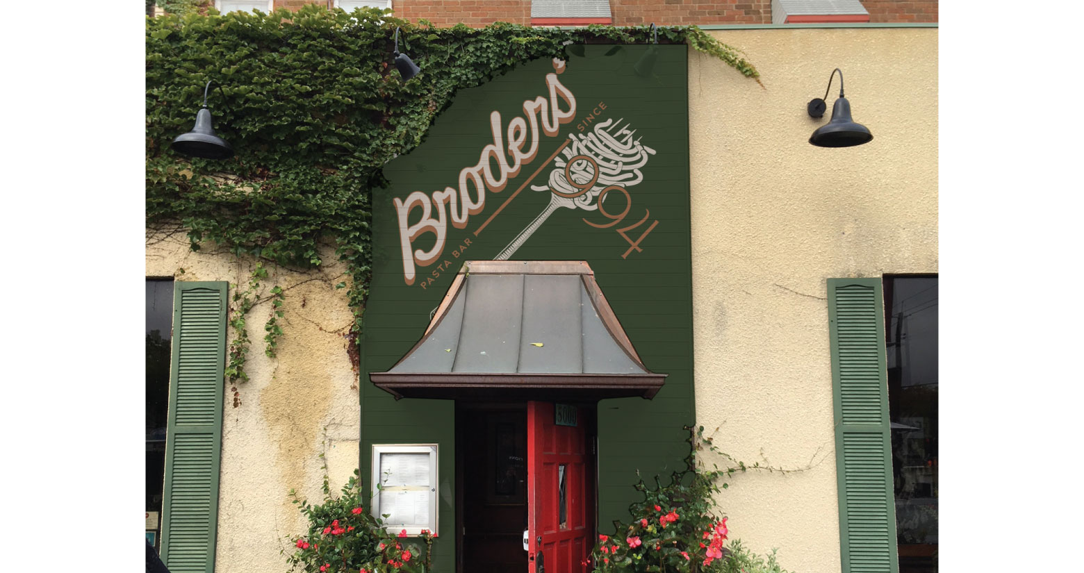
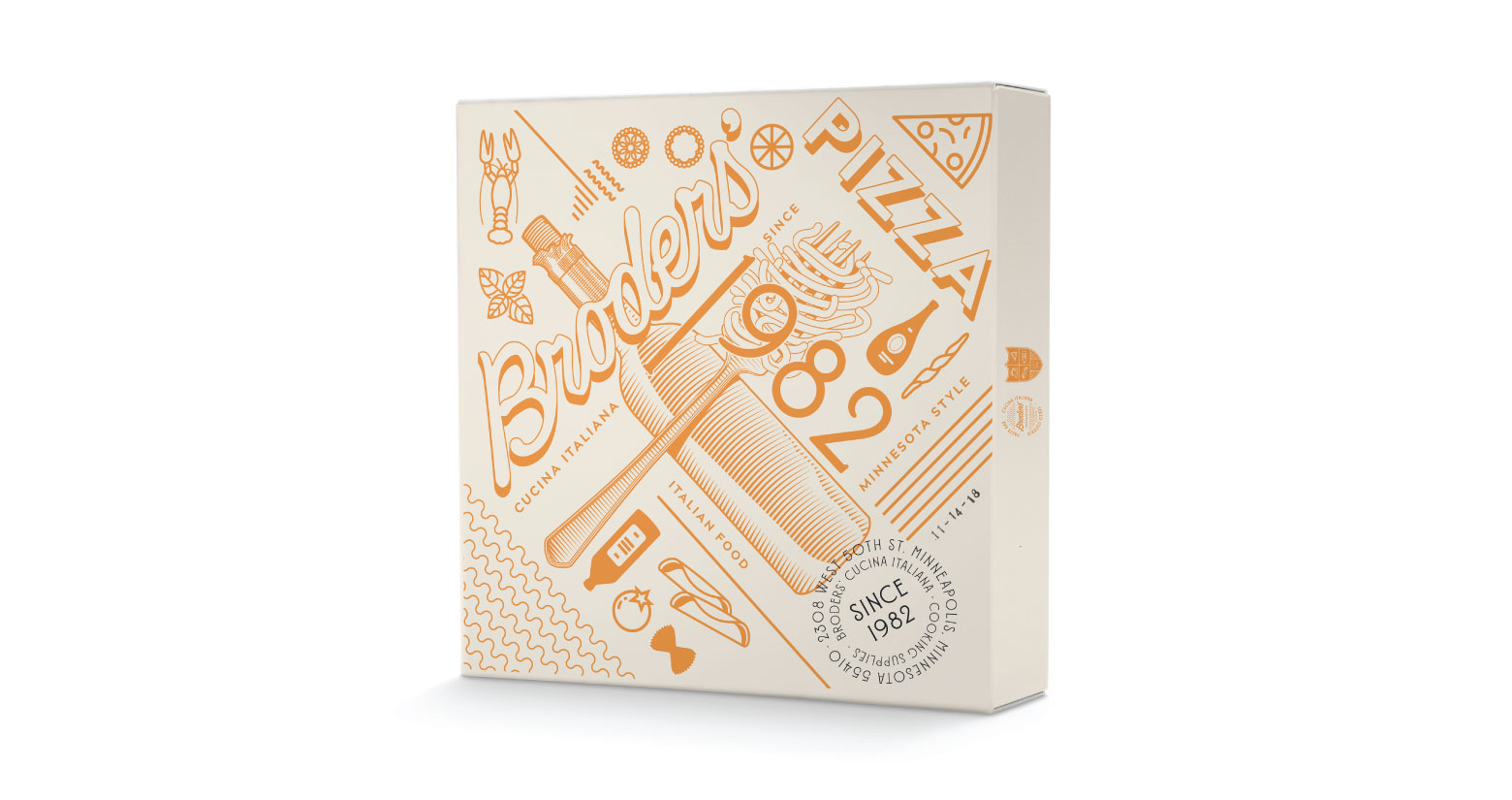
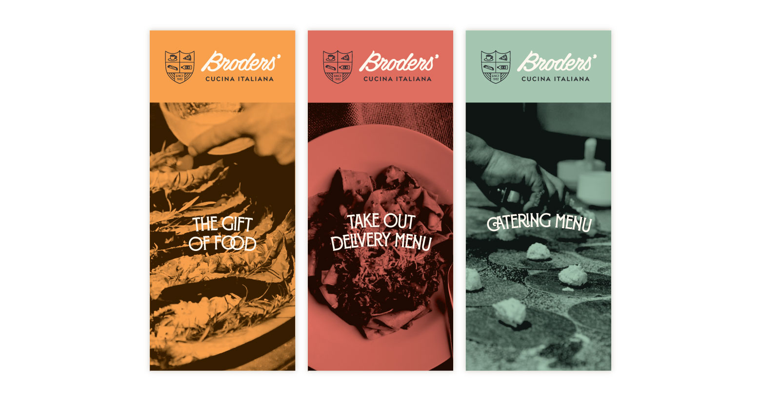
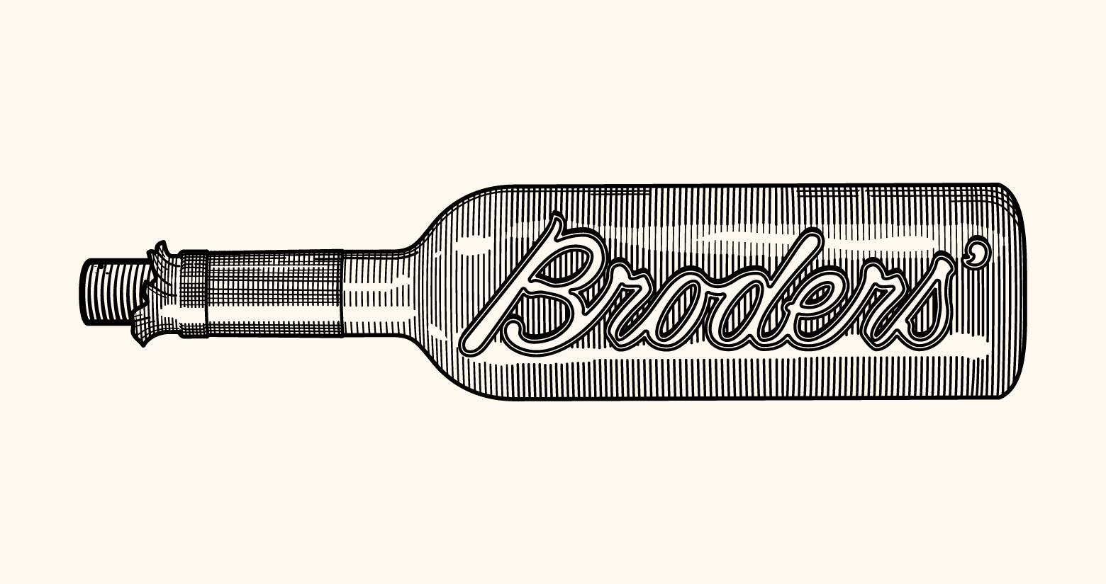
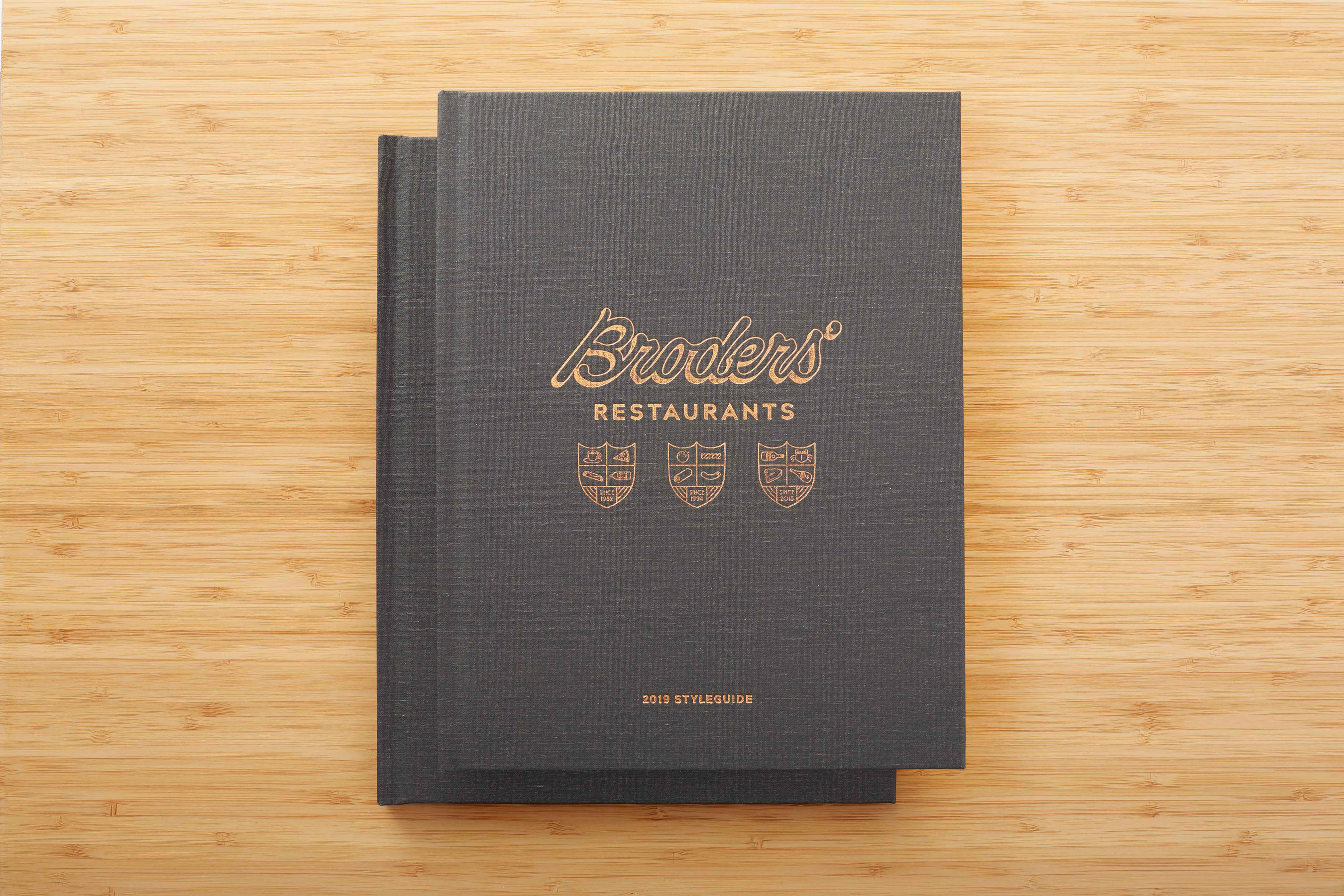
We started with a hand drawn rendering of their original logo then utilized that script as the base for our logotype. After refining the type for small space digital, we then developed iconography unique to each of the properties to be used within a system of crests and stamps to help unify all properties. We also included some new, classically inspired illustrations to help bring the brands to life.