CH_header-image

WELCOME TO THE HEIGHTS


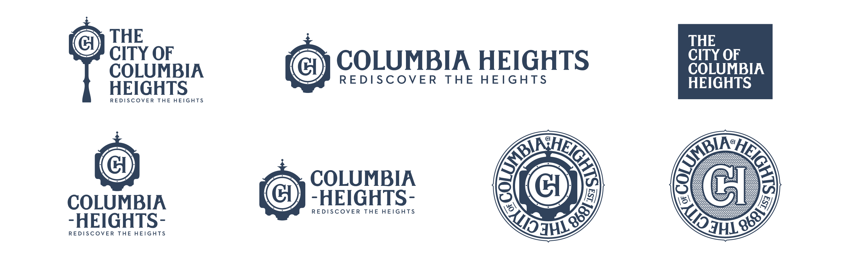
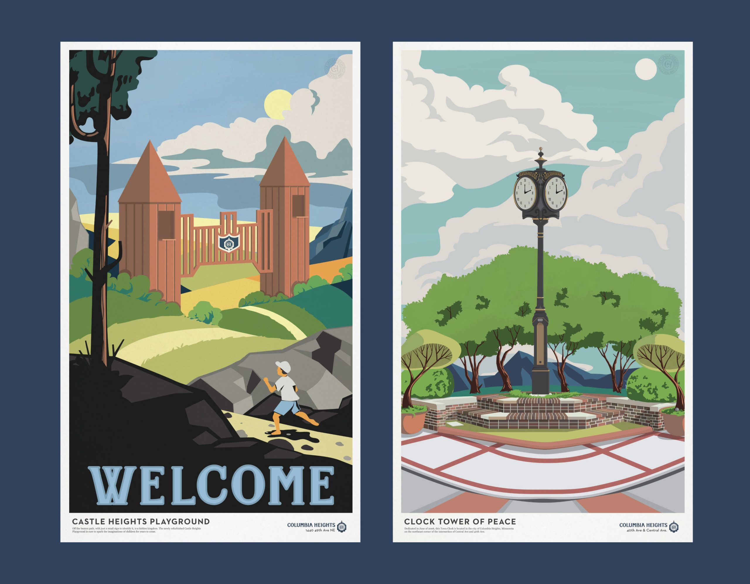
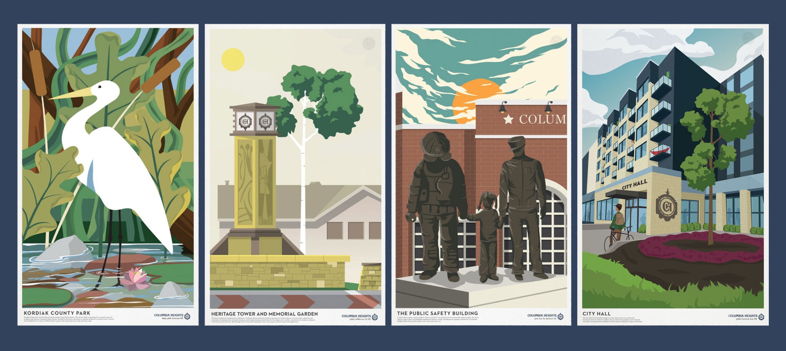
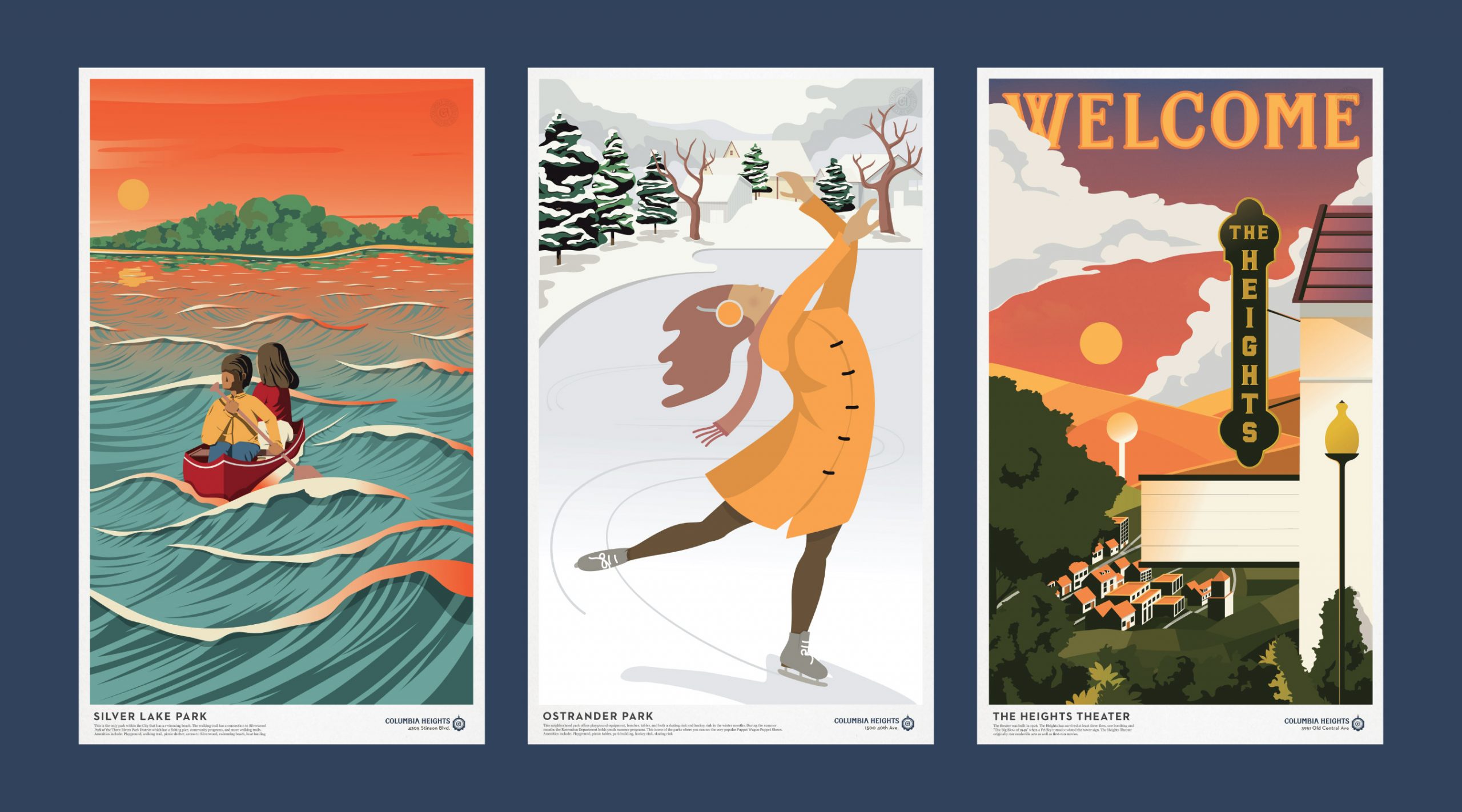
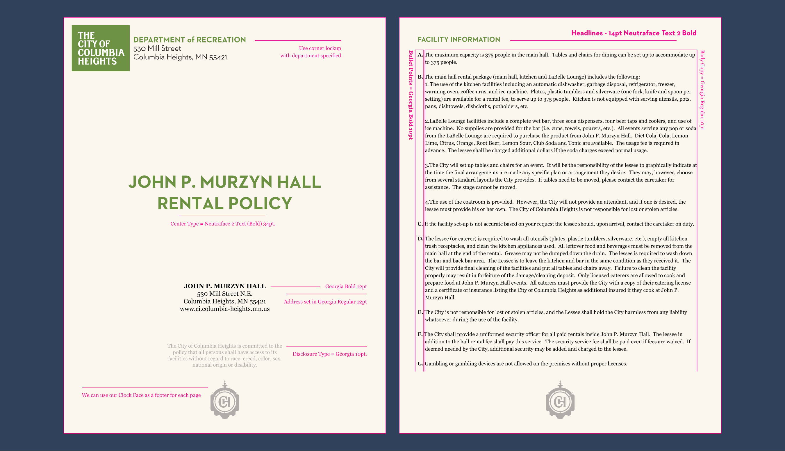
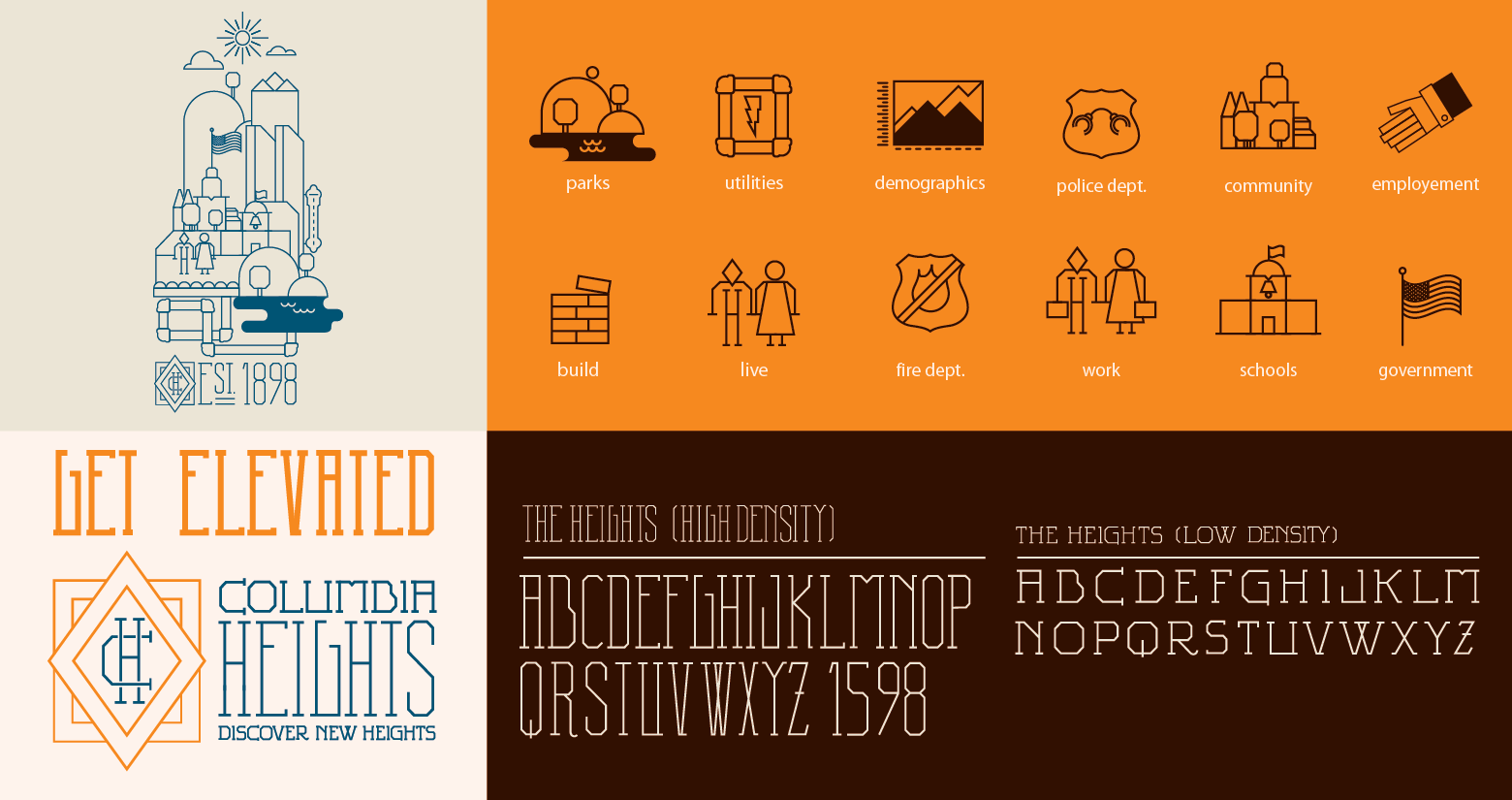
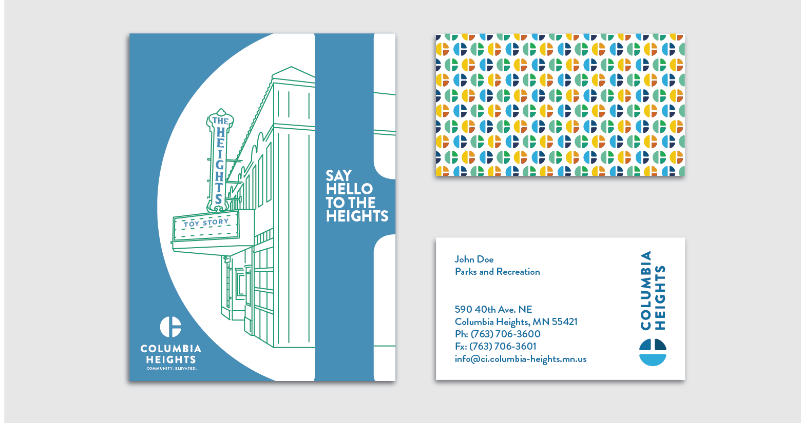
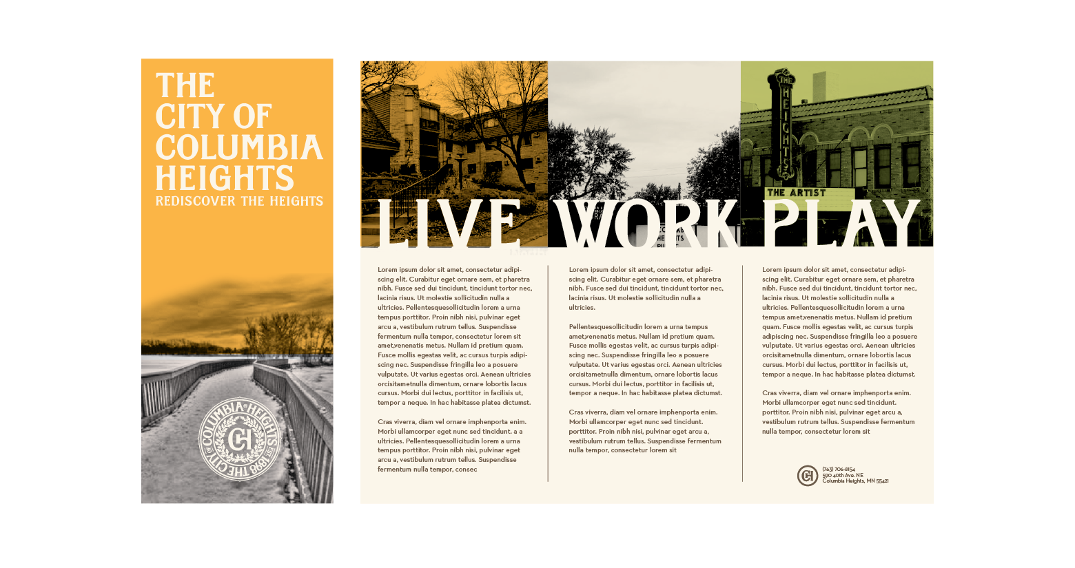
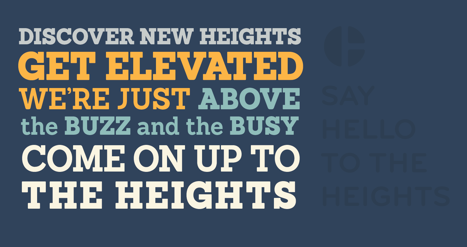
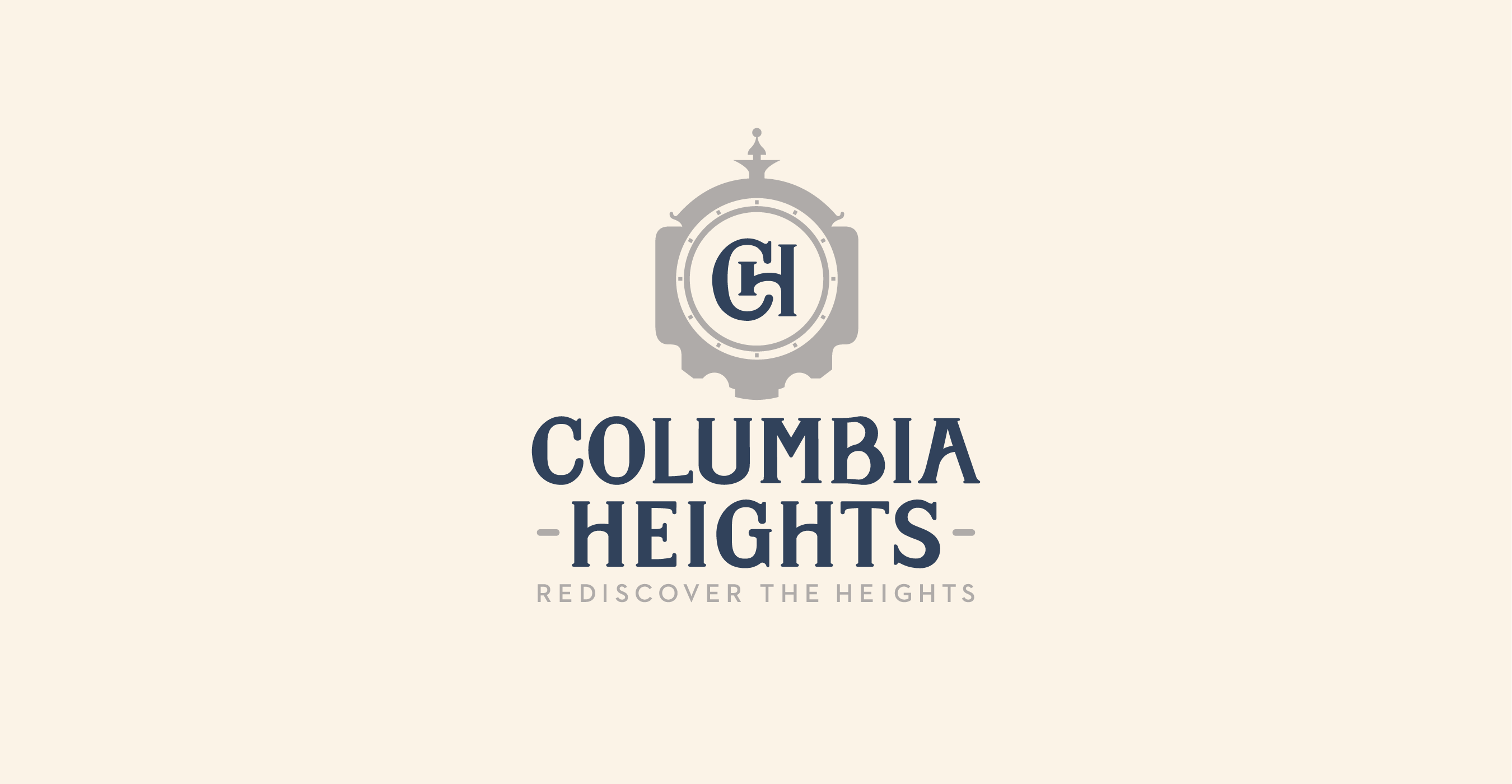
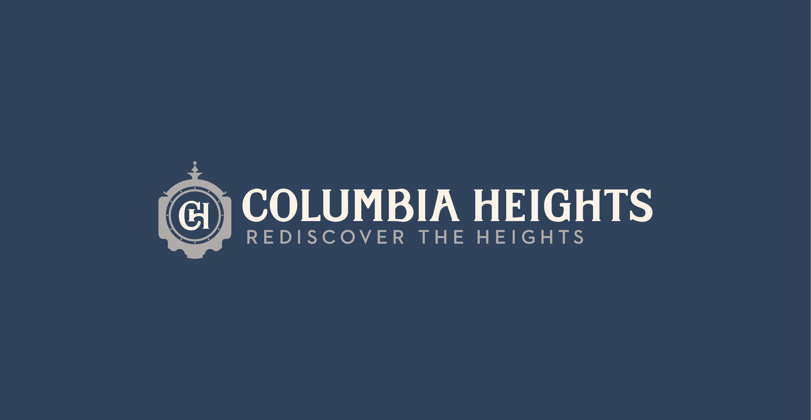
We worked with the City of Columbia Heights on a new identity and set of brand standards to create a consistent system of materials for the city and it’s many departments. For this challenge we ended up creating a custom typeface, landmark poster series, stationery templates, and an in-depth style guide to ensure future materials are harmonious with the new brand. The new logomark features the face of Columbia Heights’ Clock Tower of Peace landmark. What are you waiting for? Get out and explore the Heights!
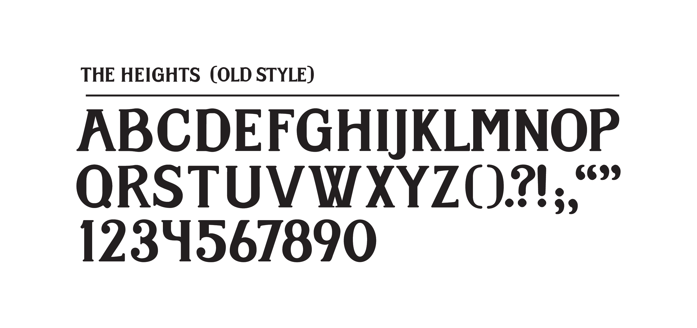
Typeface Design

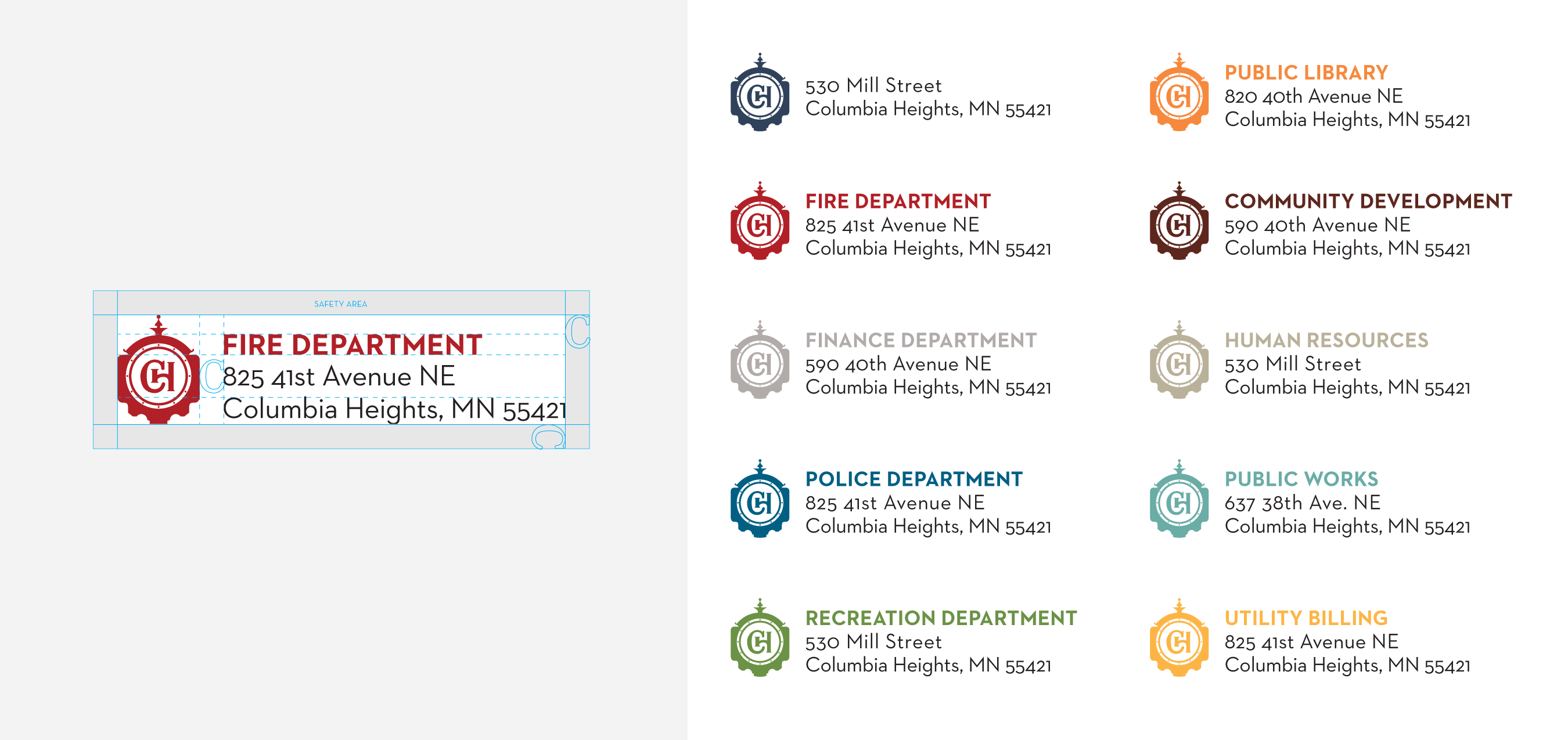
Print Materials

The Design Process

Phase 1

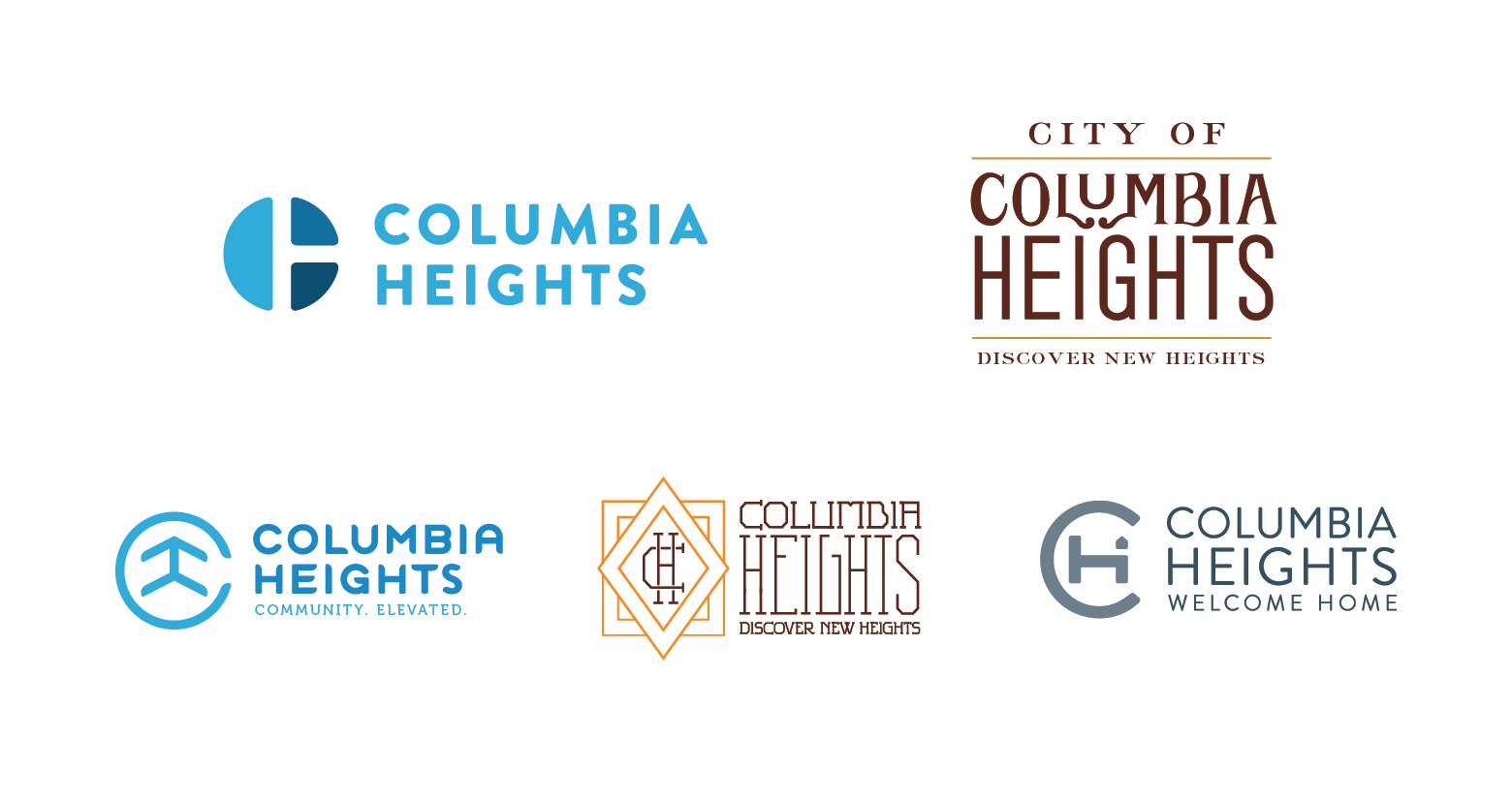
For our first presentation we came up with 5 directions. Some versions  modernized the previous Columbia Heights identity, some felt more adventurous, and some were based on vintage typography.

Phase 2

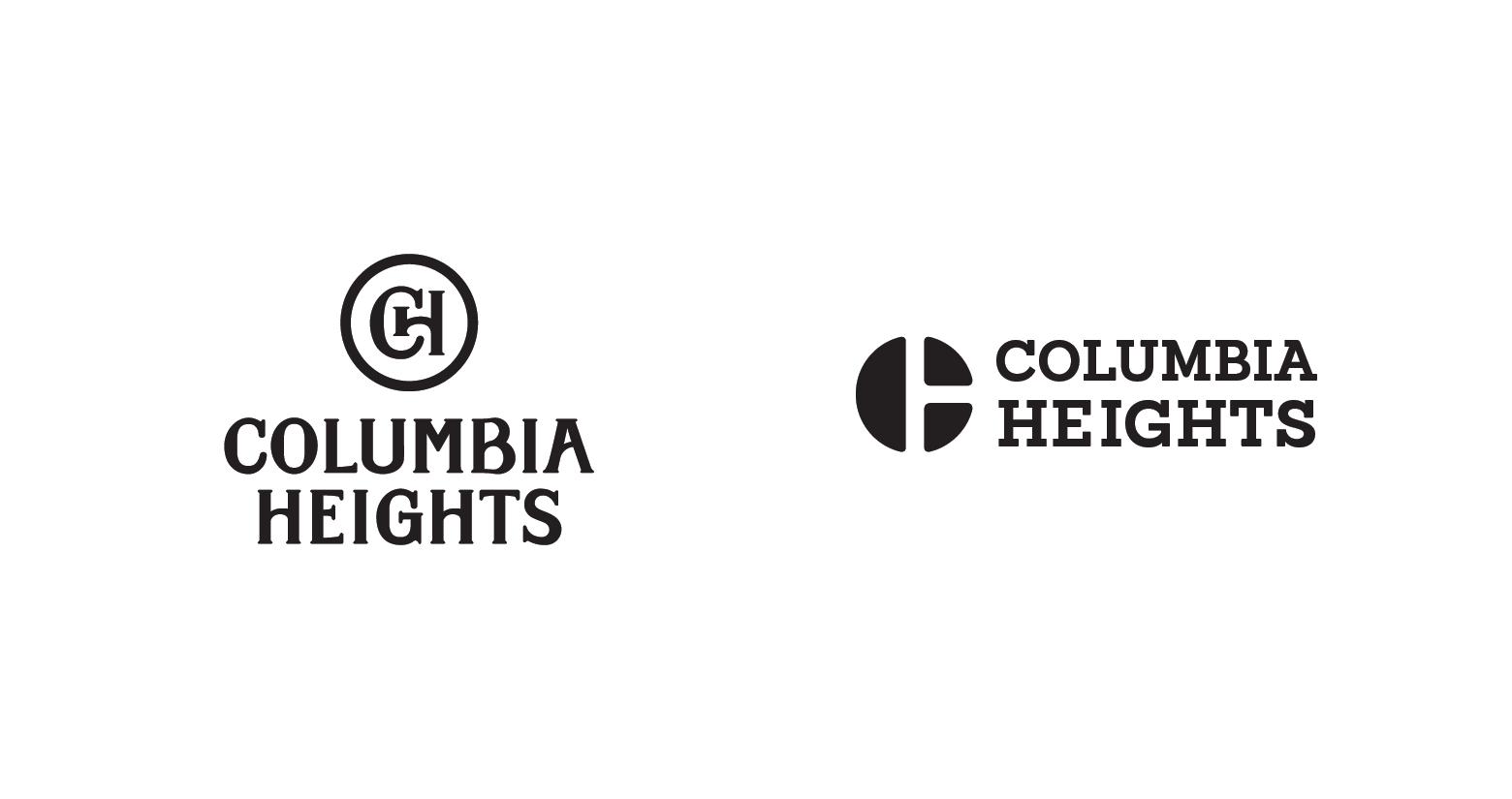
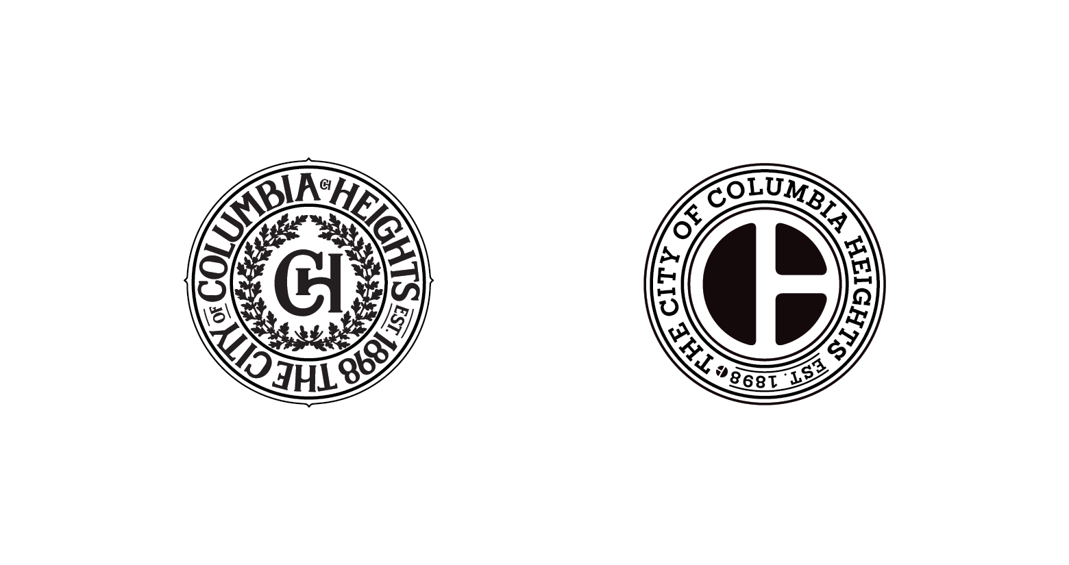
After phase 1, voting events were held between city staff as well as citizens on where they wanted the new Columbia Heights identity to go. After the votes, we narrowed down the directions to two. One that was classically inspired and spoke to the heritage of Columbia Heights, and one that was a clear modernization of the existing mark.