Thursday, January 27, 2011
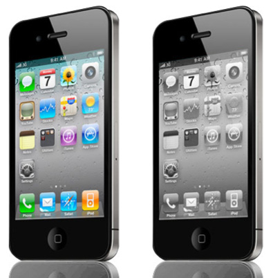
So I love my iPhone like no other – seriously, it’s really made my job a lot easier (and made bedtime stories easier, and bedtime youtube…) But I’m sort of weary of the tutti-frutti colored app page. It’s like a kindergarten classroom – not that I don’t like kindergarten classrooms, just not all the time. Seems like the iPhone should have a “Greyscale” option for the home page, or a “Minimized icon” choice where a single-color icon option for each app could be used. Call me a design elitist if you like, I’m just weary of the rainbow of fruit flavors. I had a similar feeling with the ’99 Macs that all featured Skittle colors in the hard plastic. Great a first, but then just tiring.
-jj
