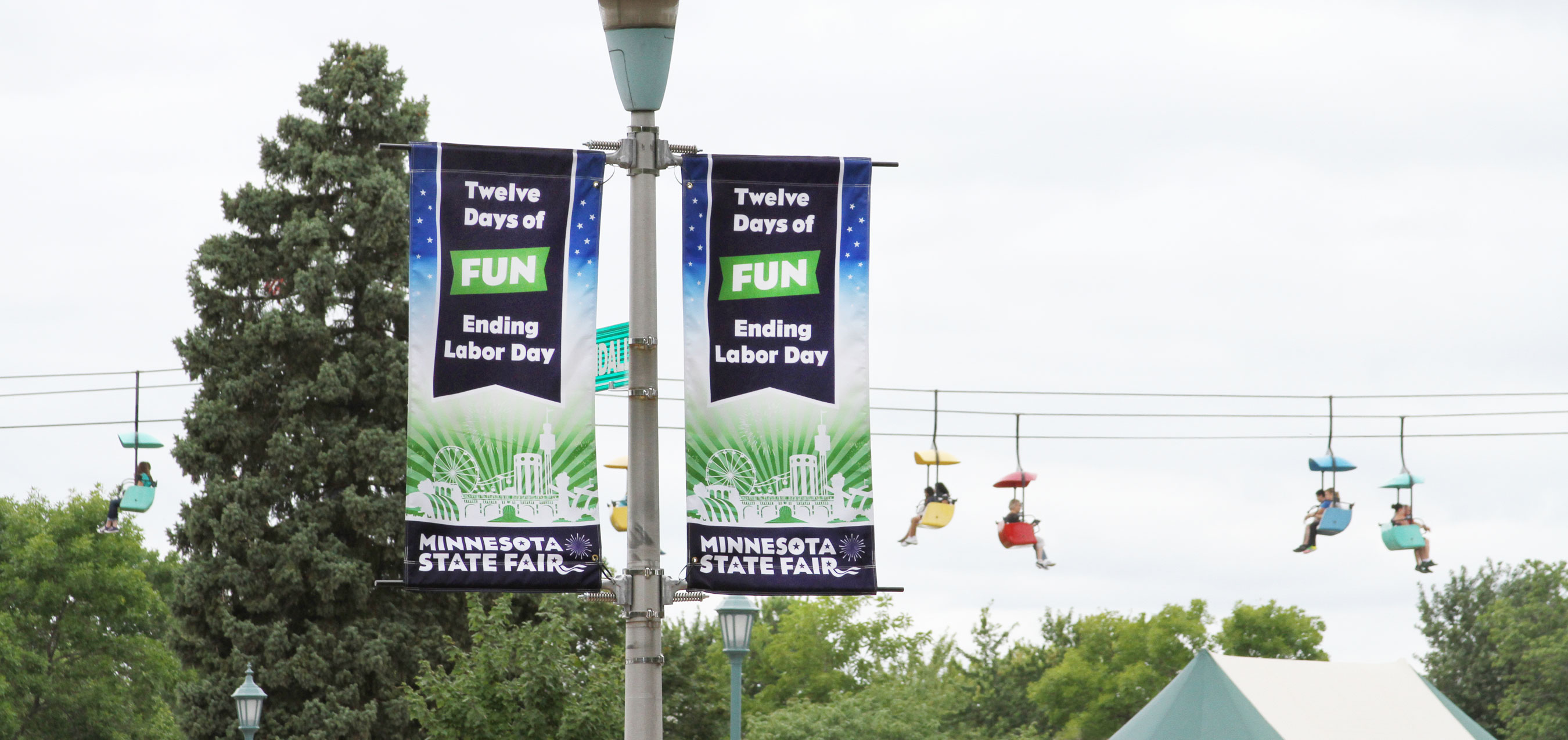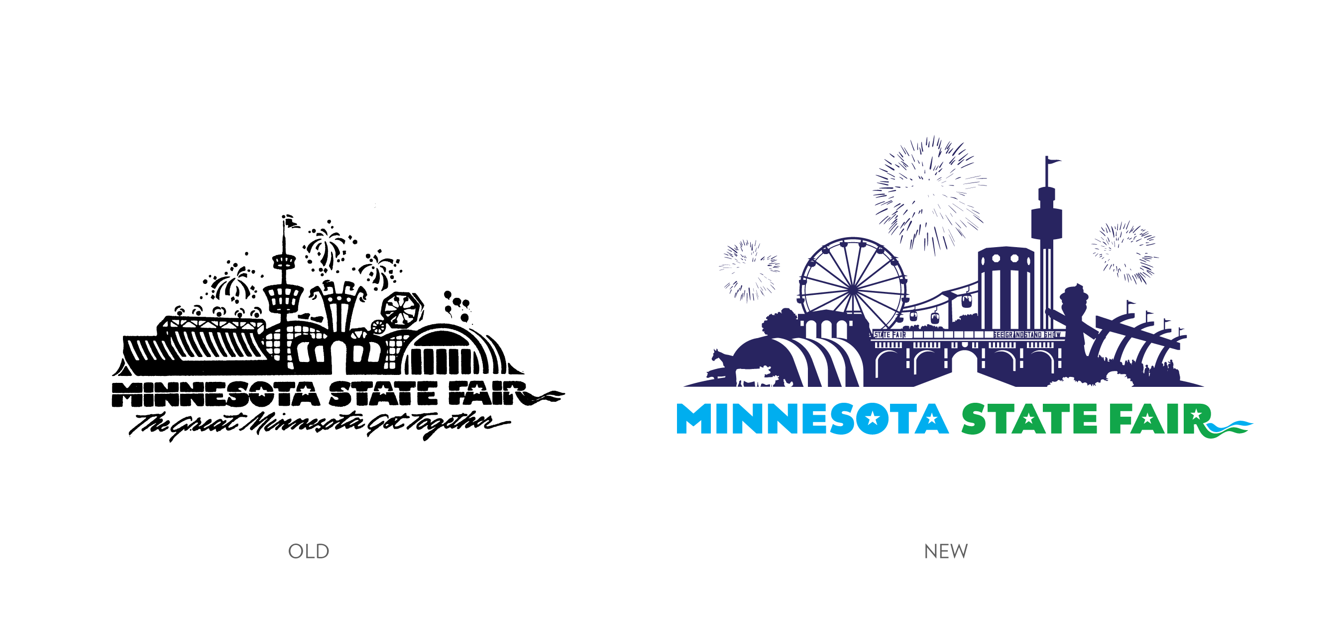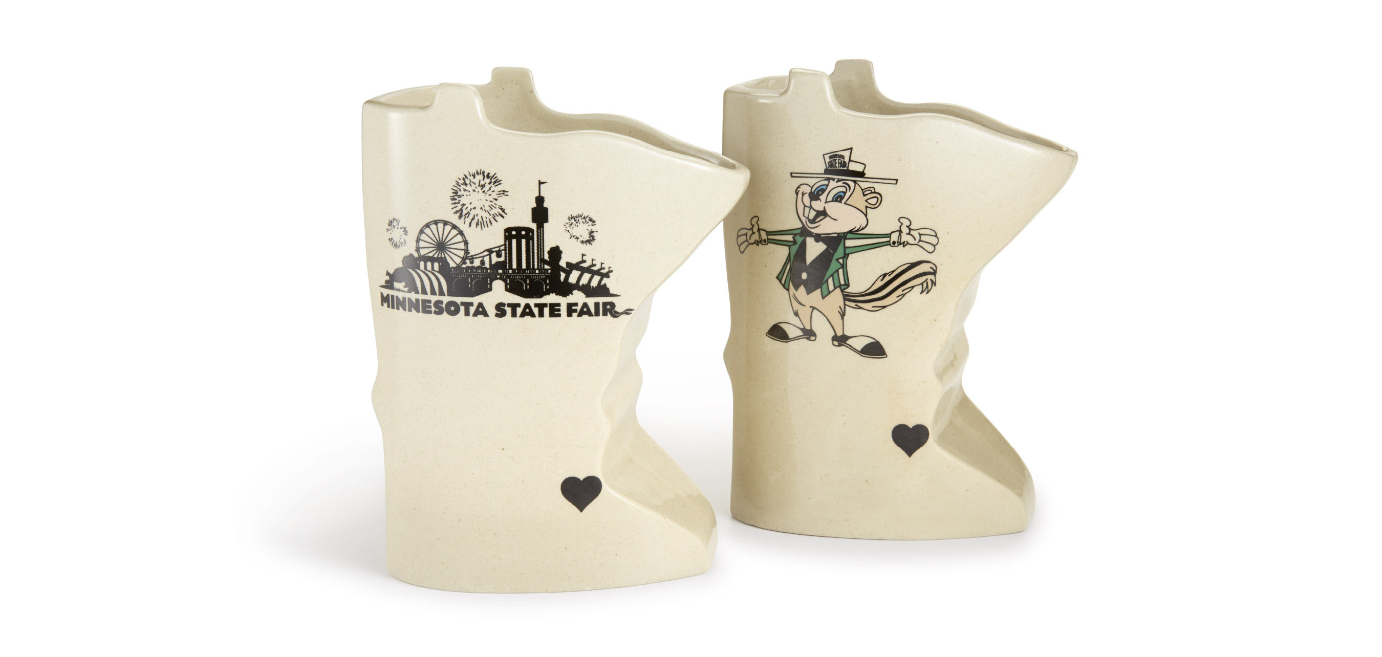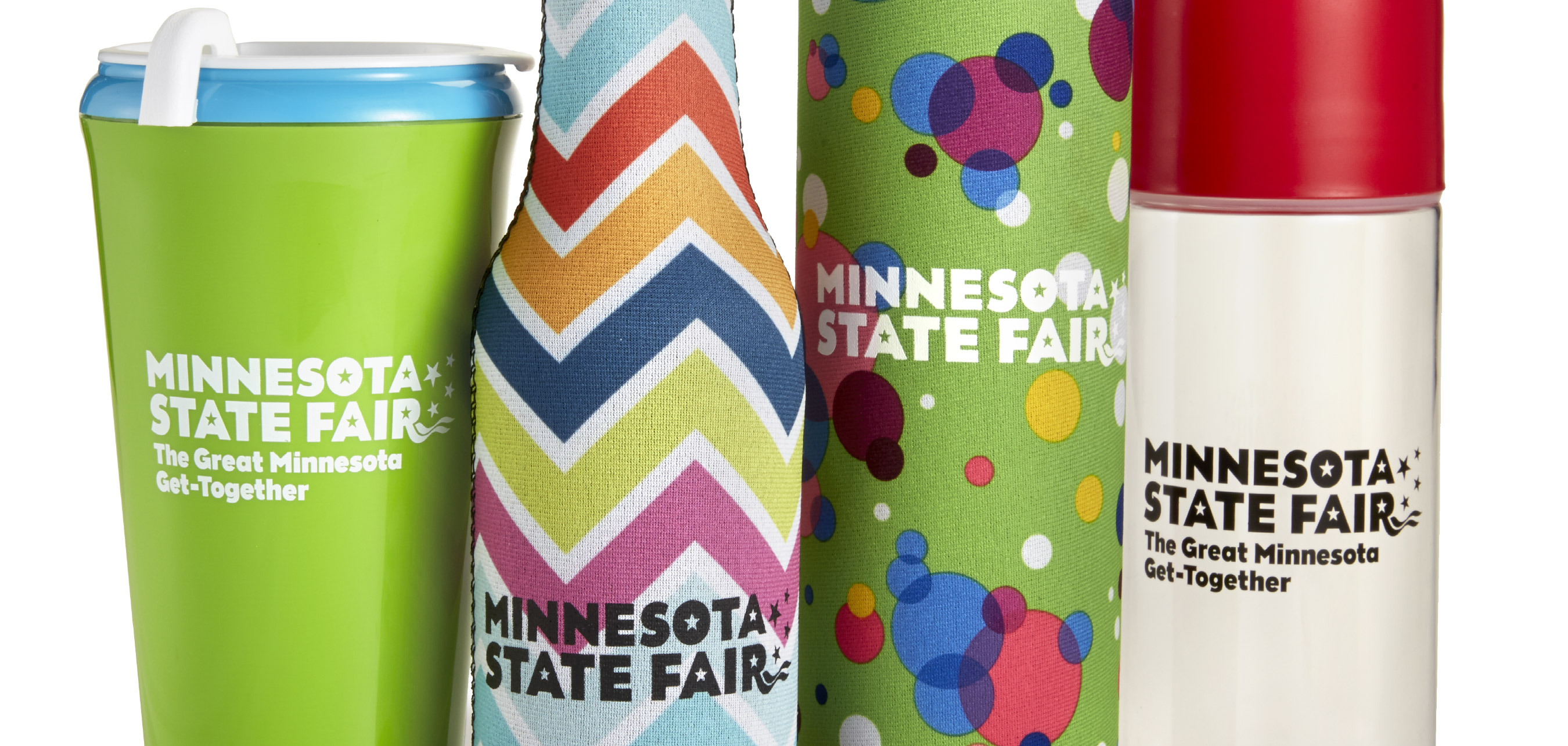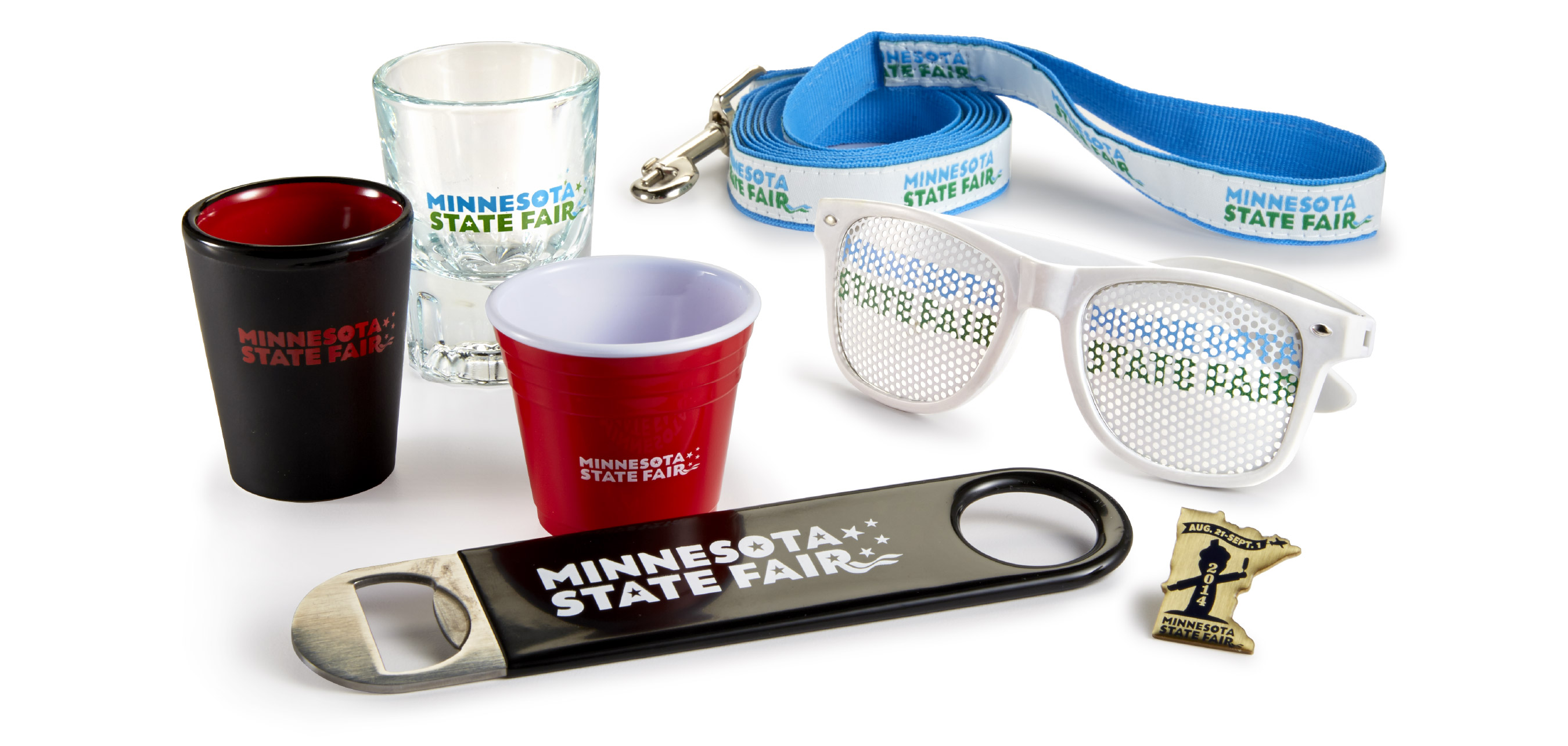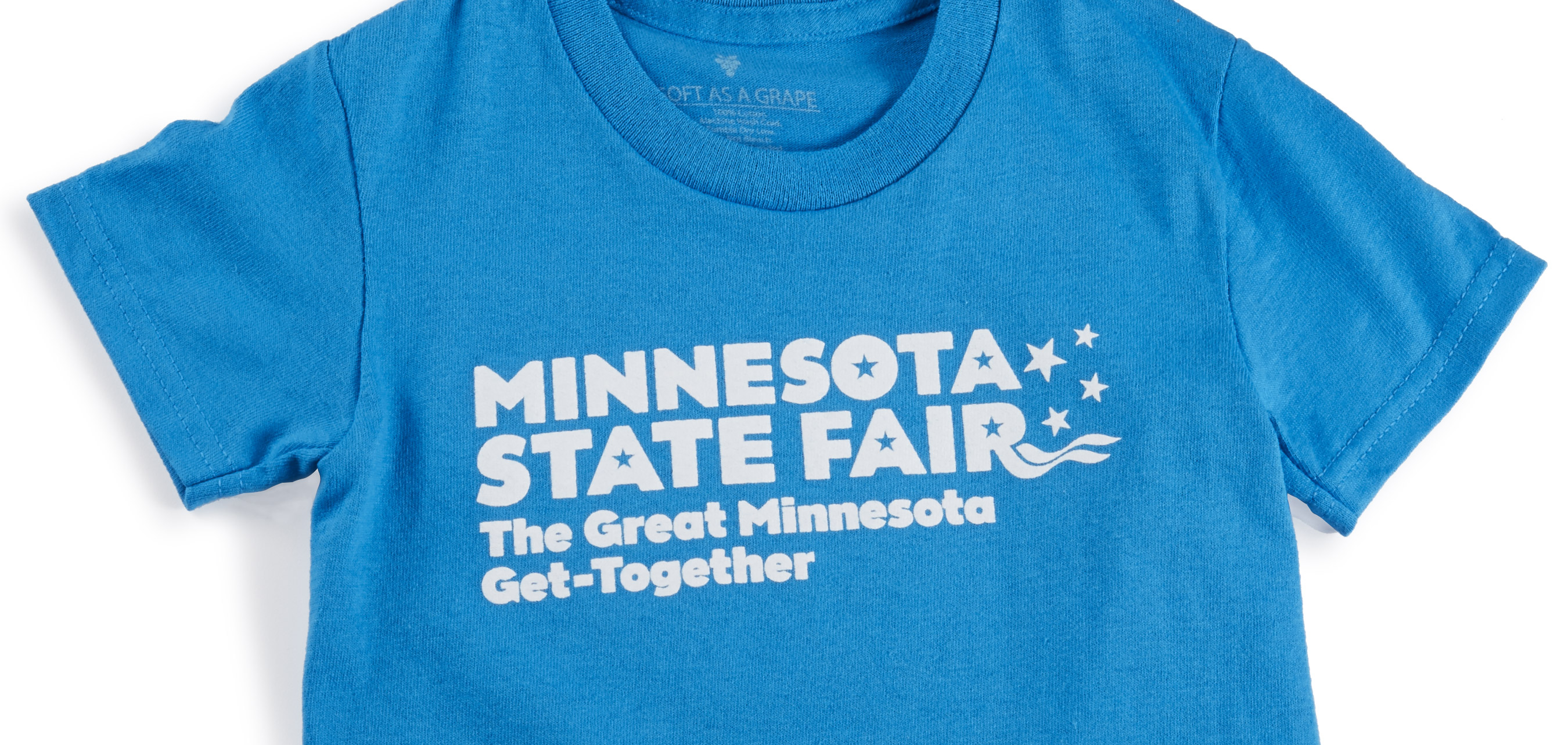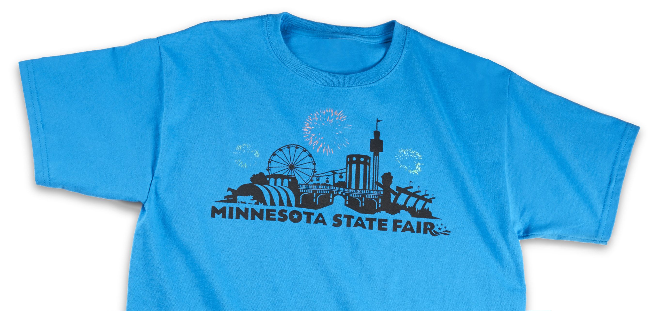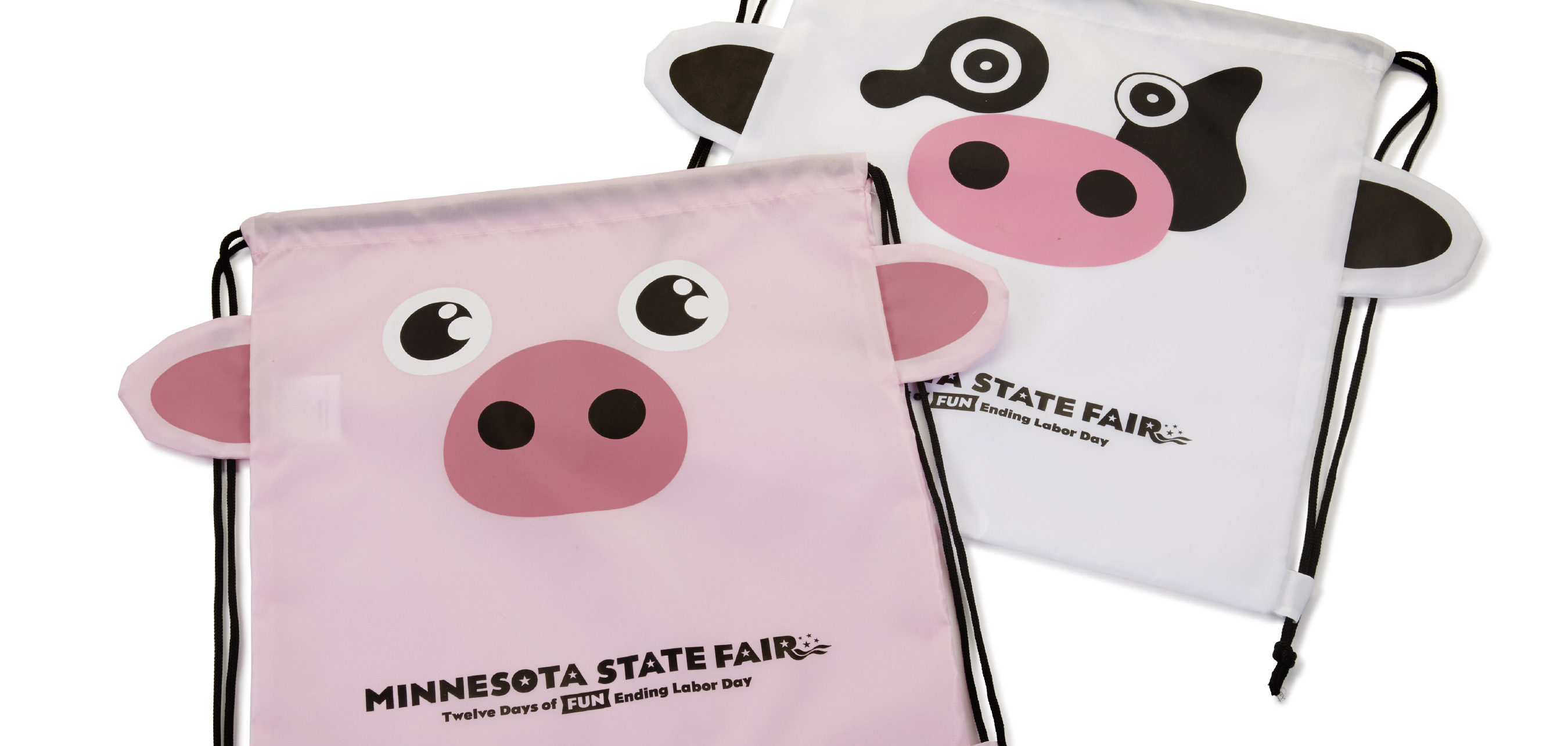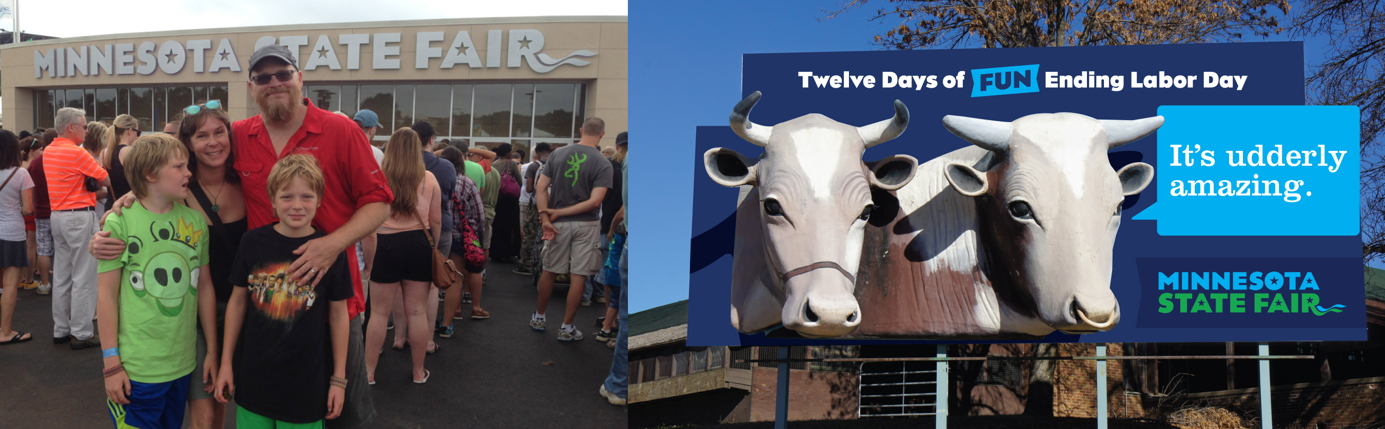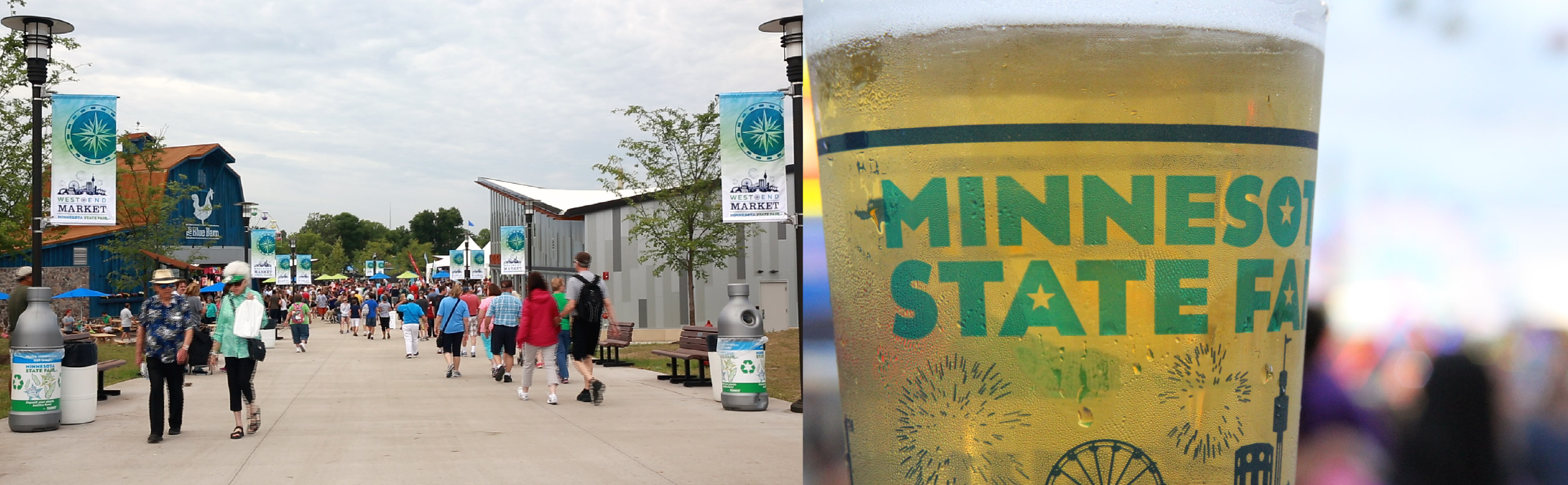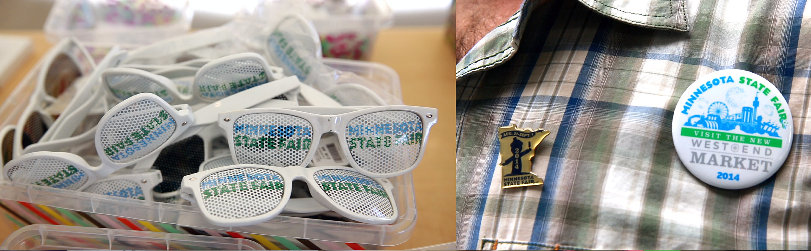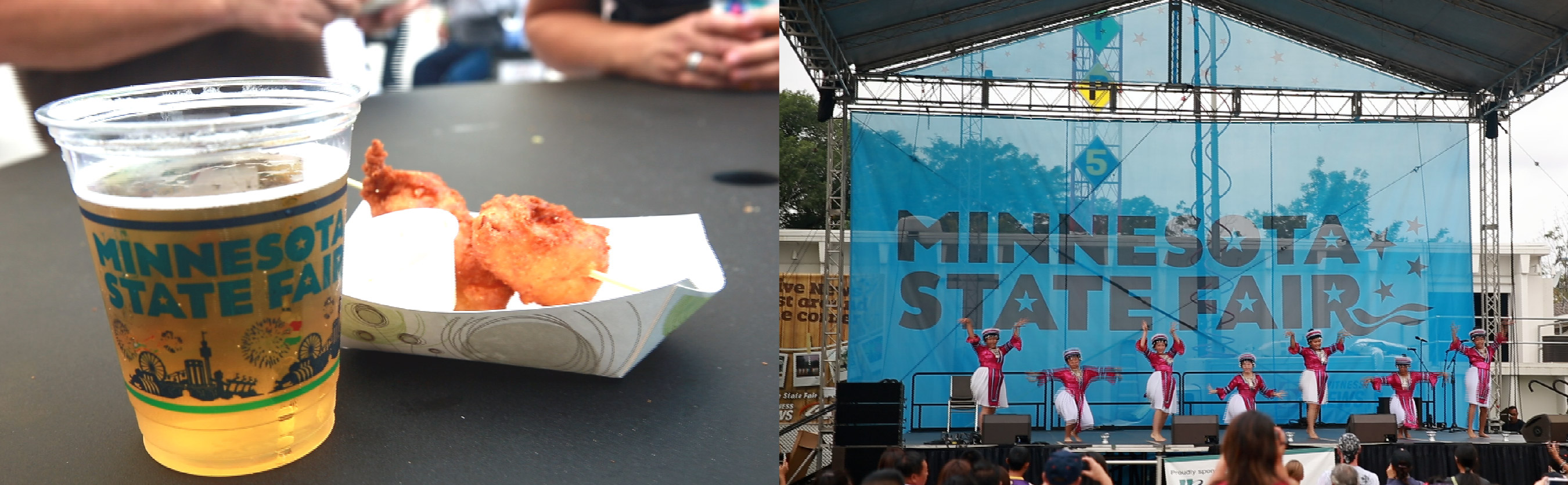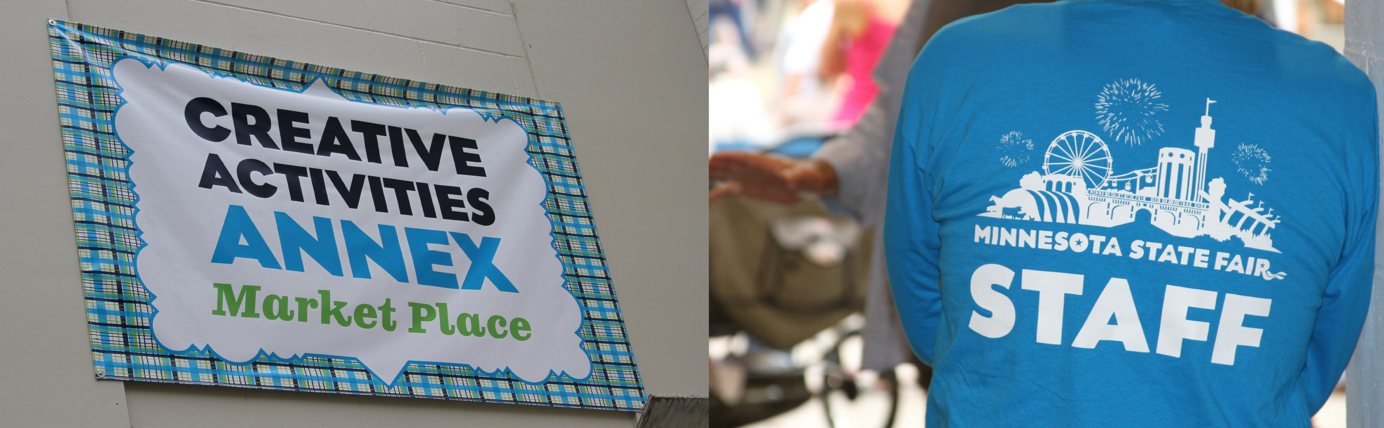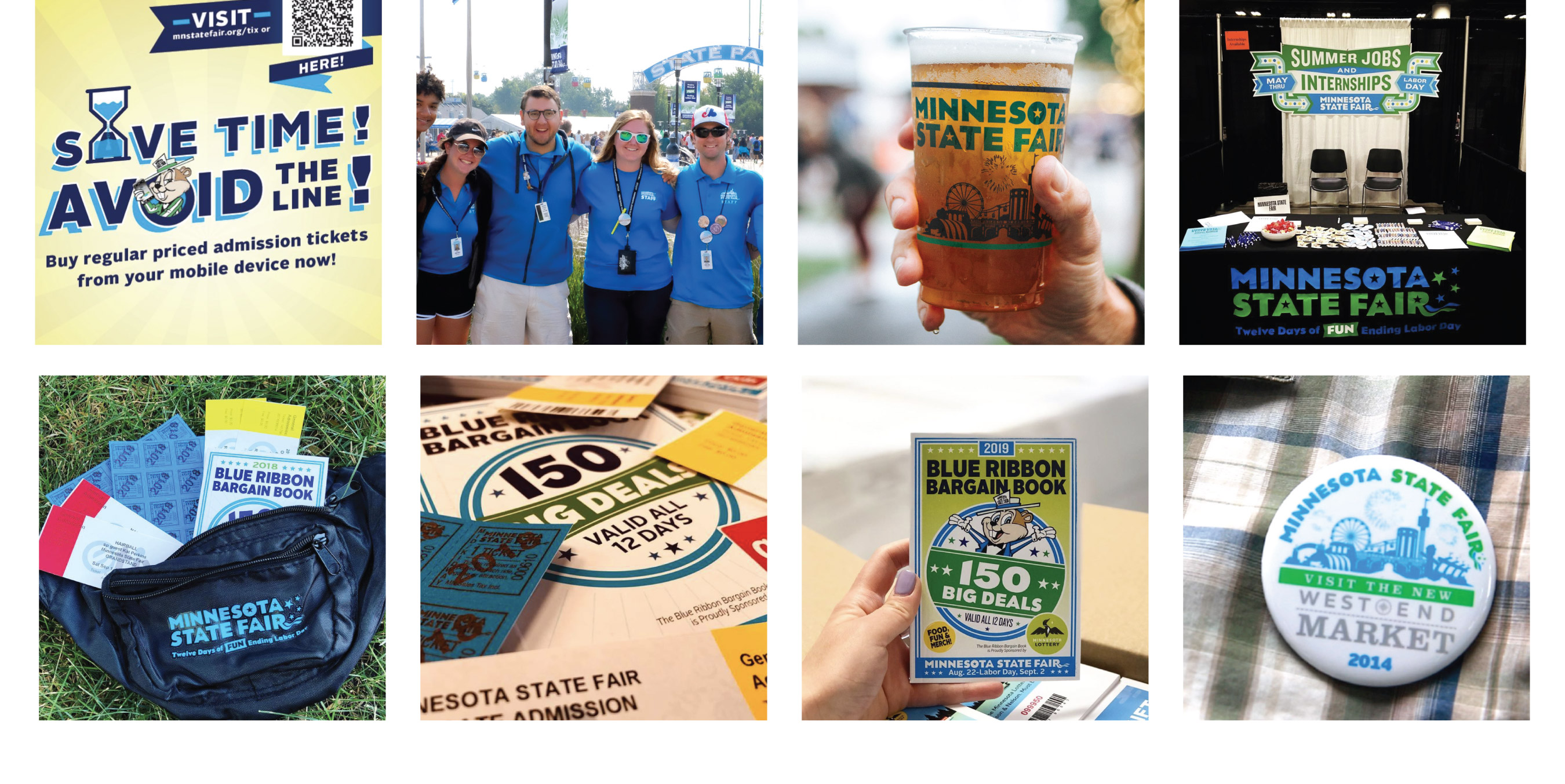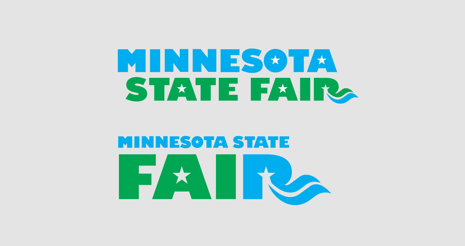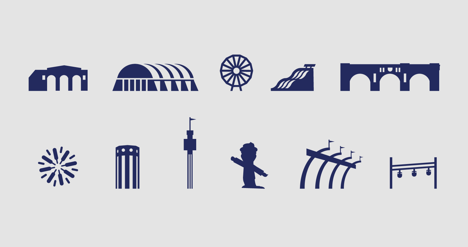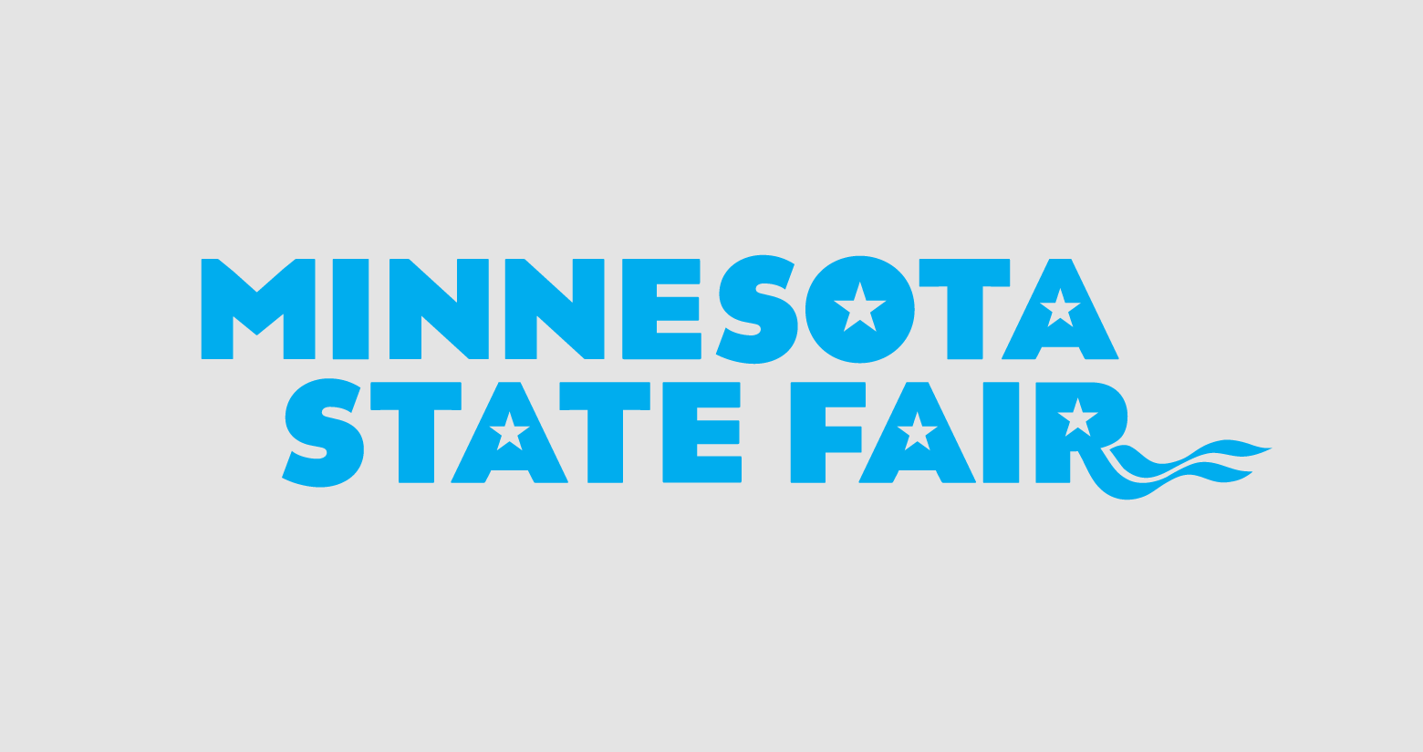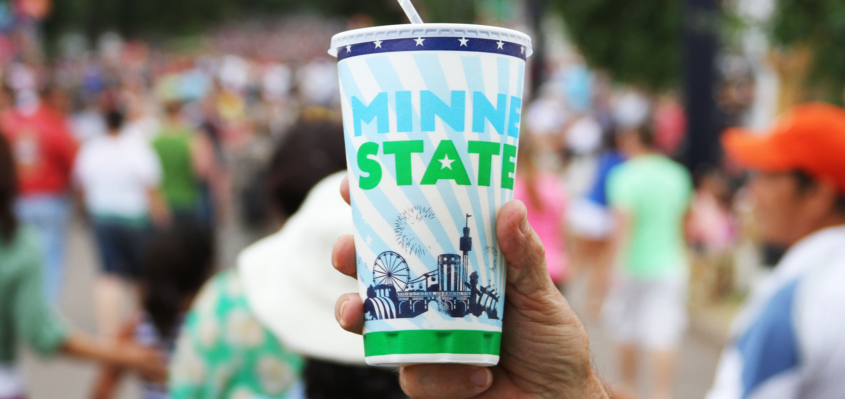
THE GREAT MINNESOTA GET TOGETHER
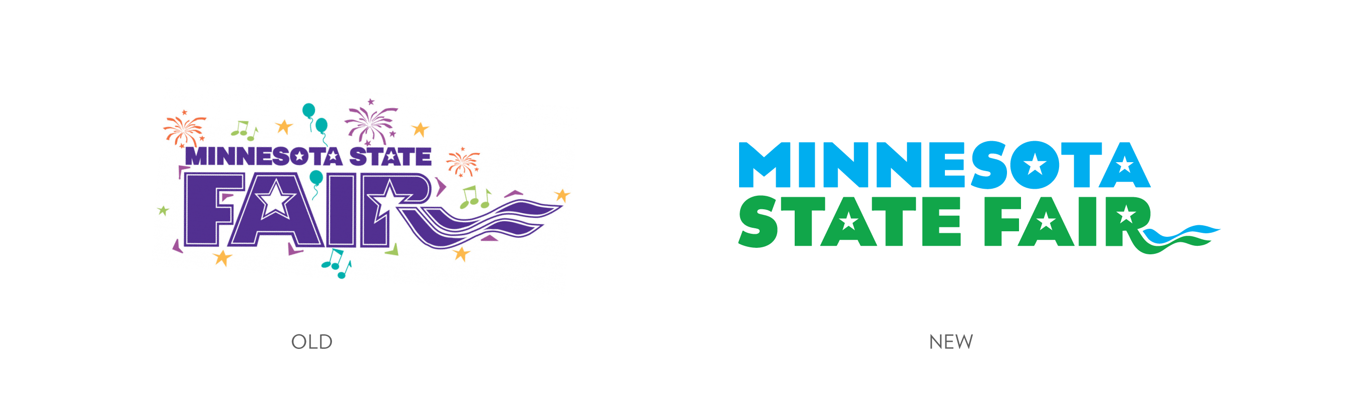
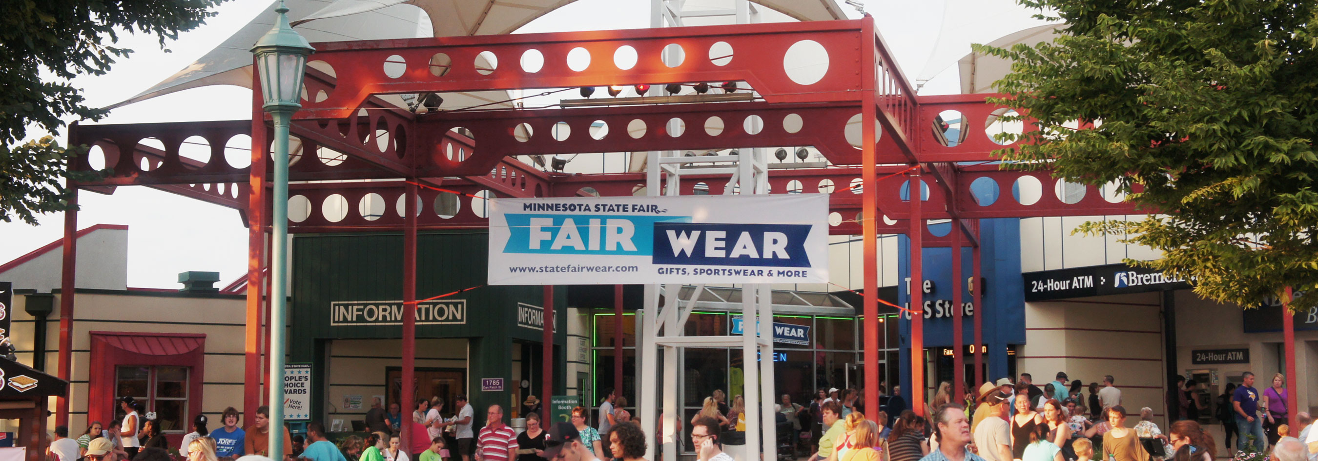
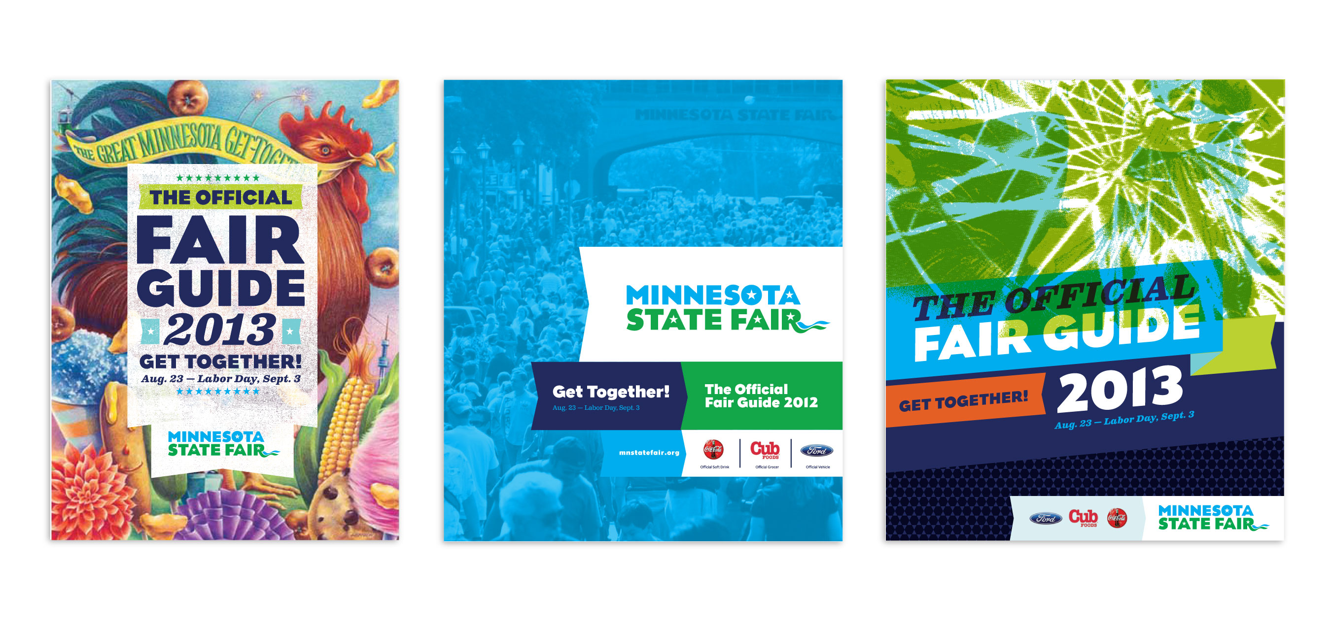
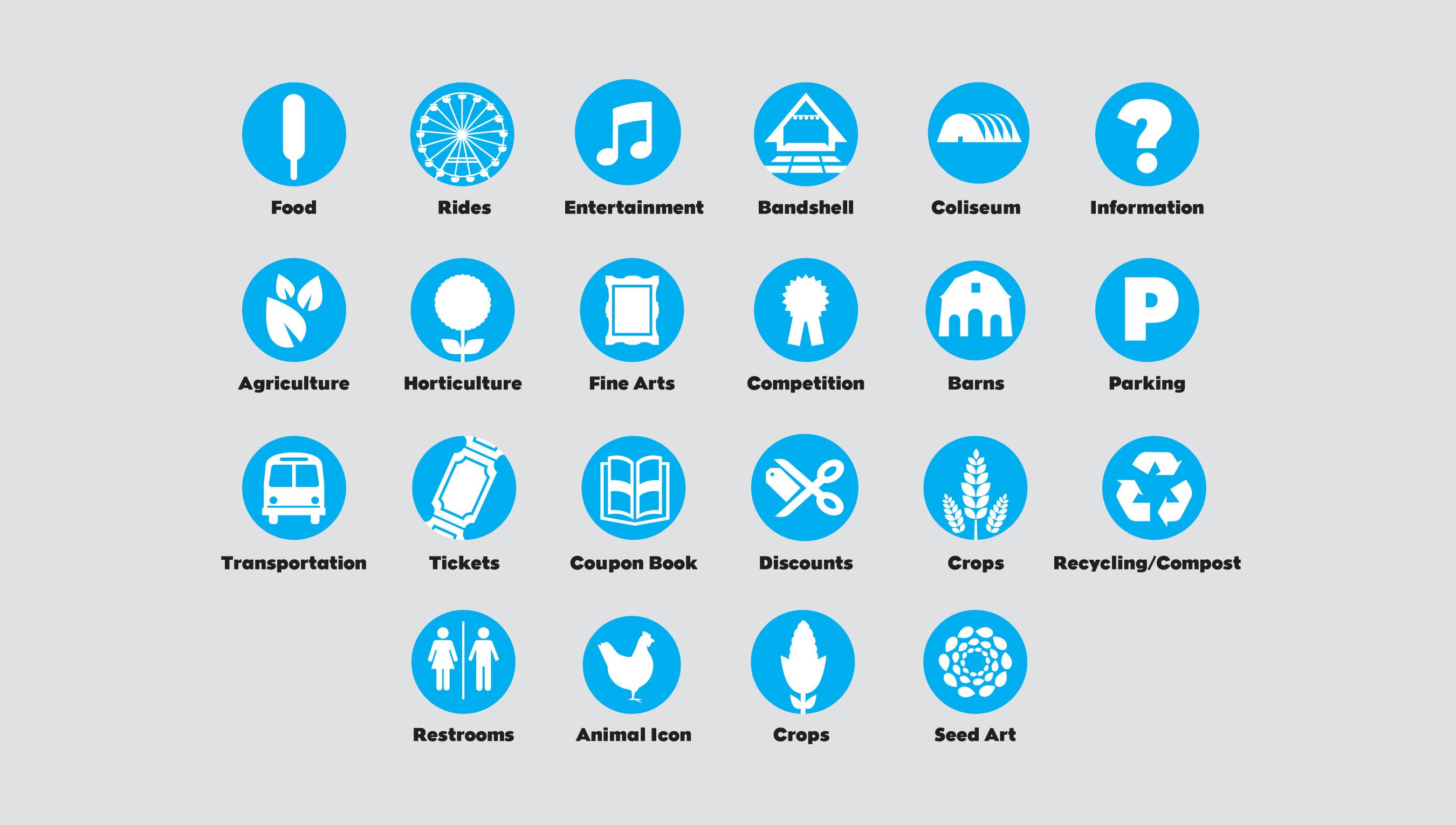
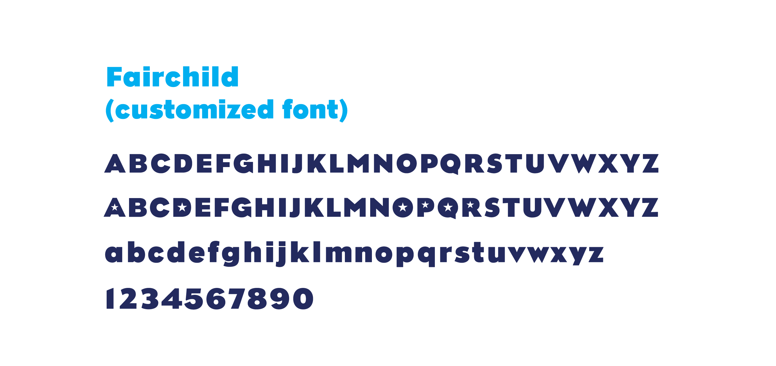
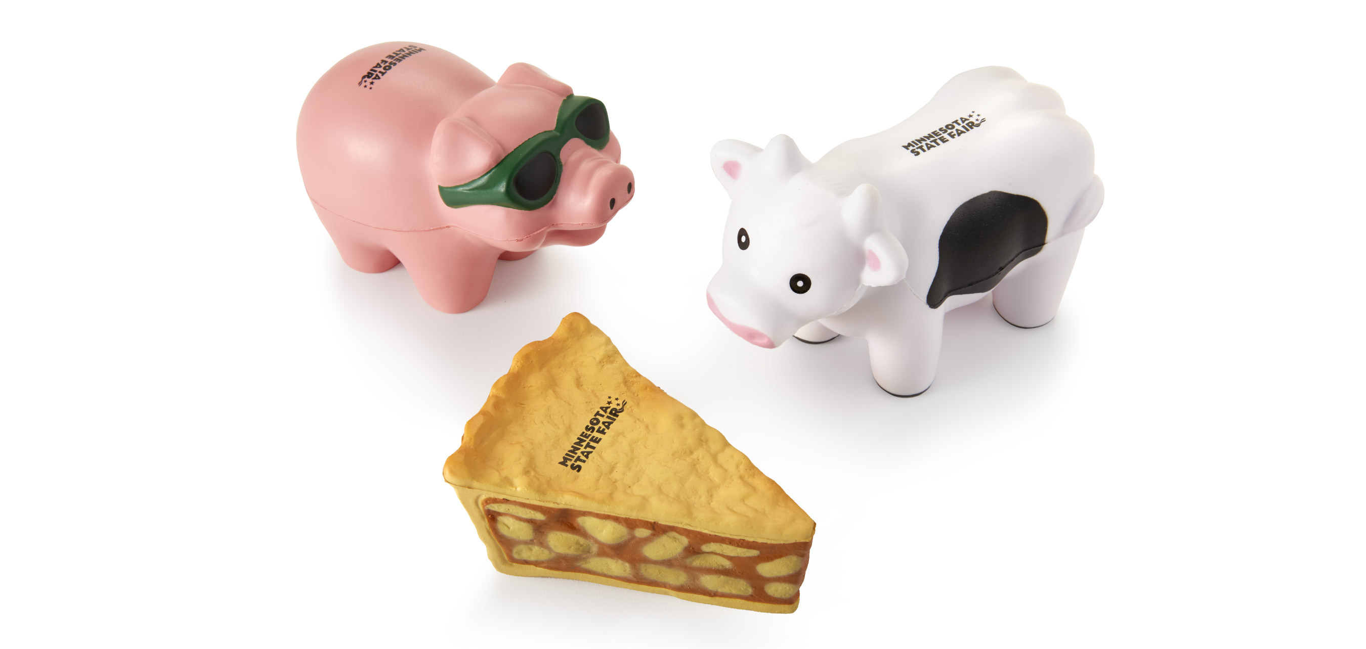
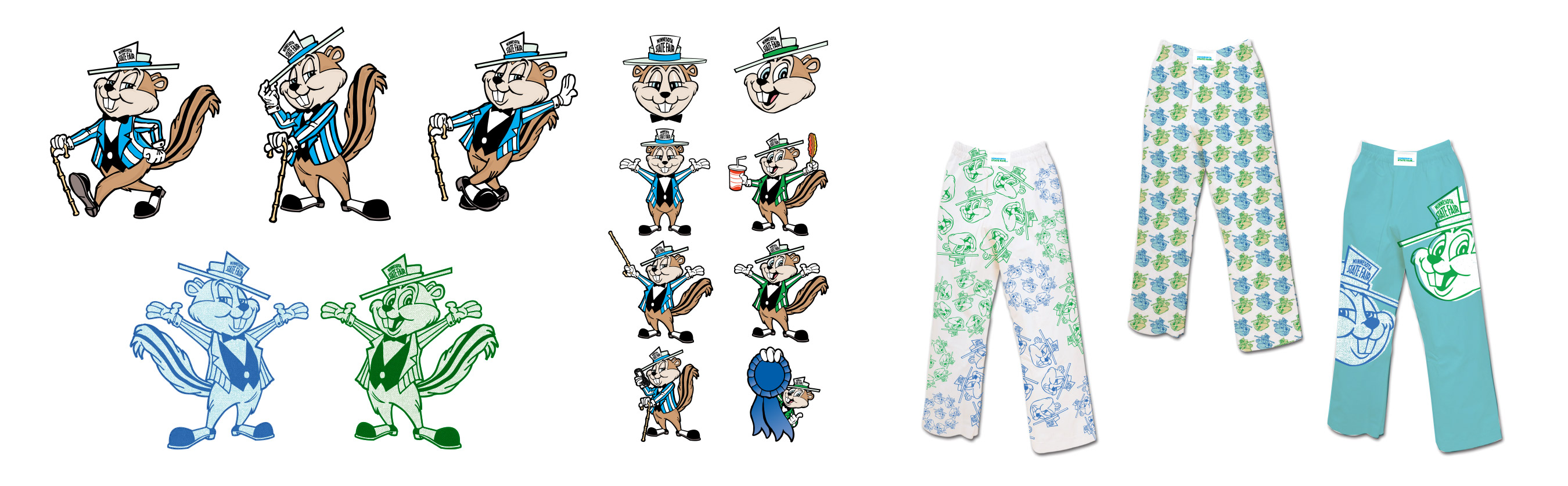
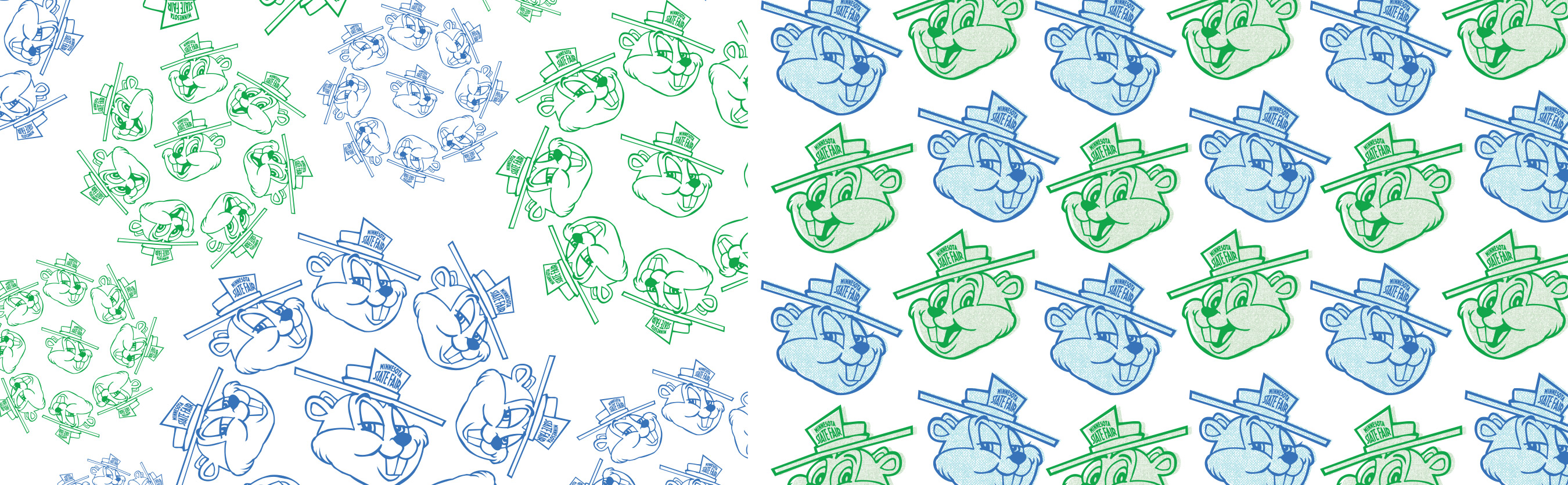
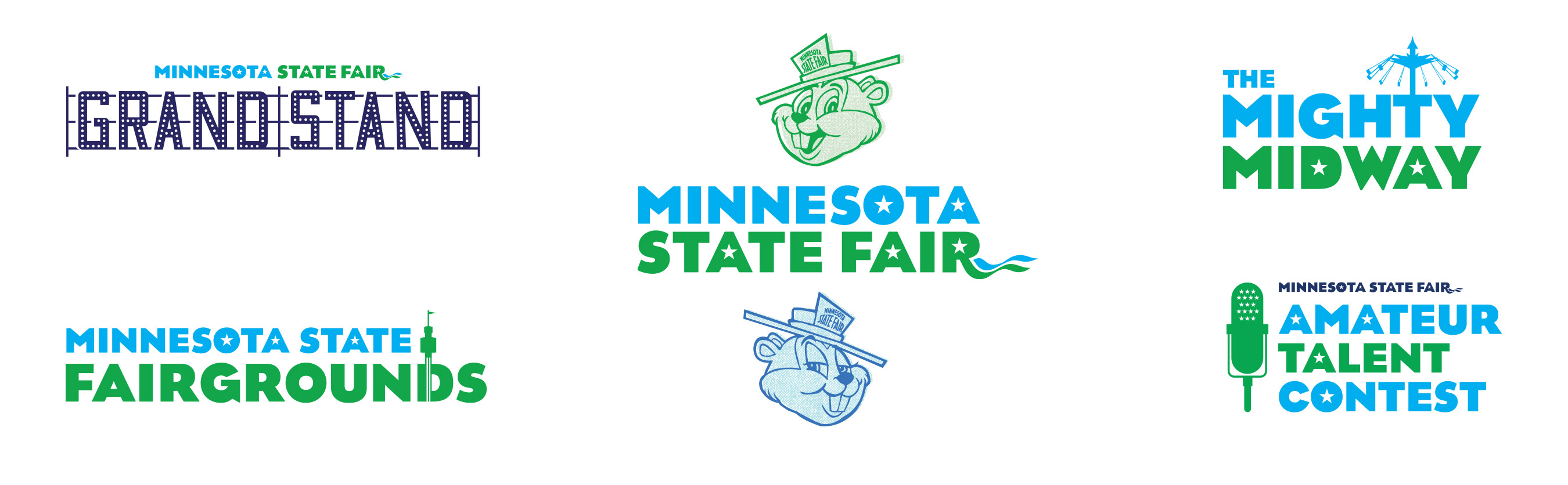
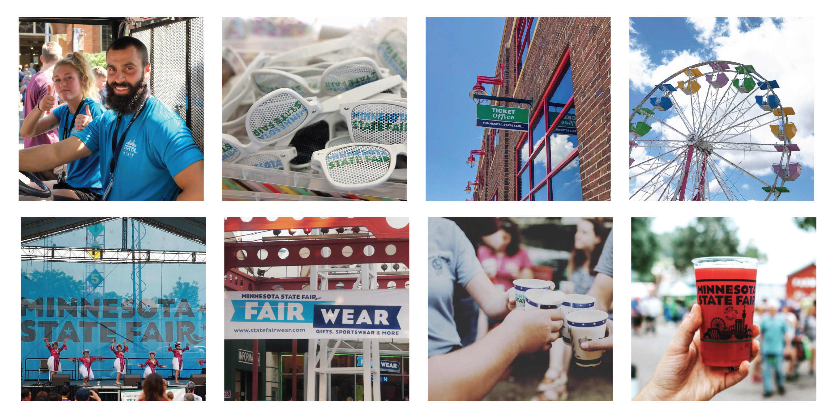
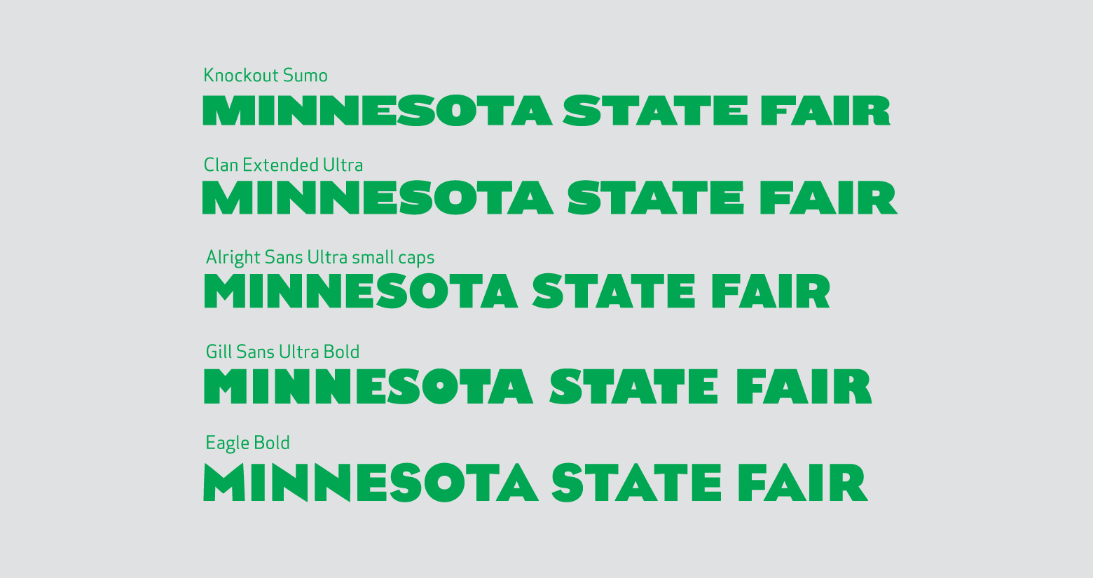
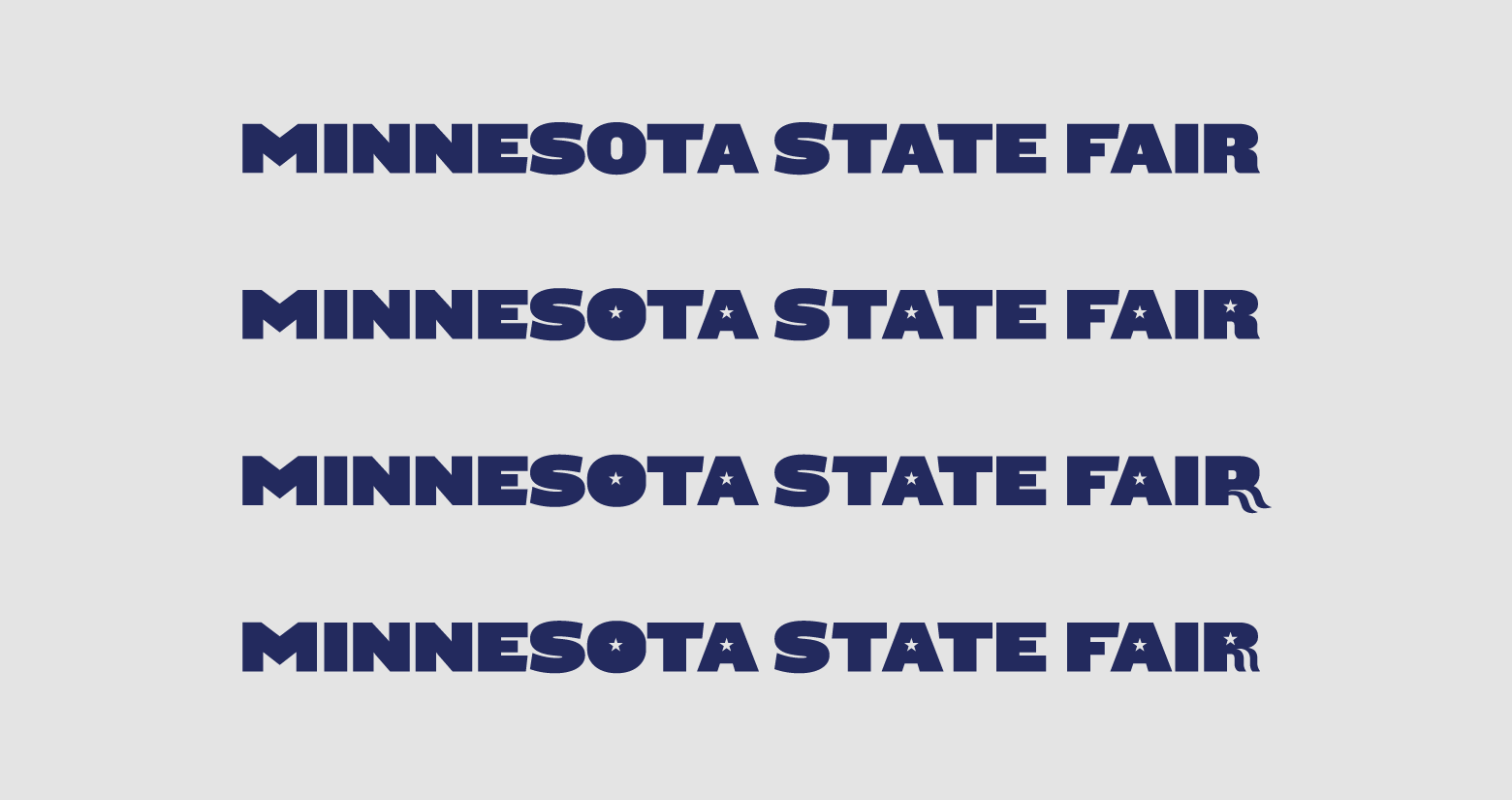
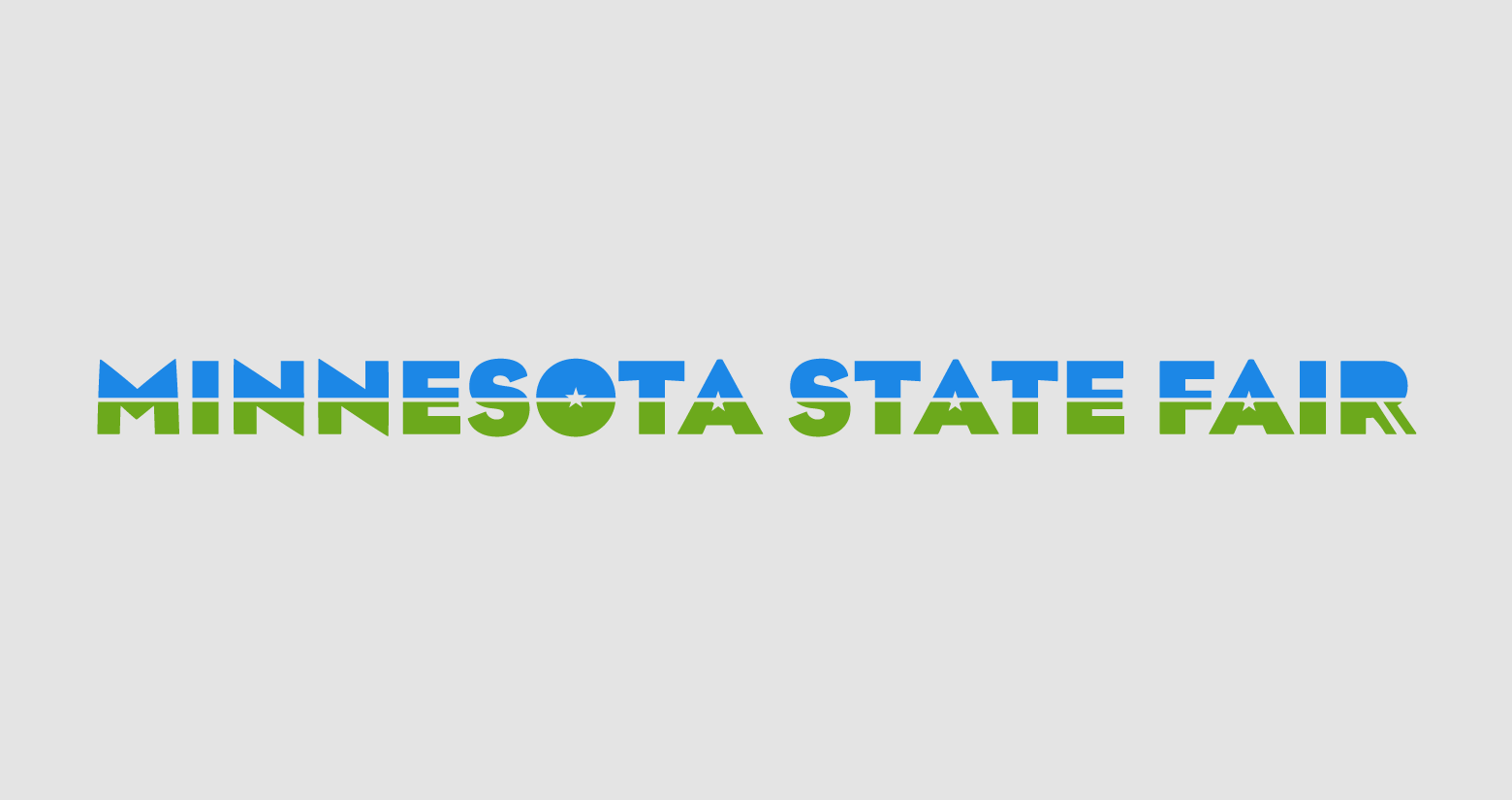
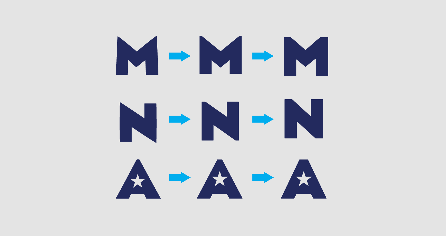
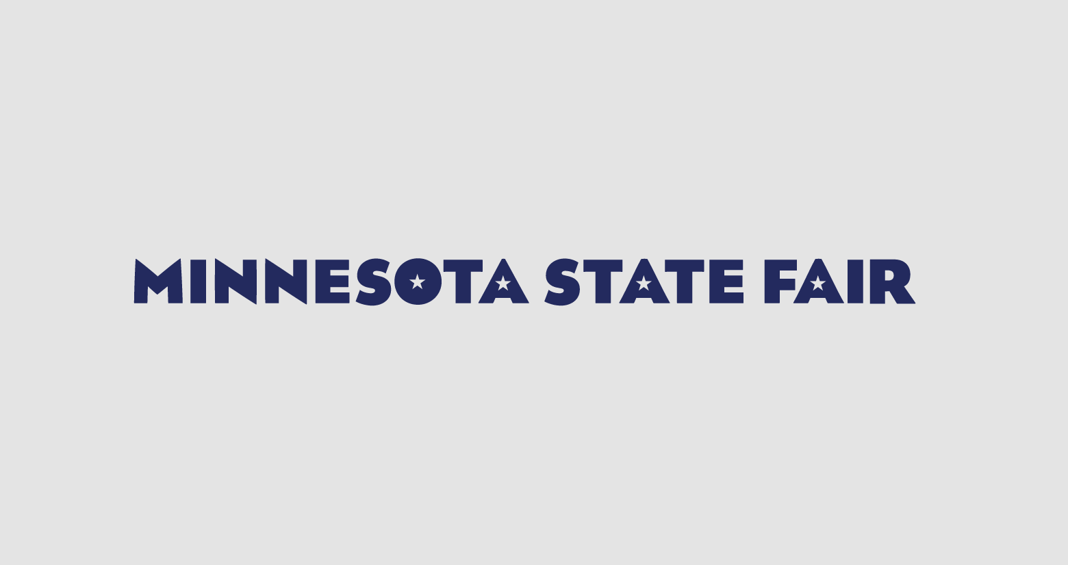
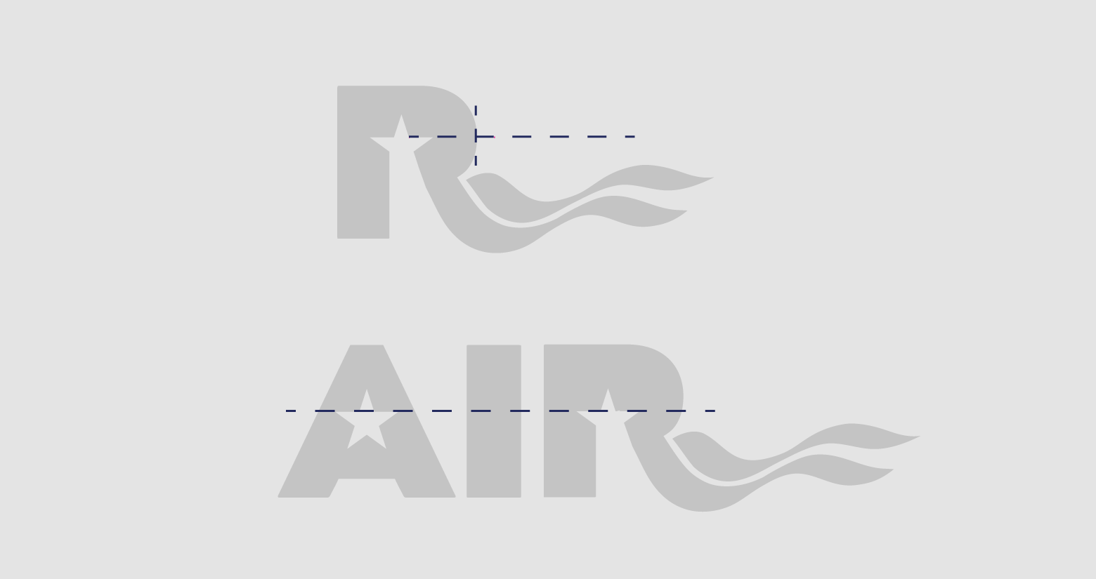
A beloved Minnesota tradition older than the state itself, the fair suffered decades of brand fragmentation. The challenge in redesign was adhering to the mandate of subtlety – that no overt or obvious visual departures distract fair goers from all corners of the state. In a two-year redesign project, we engaged focus groups frequently to ensure that this new, unified, more legible and modular system was embraced as deeply as the Fair deserved. The first year the redesign was implemented the fair broke an all-time attendance record, a triumph considering it rained 10 days of its 12 day span. The Minnesota State Fair now has an expansive brand style guide and tools to share design delivery among its hundreds of vendors and creative partners.