Monday, July 17, 2017
Bravo to our awesome client, Local Crate!!! Selected as one of the Techstars for Target Stores this years. Way to go!! A great article in Today’s Strib. Enjoy!!
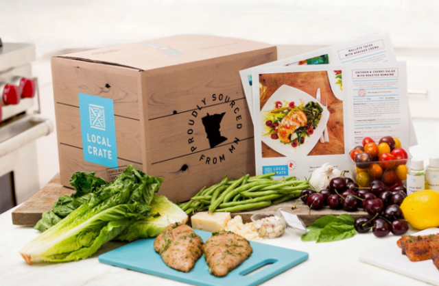
Bravo to our awesome client, Local Crate!!! Selected as one of the Techstars for Target Stores this years. Way to go!! A great article in Today’s Strib. Enjoy!!
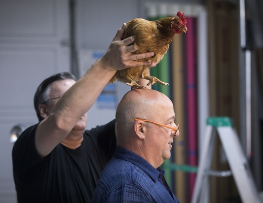
An awesome article about my long time client and friend Andrew Zimmern. He is PRECISELY why I design the stuff I design. Bravo Andrew. – Jeff Johnson
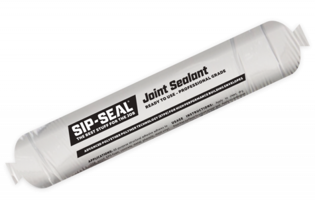
Congratulations to the fine folks at SIP-SEAL on launching their new website. SIP-SEAL creates a range of low VOC sealants and adhesives for SIP panel construction. Replace created the branding, packaging, and had the honor of working with Room 34 to construct the new site.
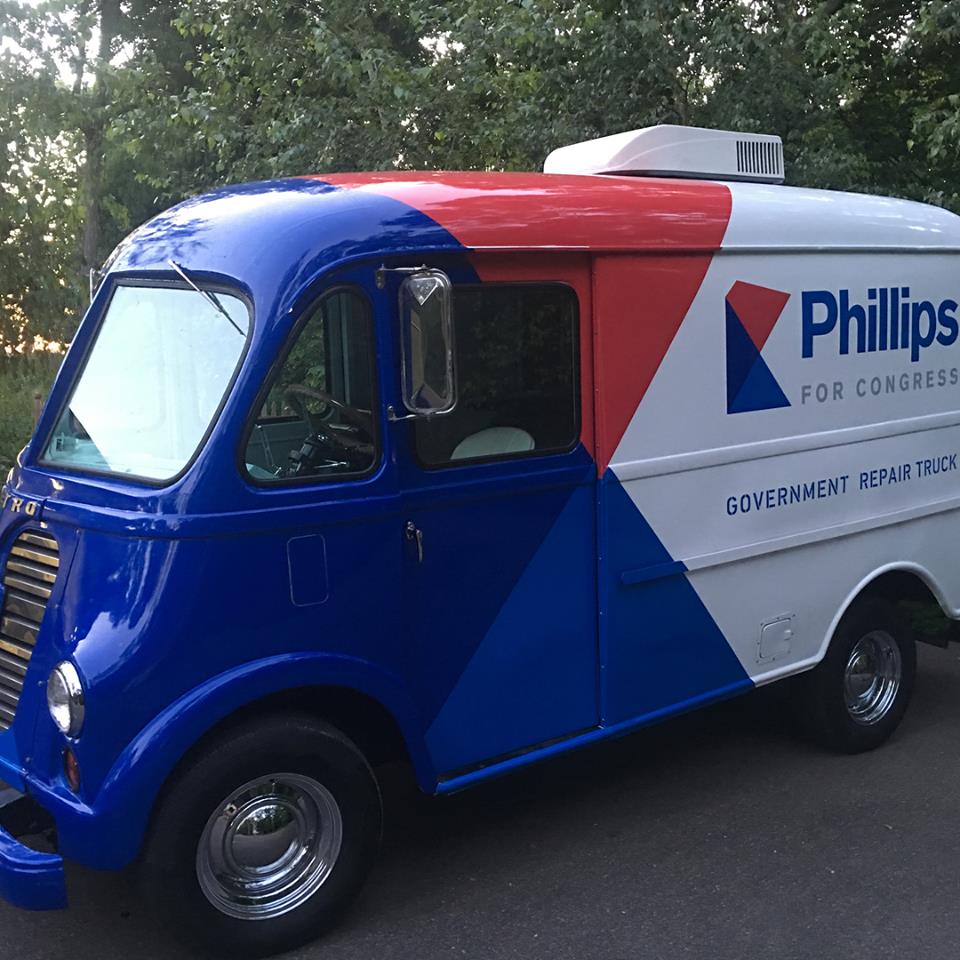
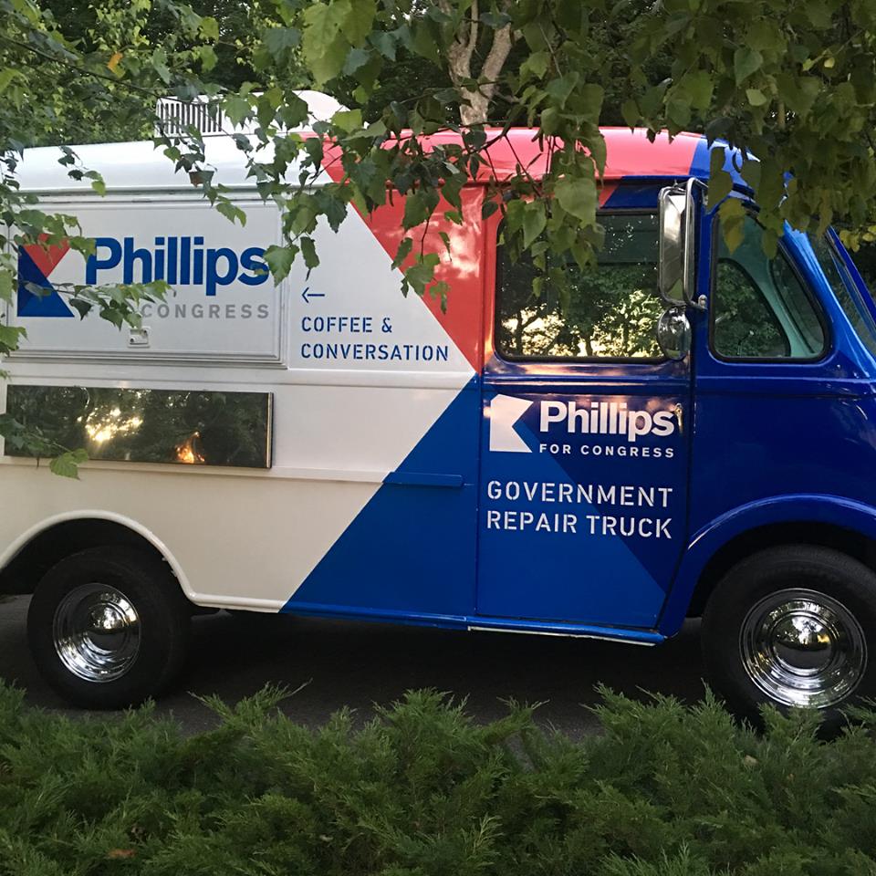
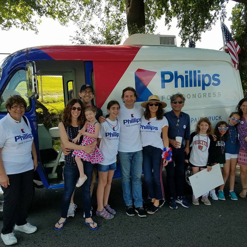
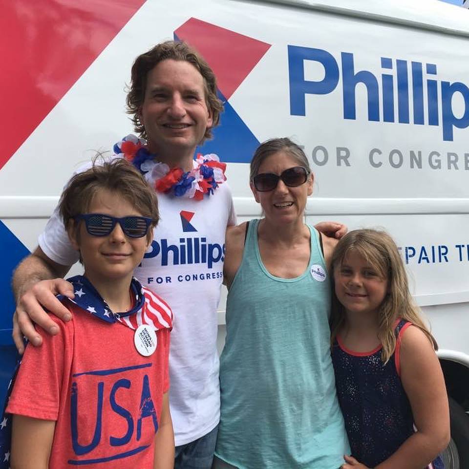
We’re proud to participate in Dean Phillips’s campaign for US Congress! Replace designed this 1960 International Harvester Metro paint job. Get some of our awesome work for yourself at replaceeverything.com and 50% of the profits will go to awesome local charities!
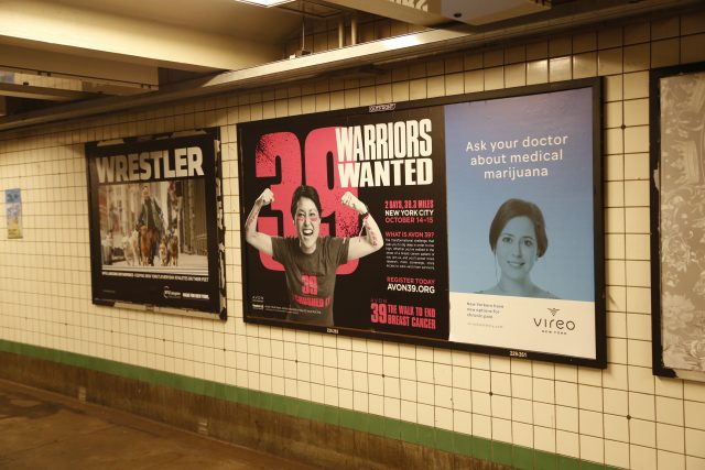
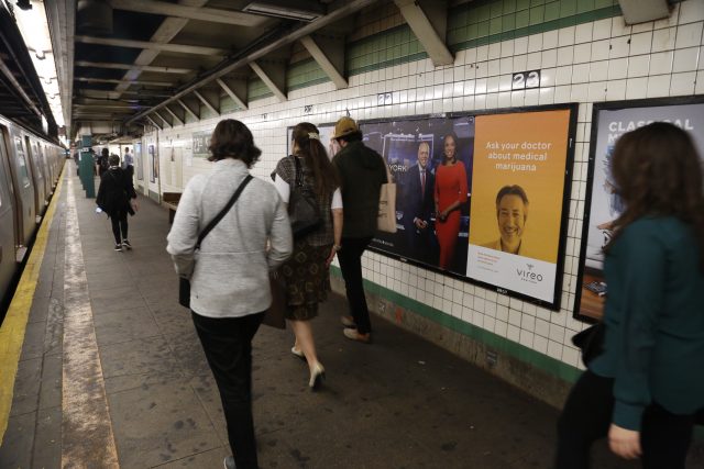
Bravo to our awesome client Vireo Health! For the people dealing with chronic pain, cannabis-based pain relief is a much needed alternative to opioid-based options that currently dominate the market. Vireo Health partnered with Replace to design the new brand identity and packaging system for this medical marijuana innovator. Vireo Health provides pain relief alternatives for the people of New York and Minnesota. Congratulations Vireo!
https://vireohealthny.com/products/
Tug & The Tooth is a colorful story about a little girl named Liza who discovers she has a loose tooth! Liza meets Tug, a magical tooth, who becomes her guide through this wiggly time. Together they embark on a great adventure where she learns to handle the fear and excitement of losing her first tooth. To tell this story, we first worked hand-in-hand with the author to conceptualize and illustrate Tug and Liza. The author then had plush protoypes of Tug created locally. Once approved, we moved into producing a hand-drawn, complementary aesthetic for the background illustrations. When the book was complete, Replace developed a packaging solution that would tie the whole brand together.
http://designreplace.com/casestudy/tug-and-the-tooth/
Get Smashed! I am SOOOO dang proud to show off the work we did this year for Smash Burger. SB is a bit of hero of mine. Honestly great burgers with honest real ingredients. The SB brand has deep roots in Minneapolis. They are a great Replacement for the Status Quo in the Big Burger world. All the design & illustration work is inspired by classic American Neon, Cattle Branding, and even Ancient Hieroglyphs. A multi-faceted design celebration of The New Way to Burger. Enjoy!!!