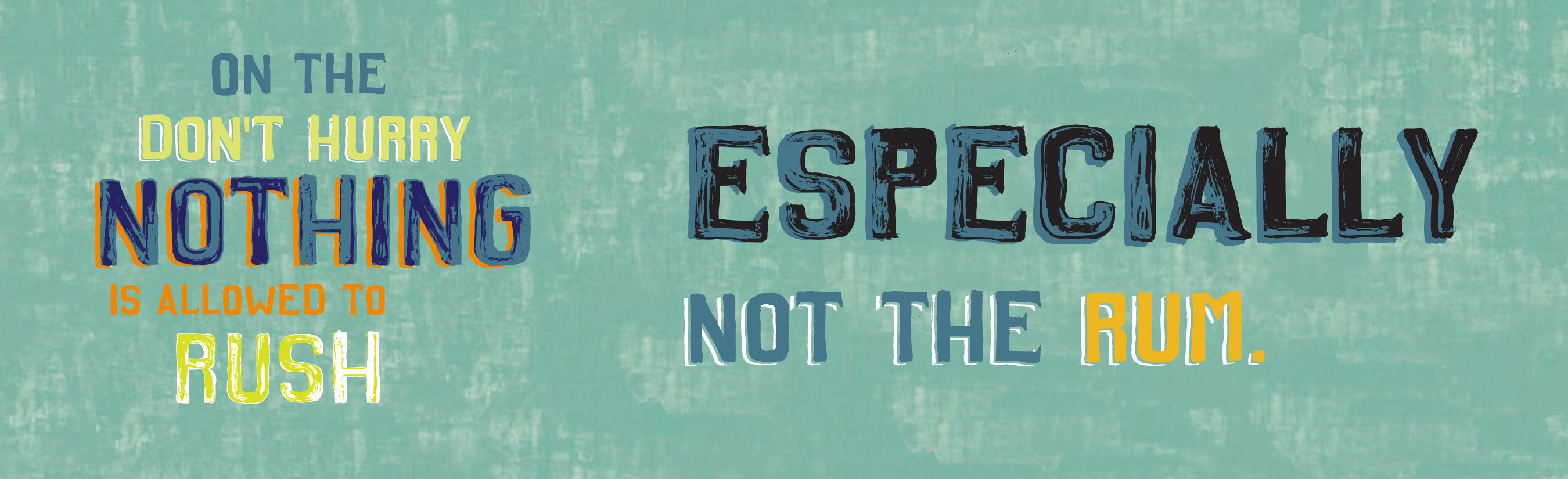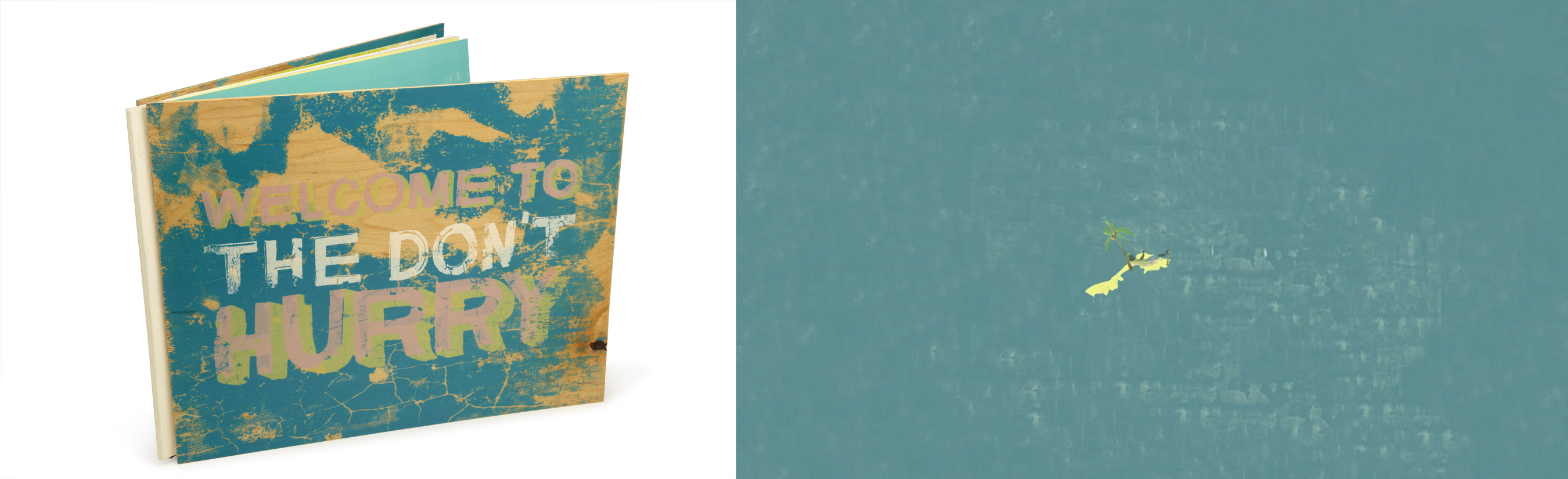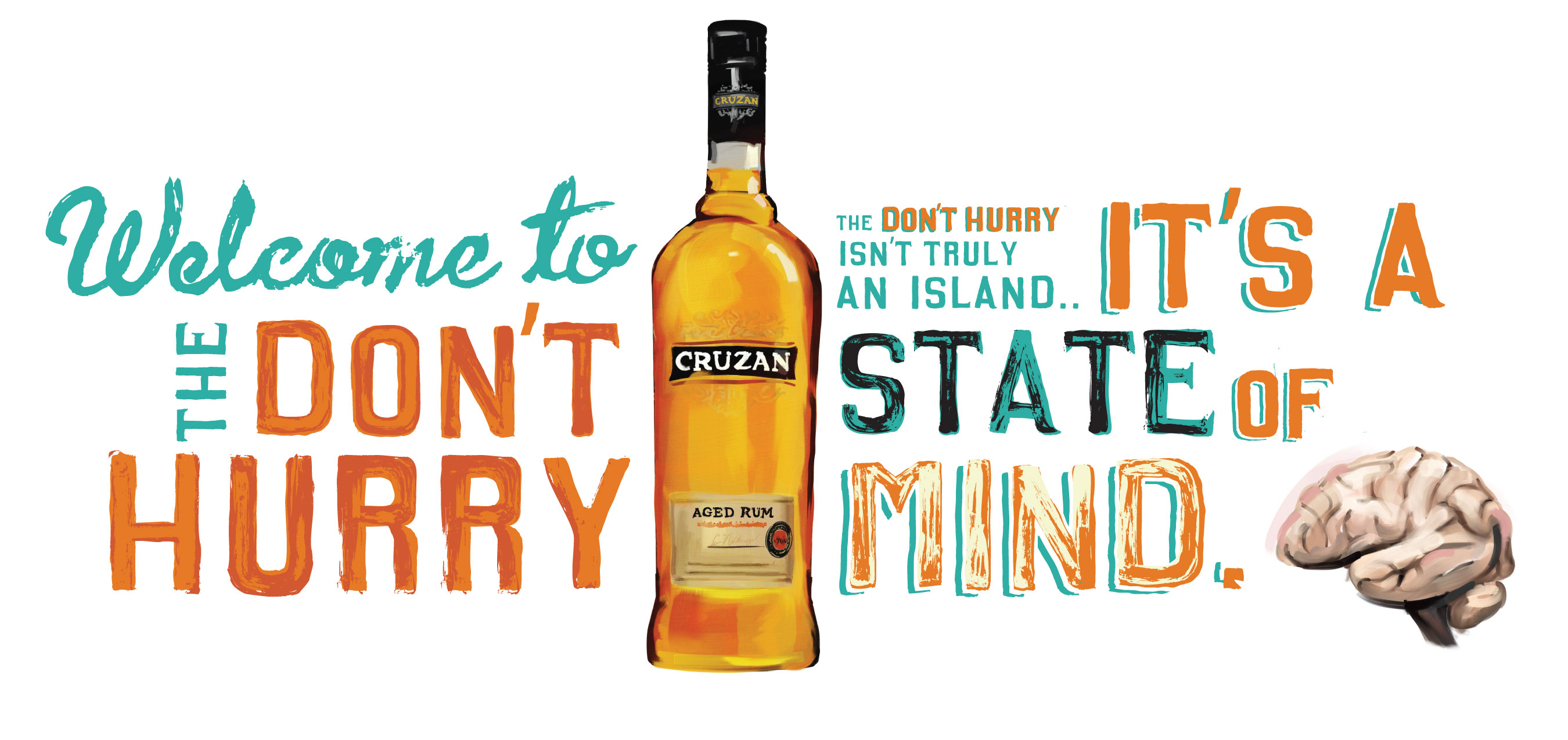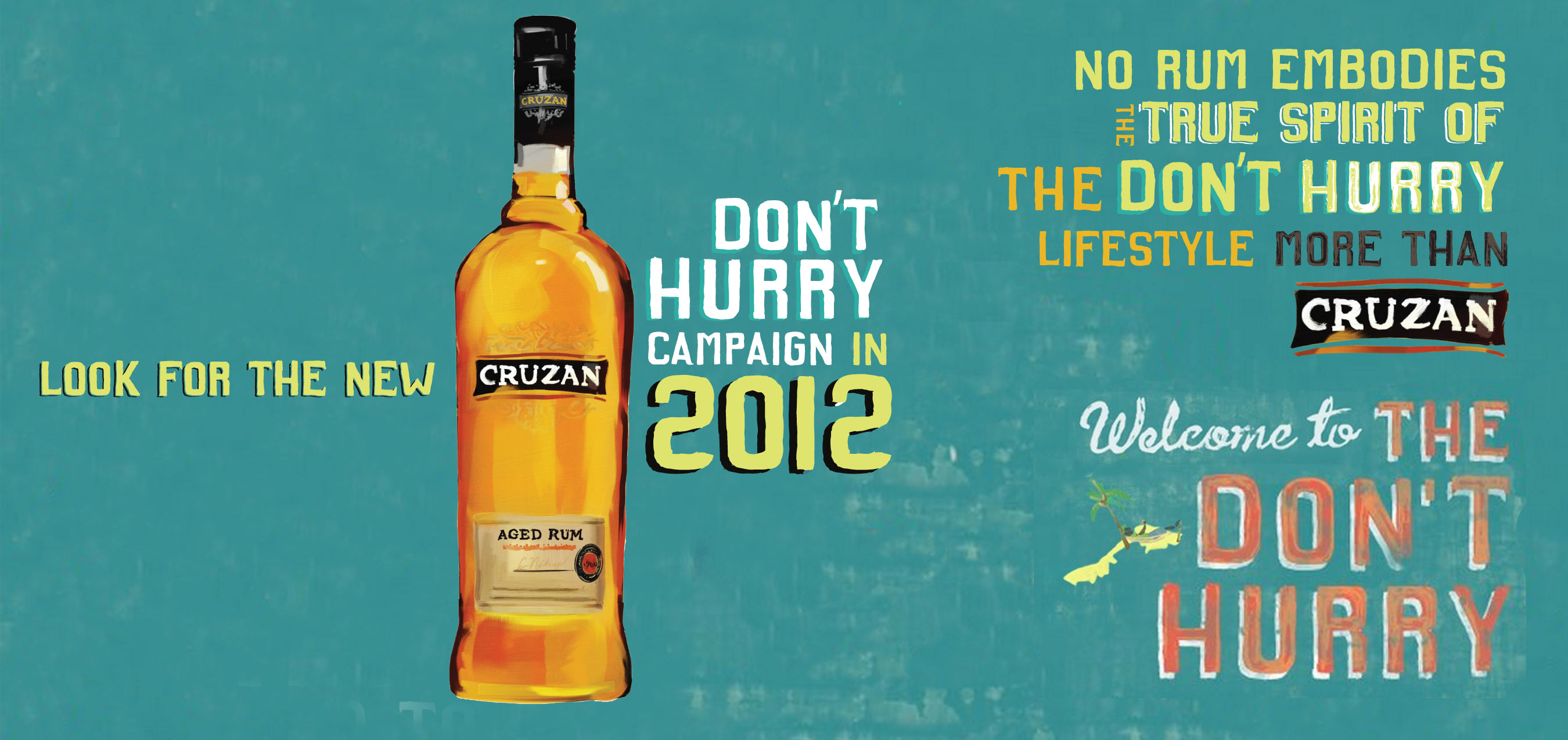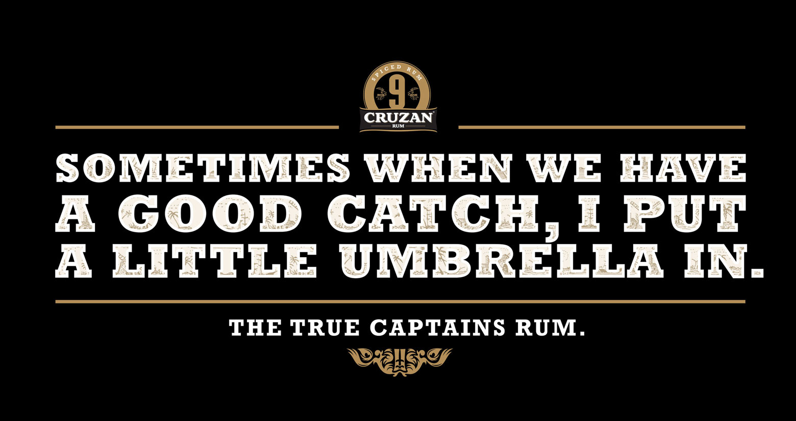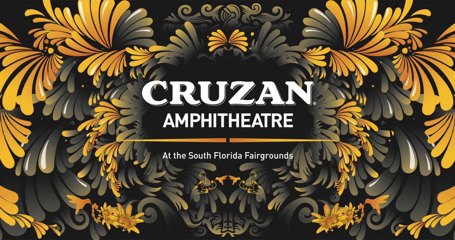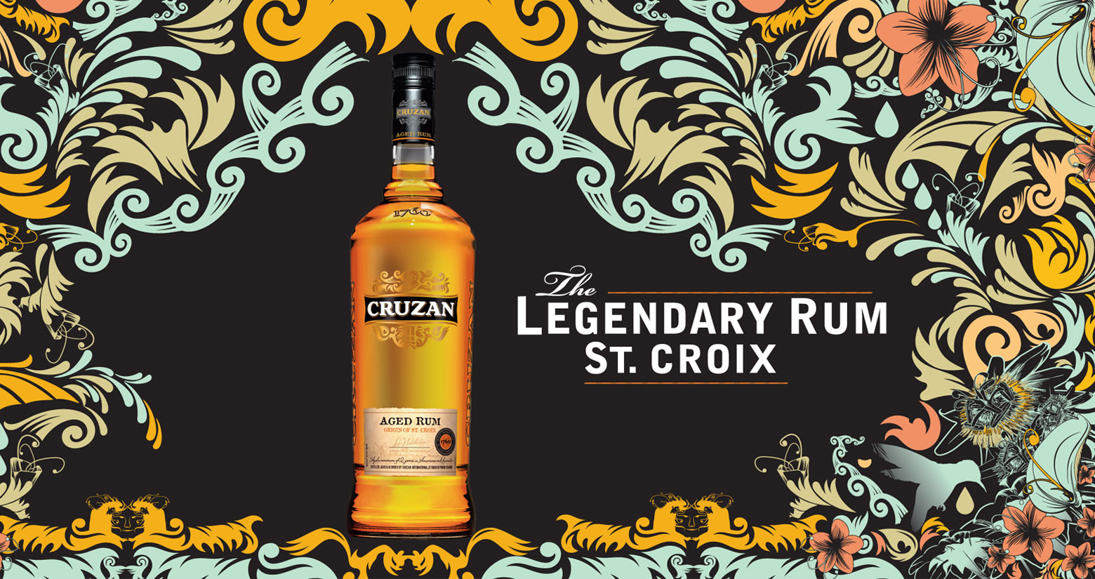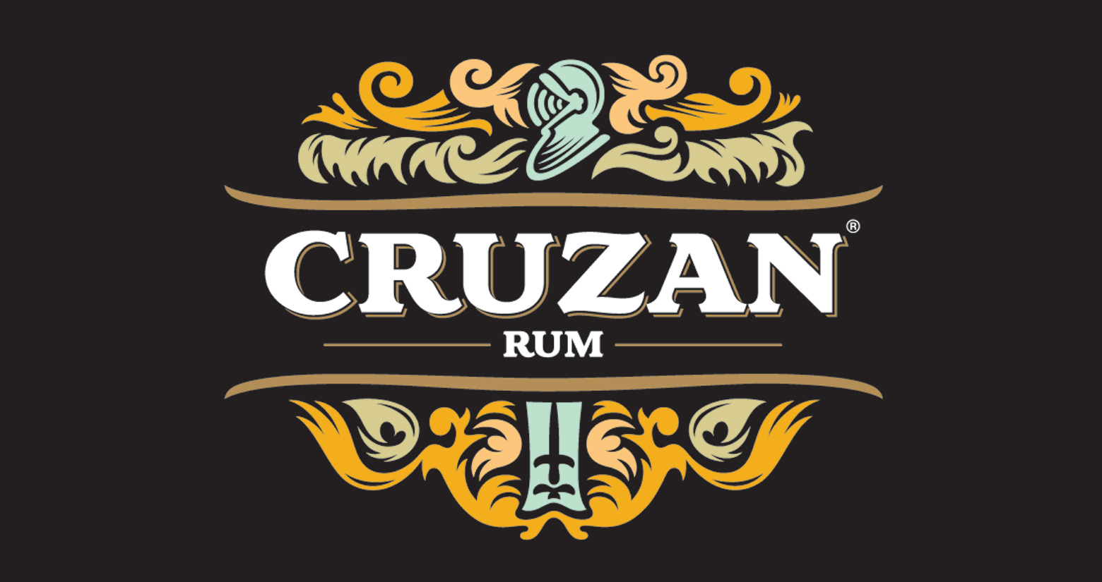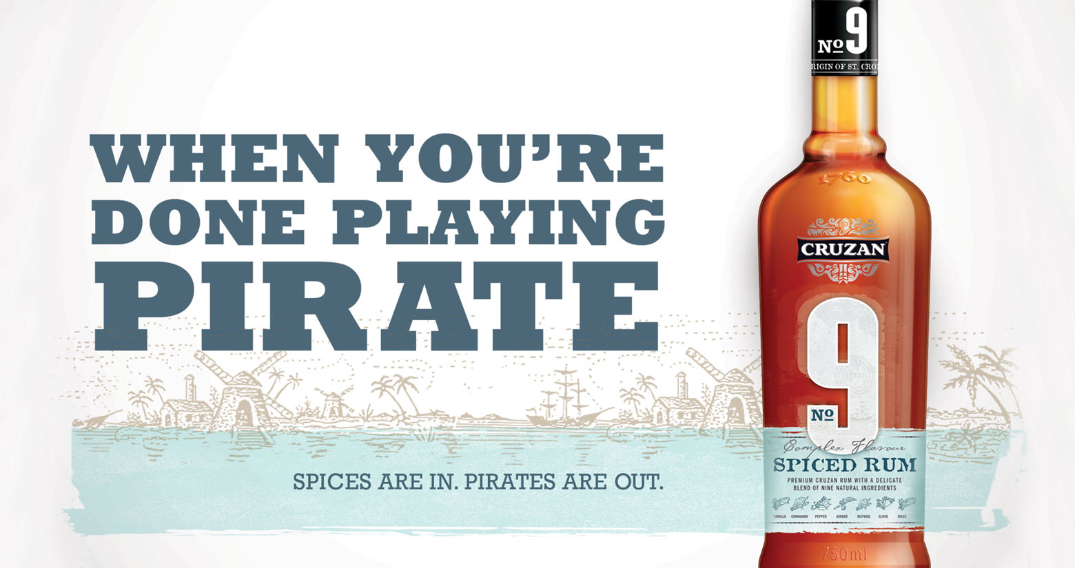
Cruzan Rum
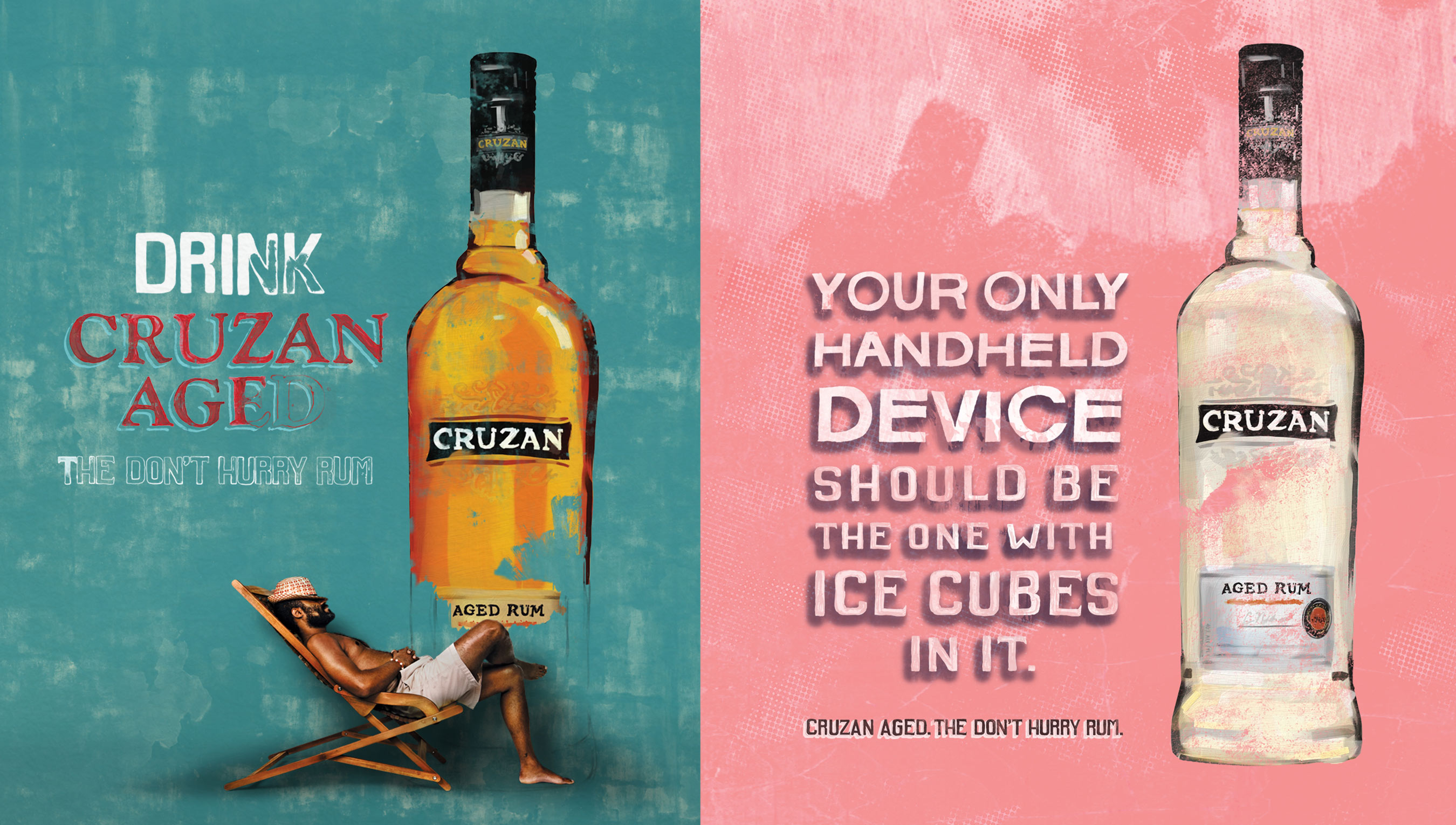
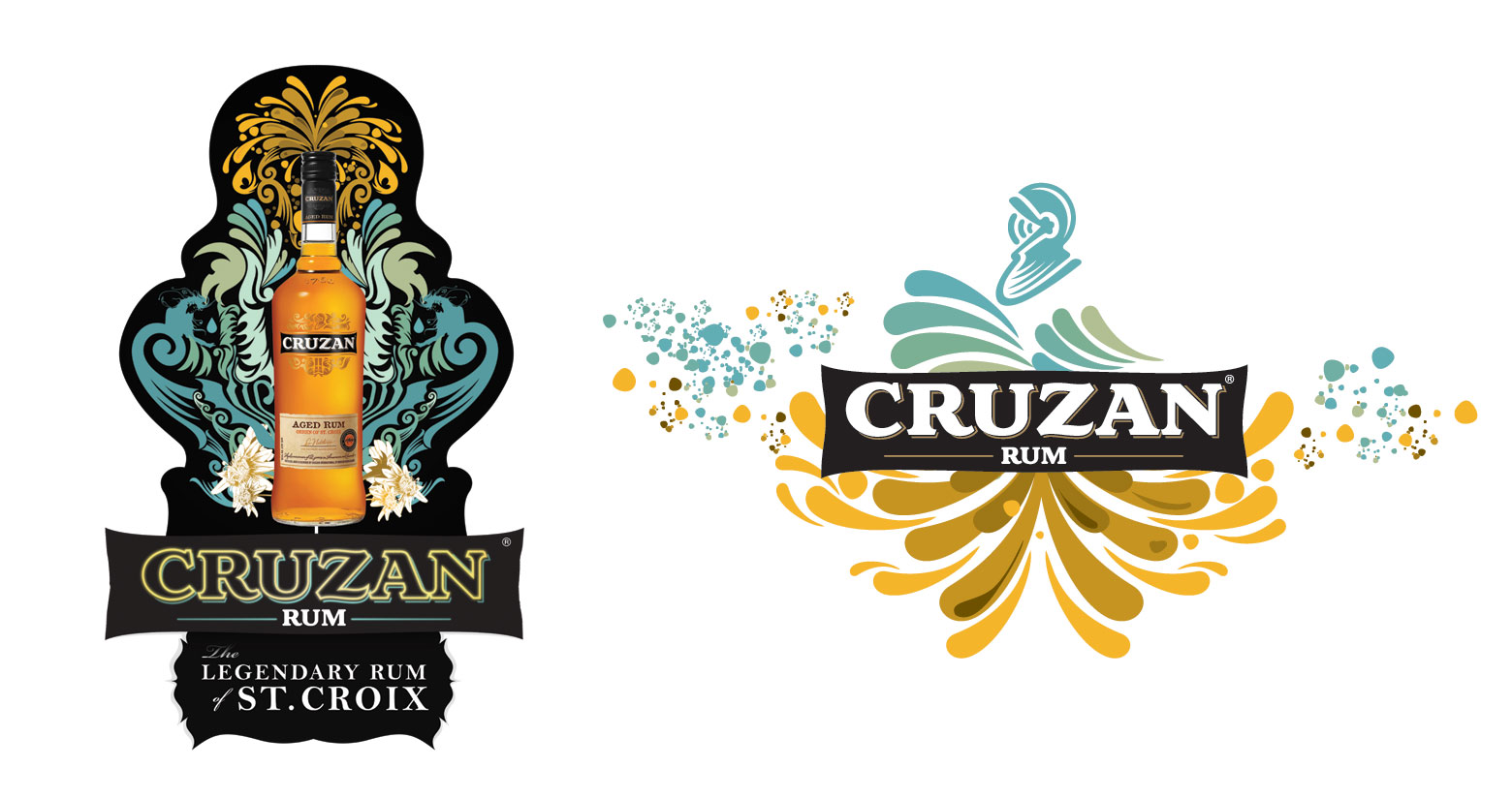
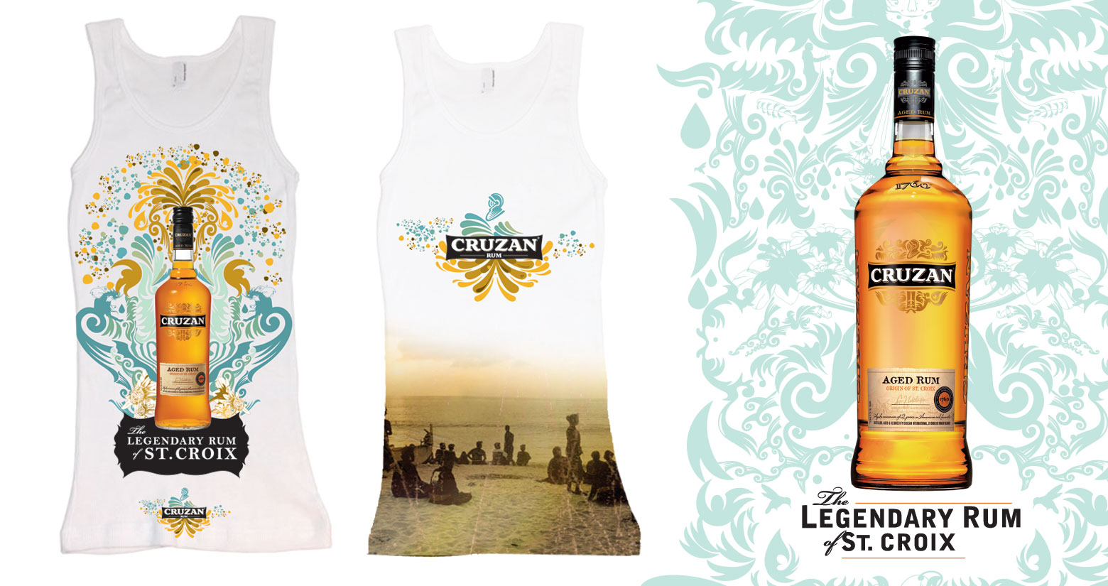
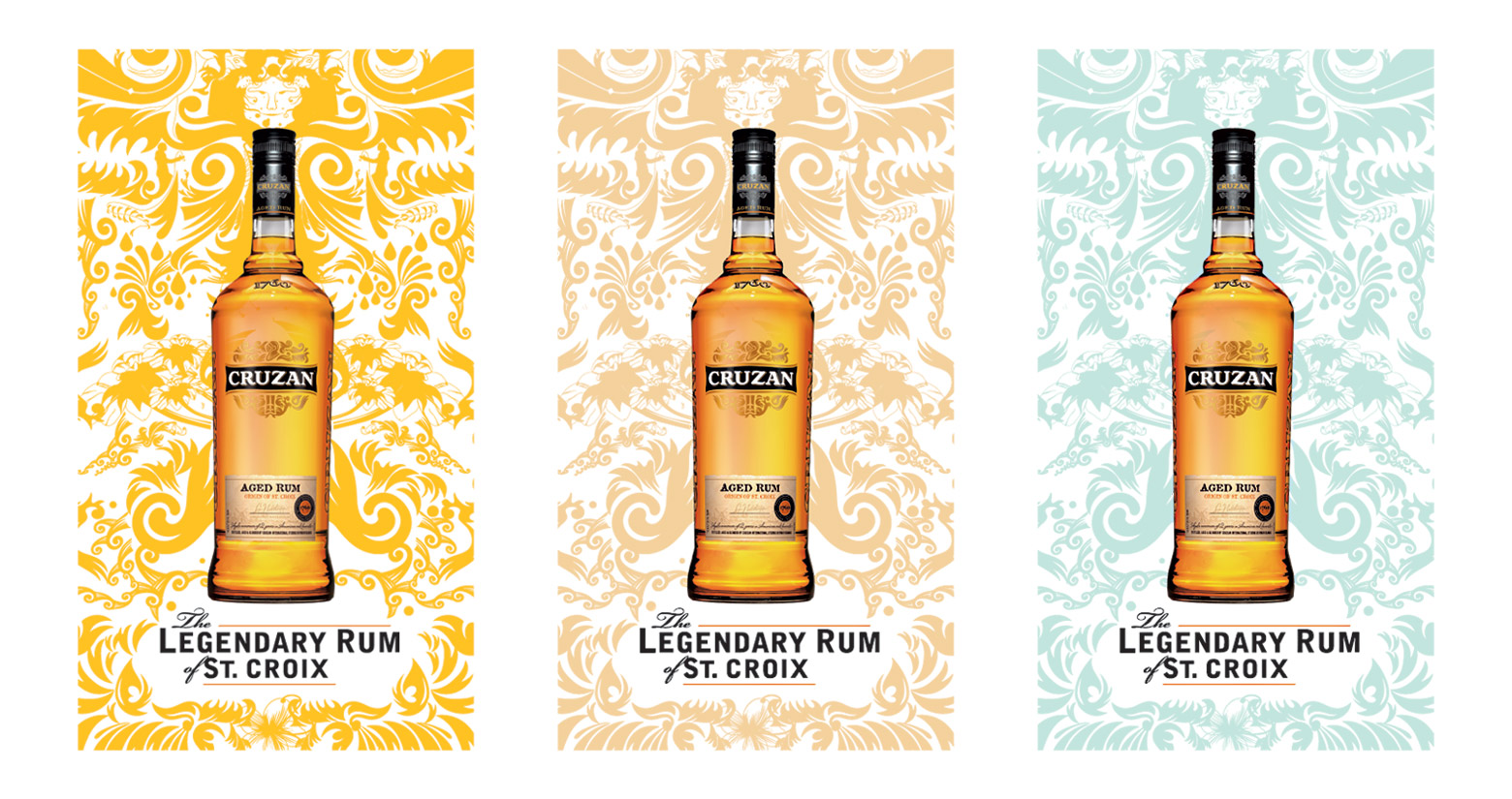
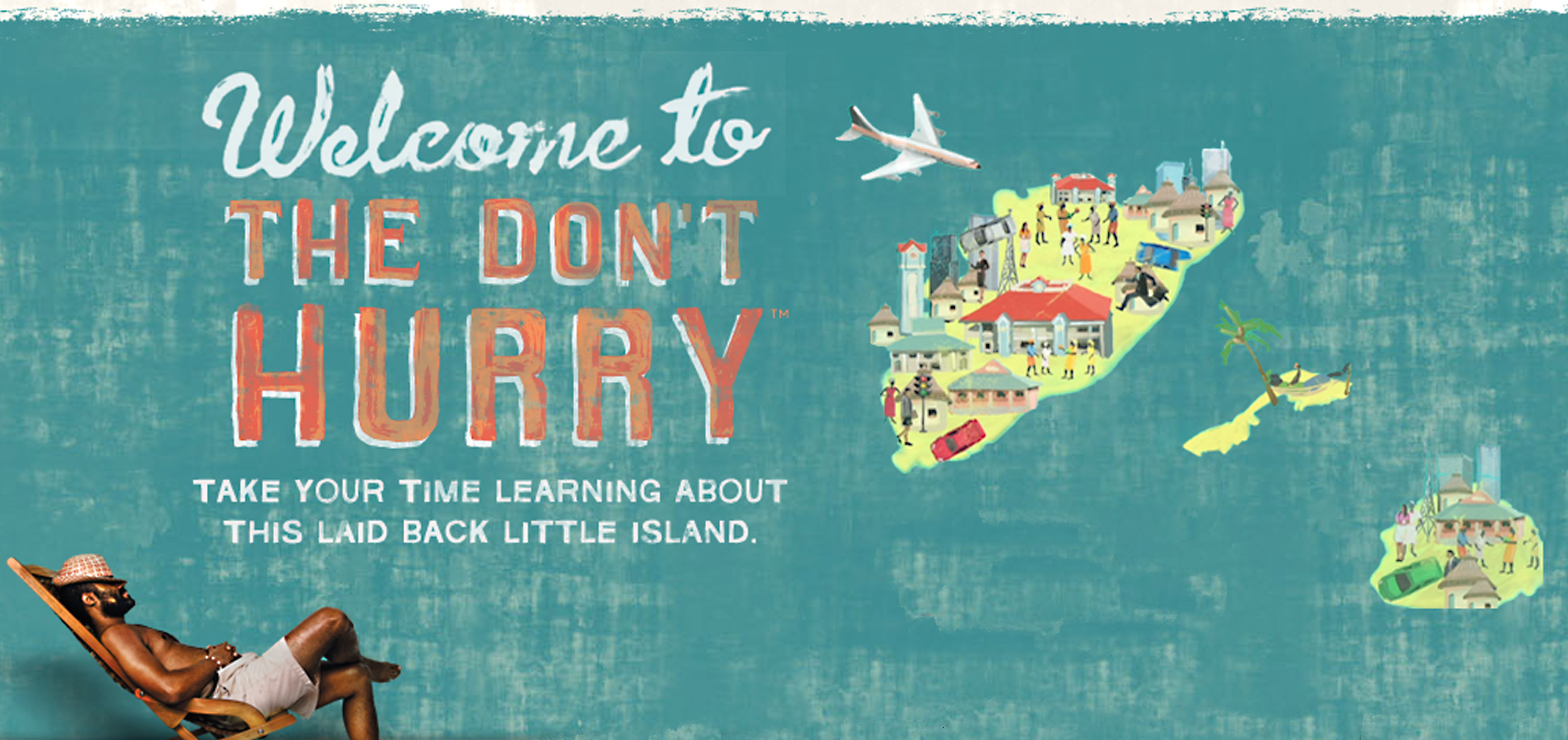
The design landscape of global liquor branding is often boring and incredibly exploitive of women. The Cruzan brand design team engaged us to Replace the “Pirates” and “Pin-ups” of the Rum world with some joyful and lasting design quality. The sexist communication of liquor branding is as easy as it is unconvincing. Bravo to Cruzan for embracing the rich island visual landscape of St. Croix street culture. The Caribbean hand painted building of the St. Croix (the root word for “Cruzan”) was deeply studied and explored in “The Don’t Hurry” campaign. Replace designed the campaign look and feel, hand painted and coded the custom font treatment, directed and authored the illustration direction, and oversaw the design delivery from campaign pitch to campaign implementation. Replace also designed, edited and directed the launch video shown to the brand team at brand launch. We took the time to make “The Don’t Hurry” an experience best savored over ice and good friends.