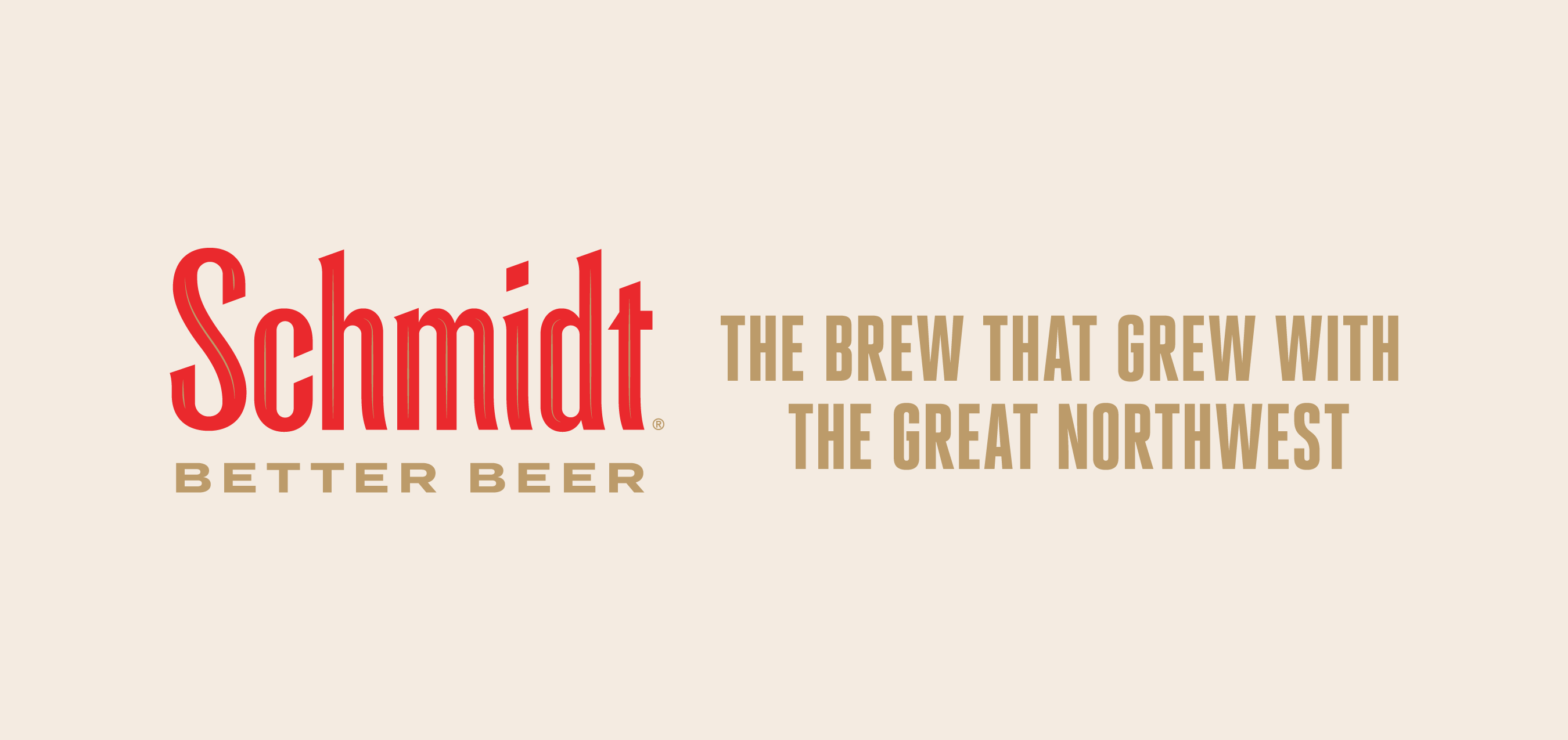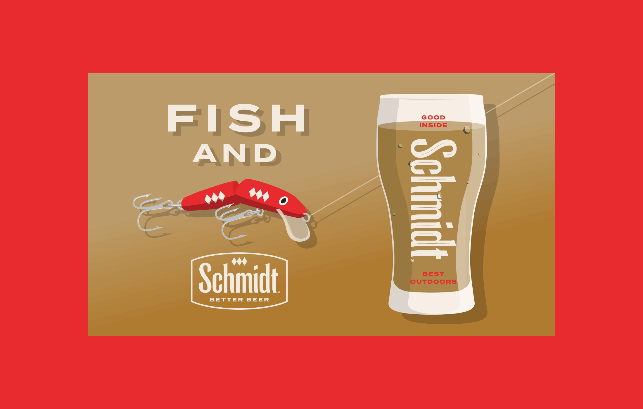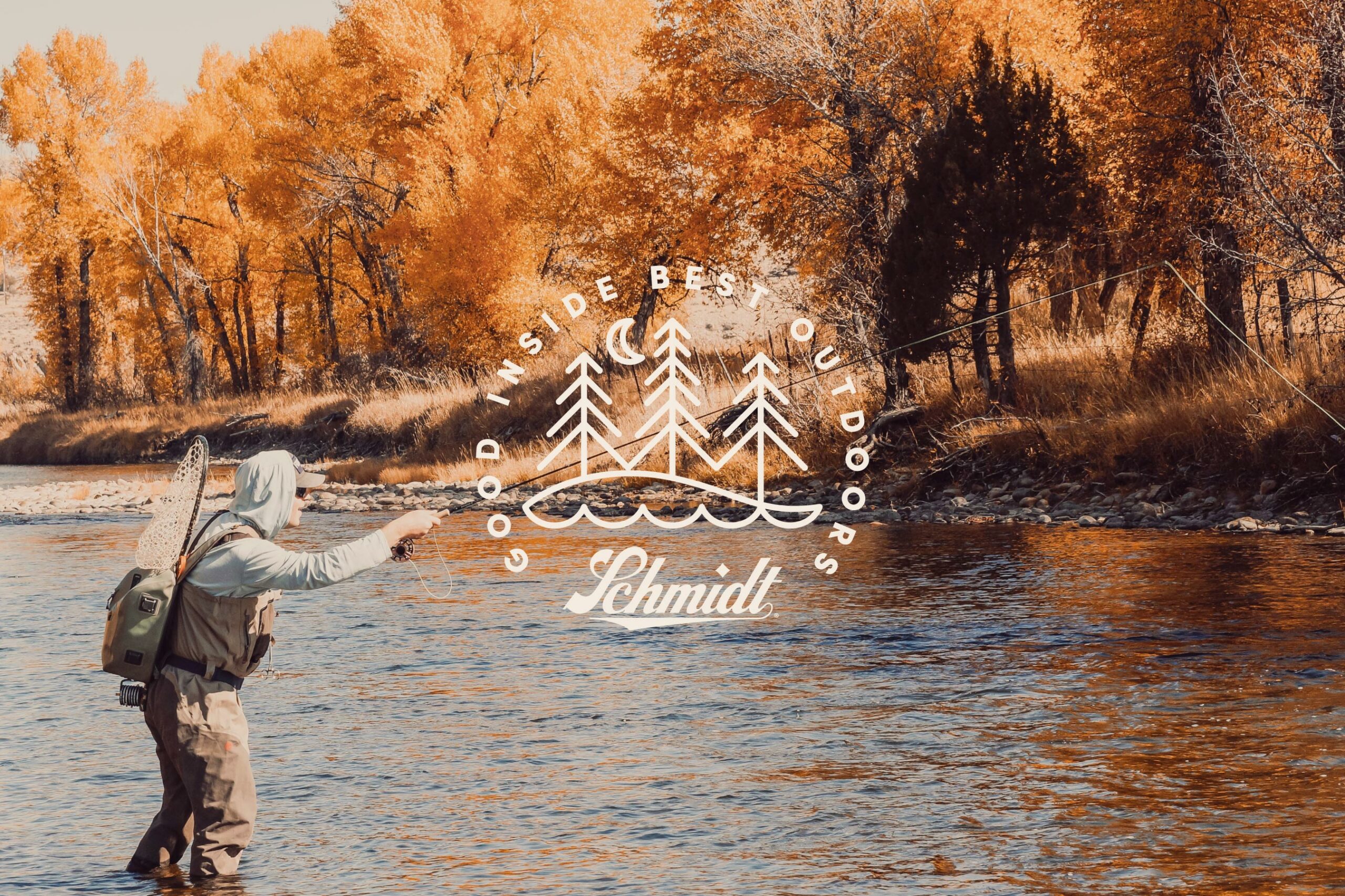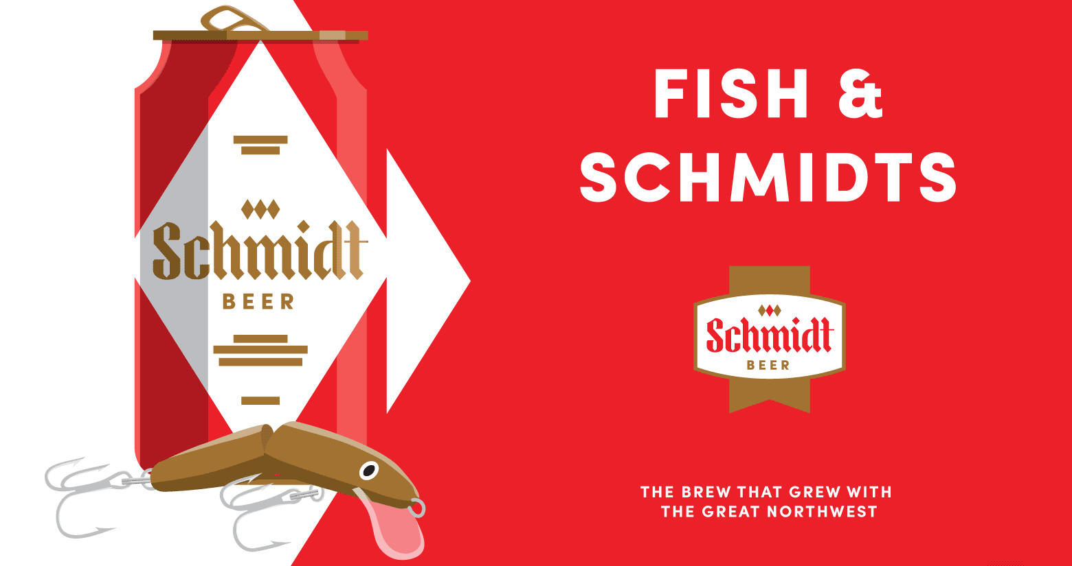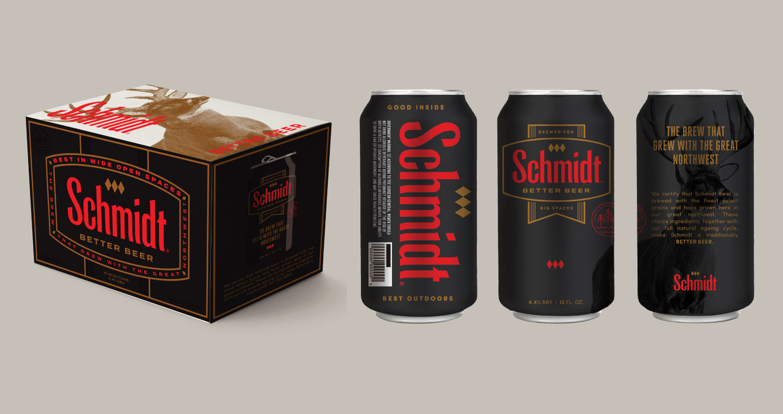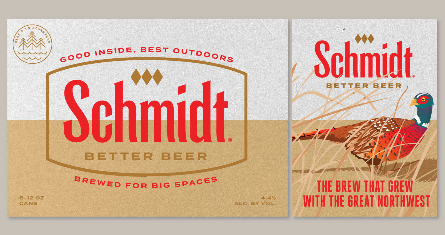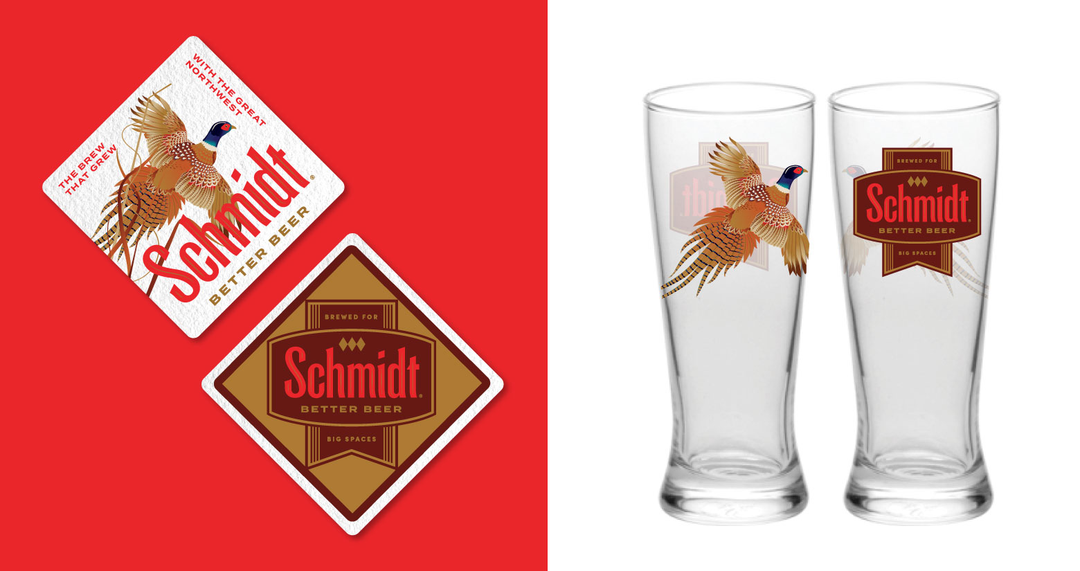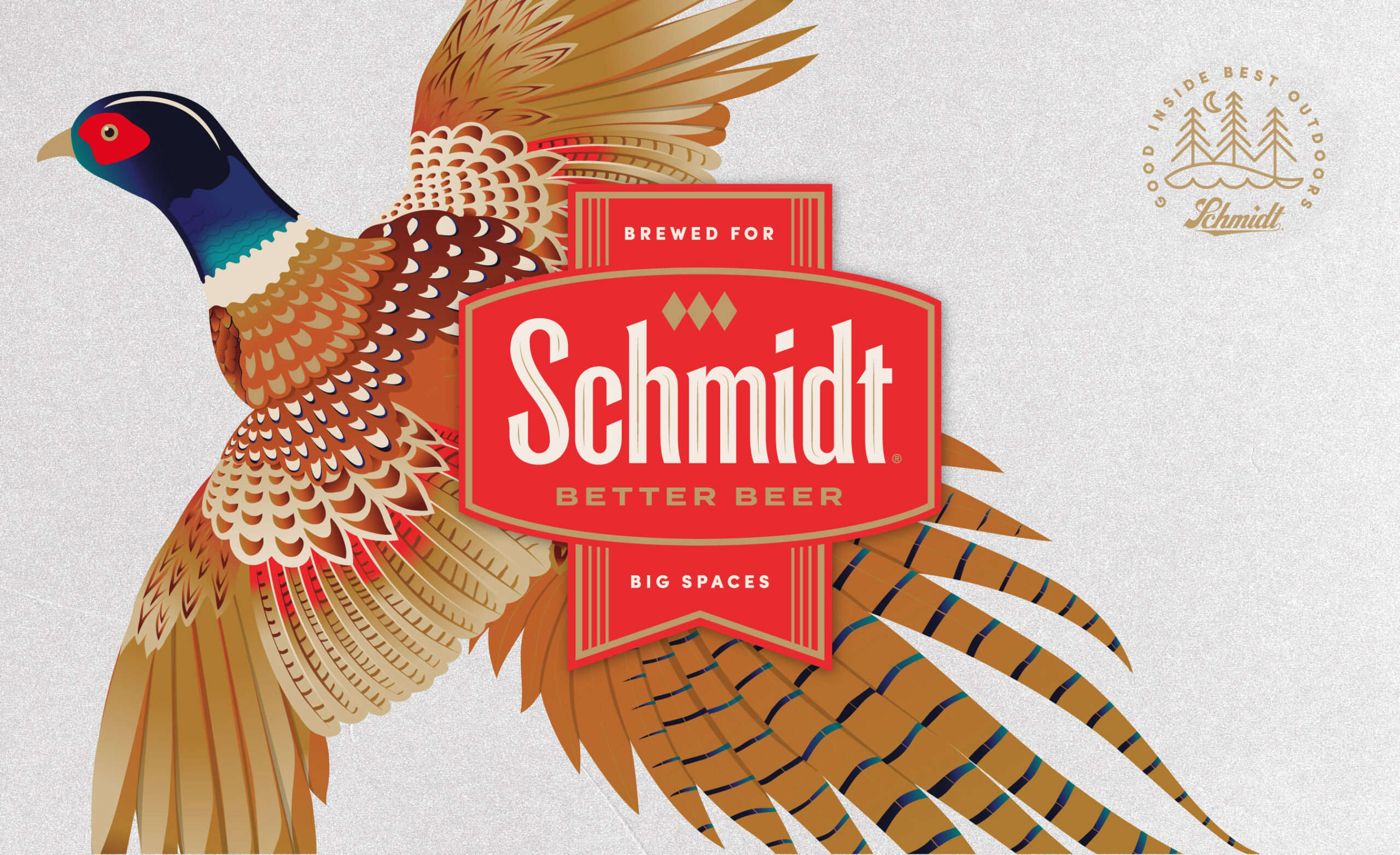
THE BREW THAT GREW WITH THE GREAT NORTHWEST
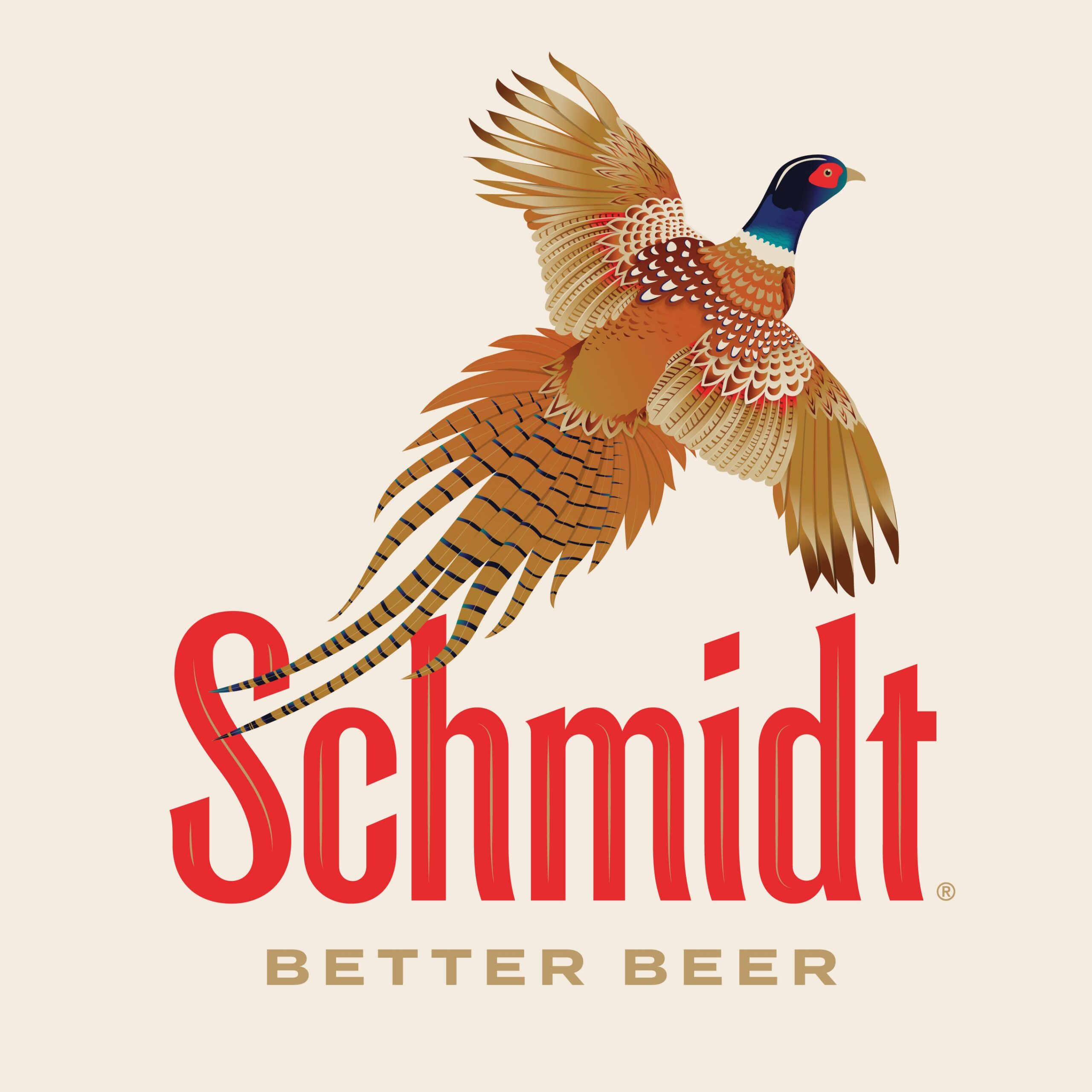
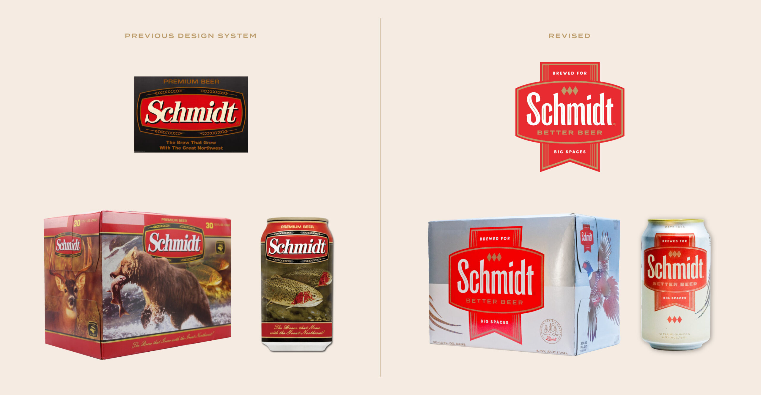
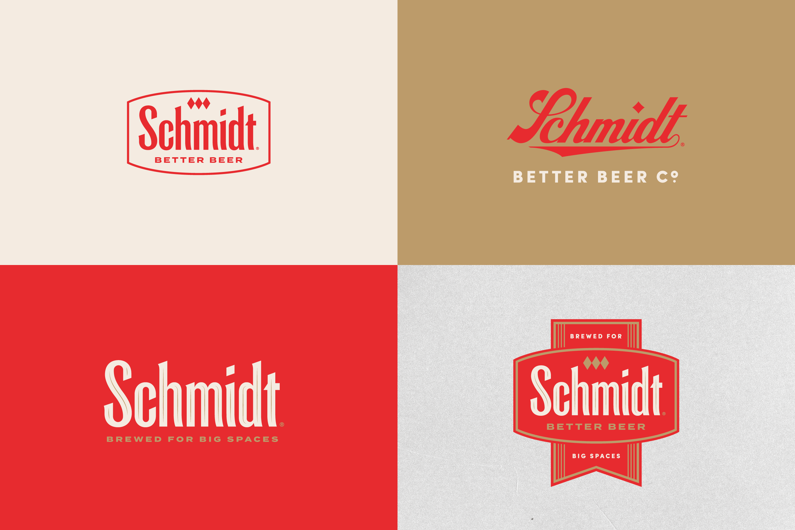
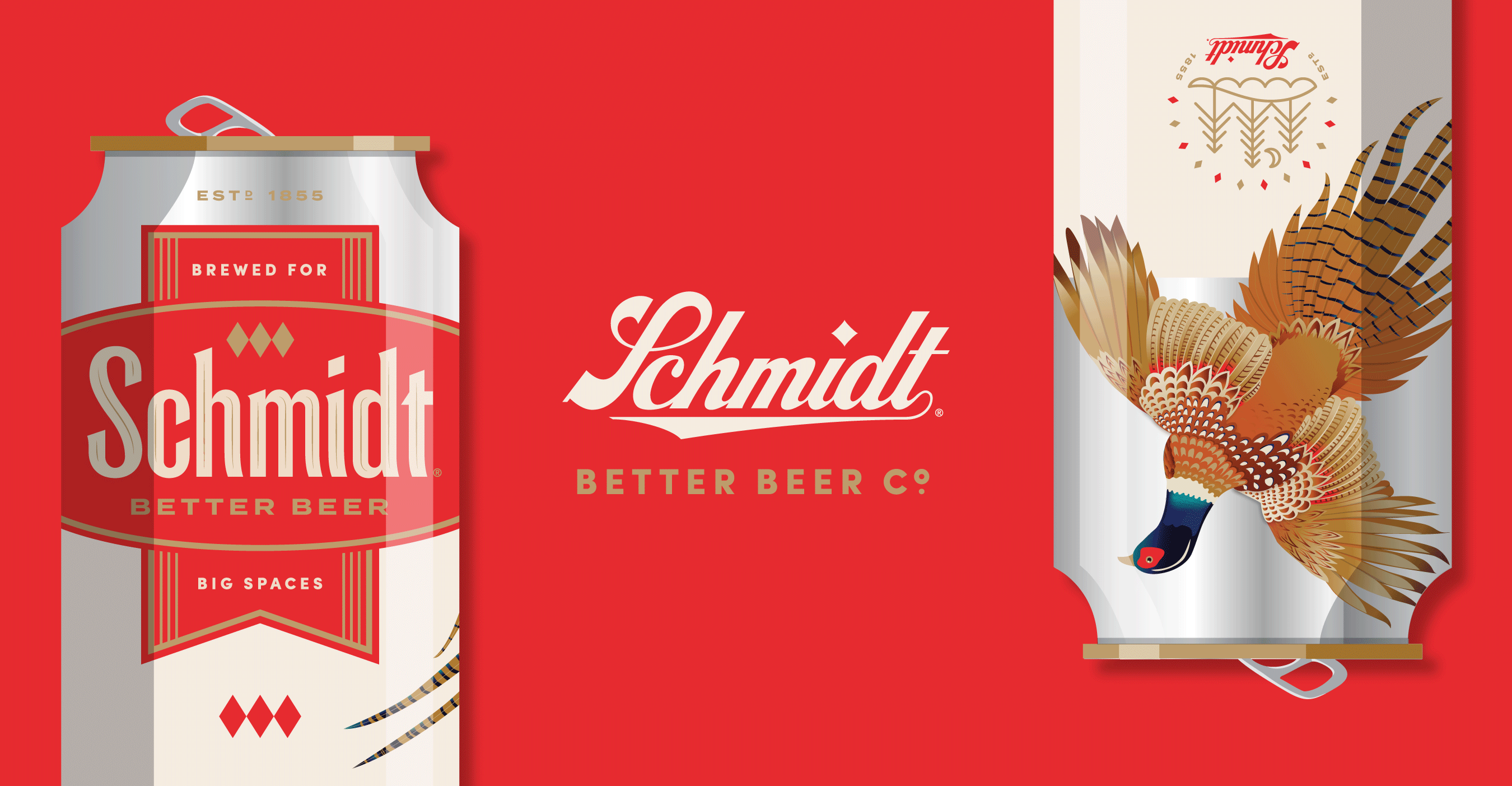
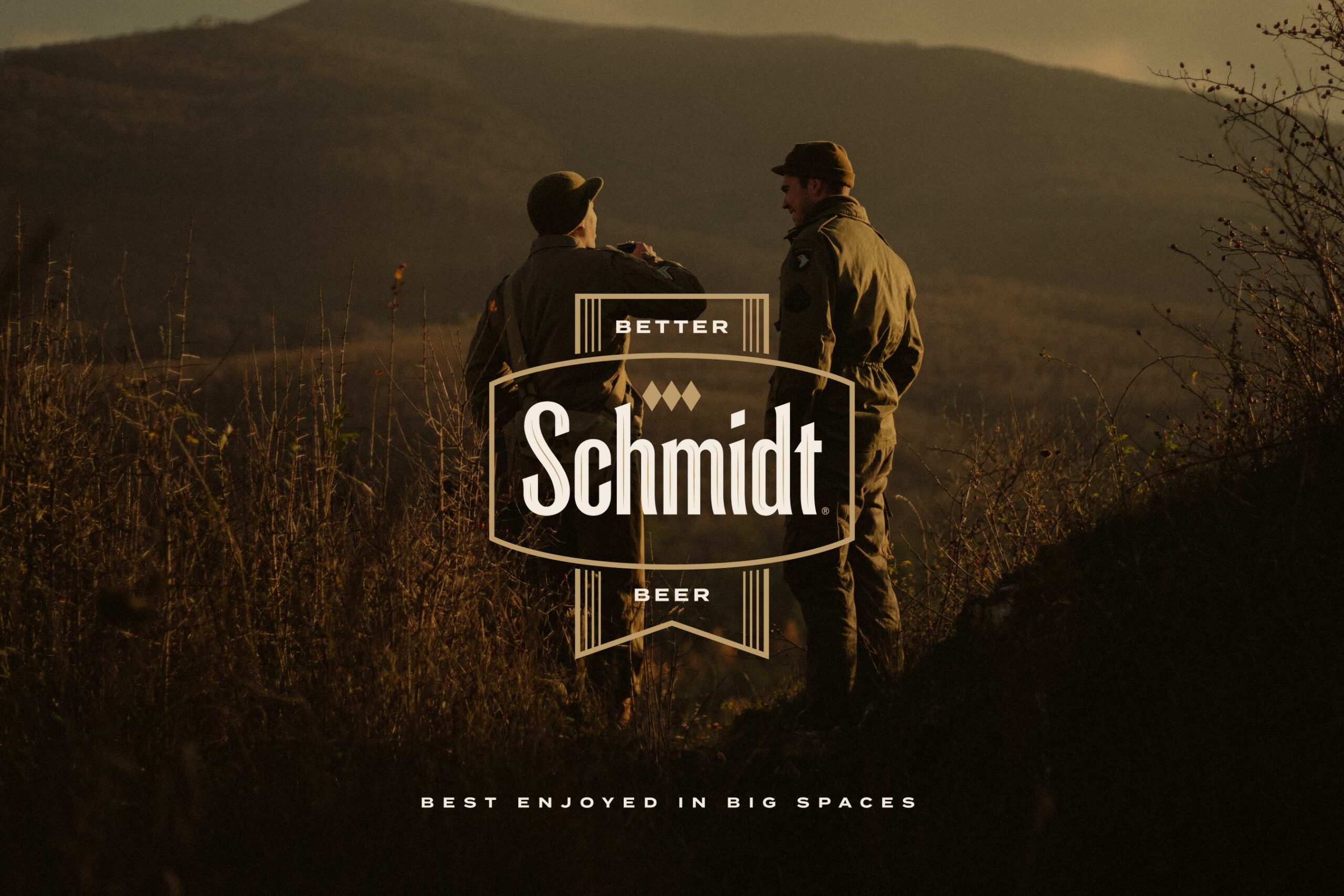
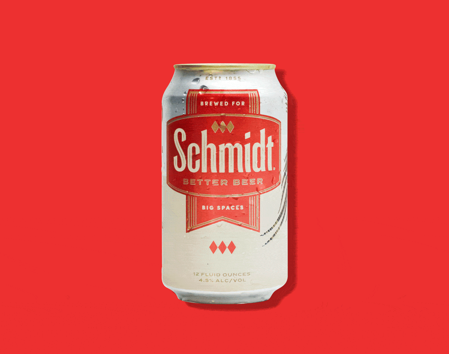
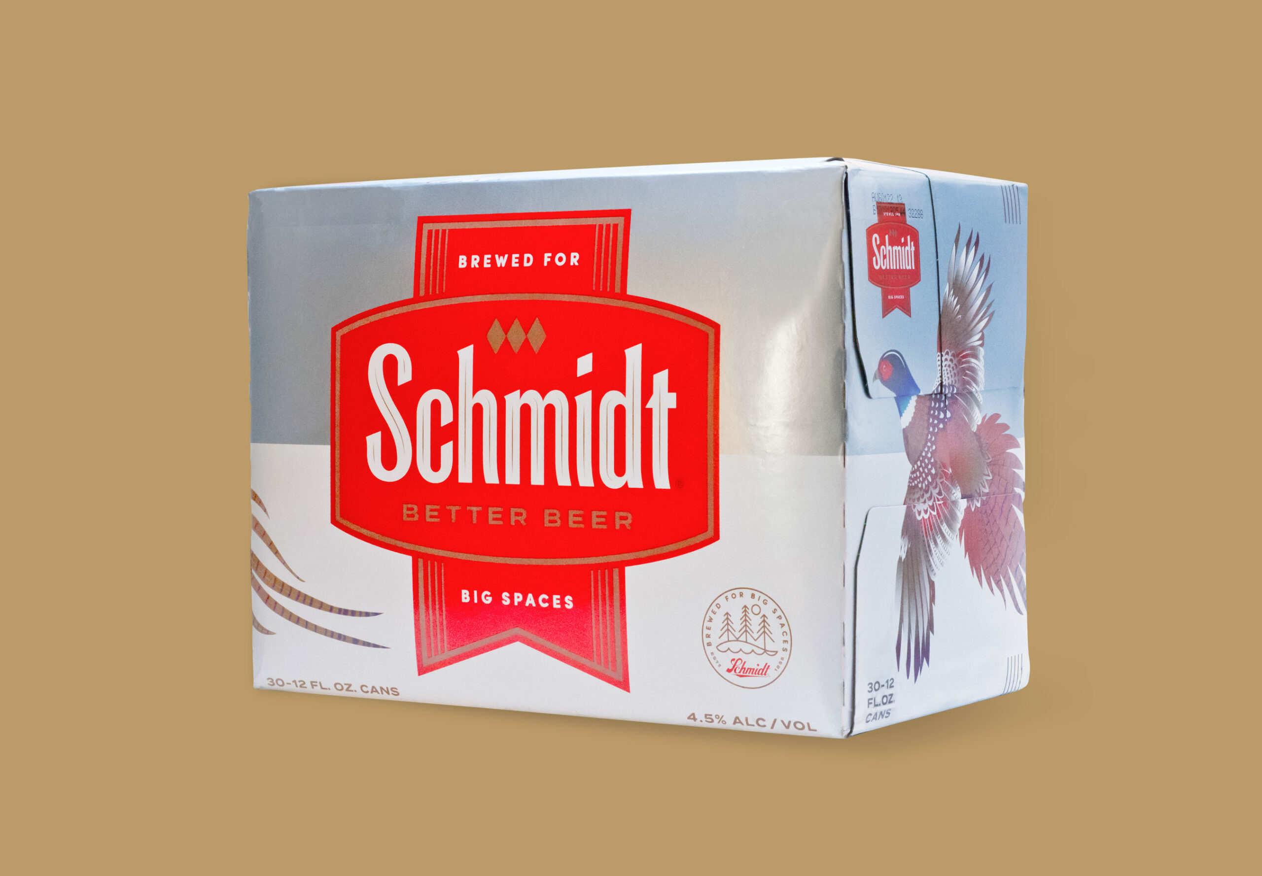
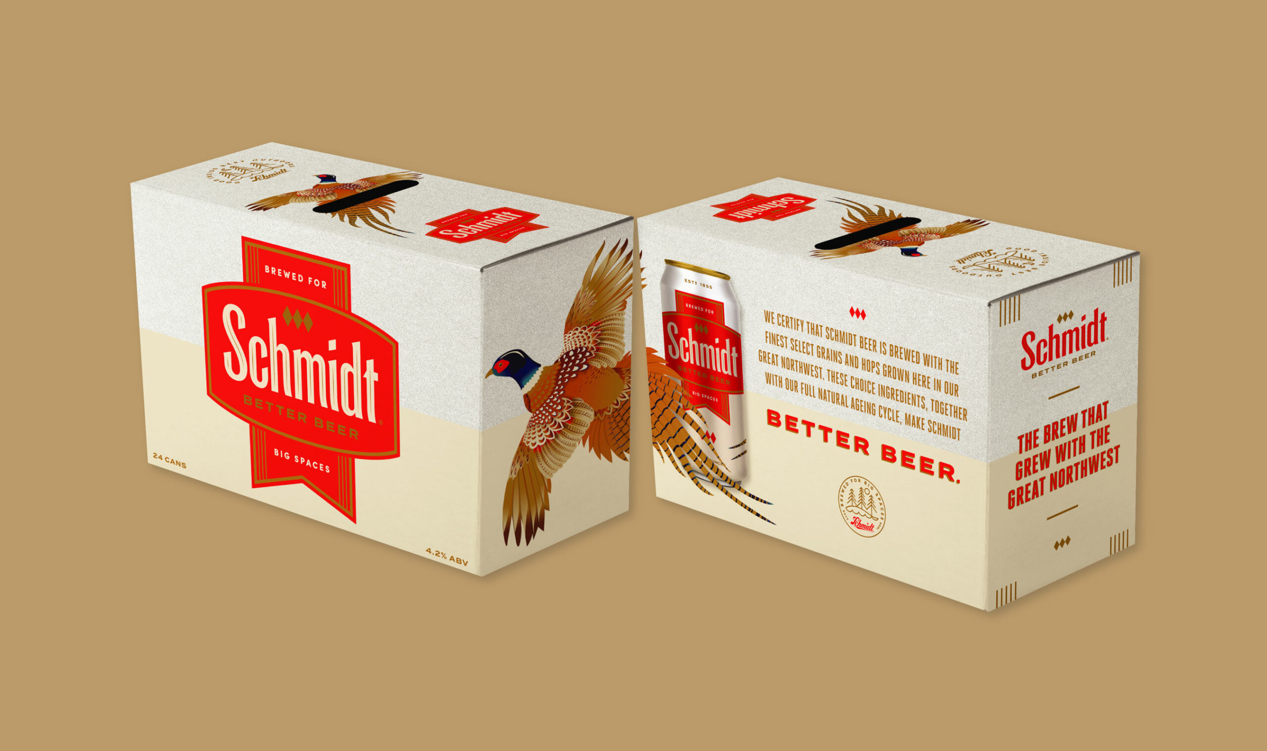
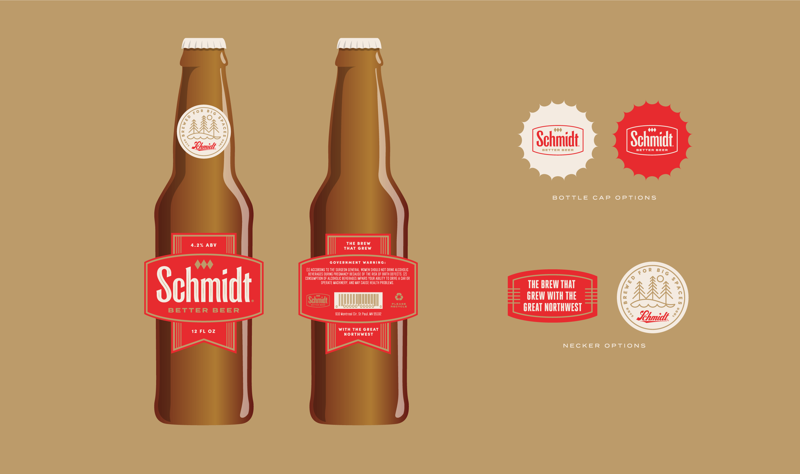
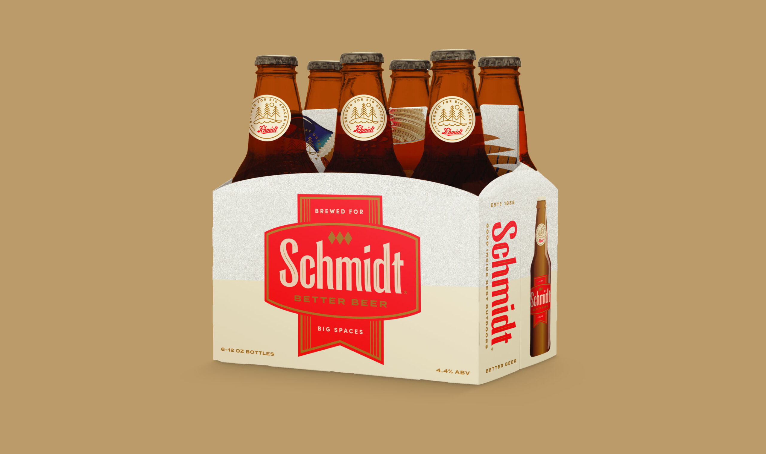
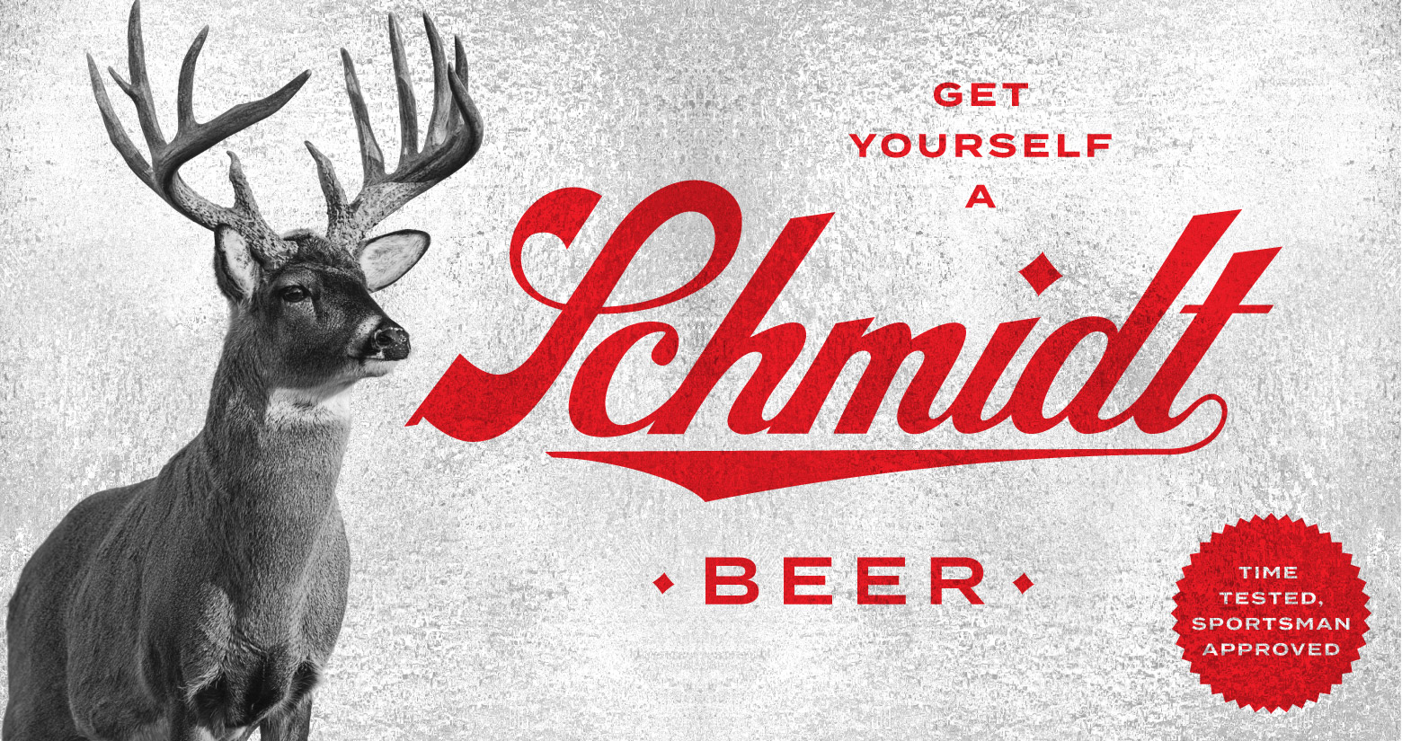
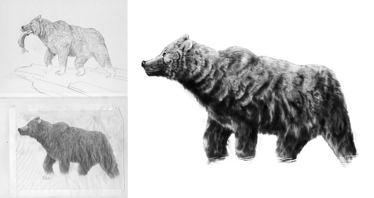
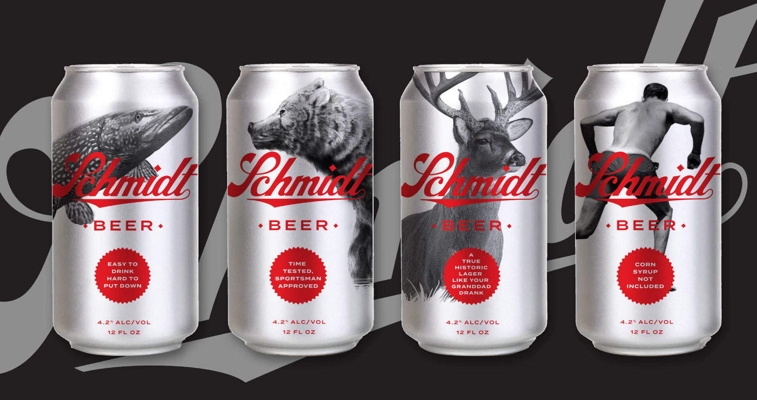
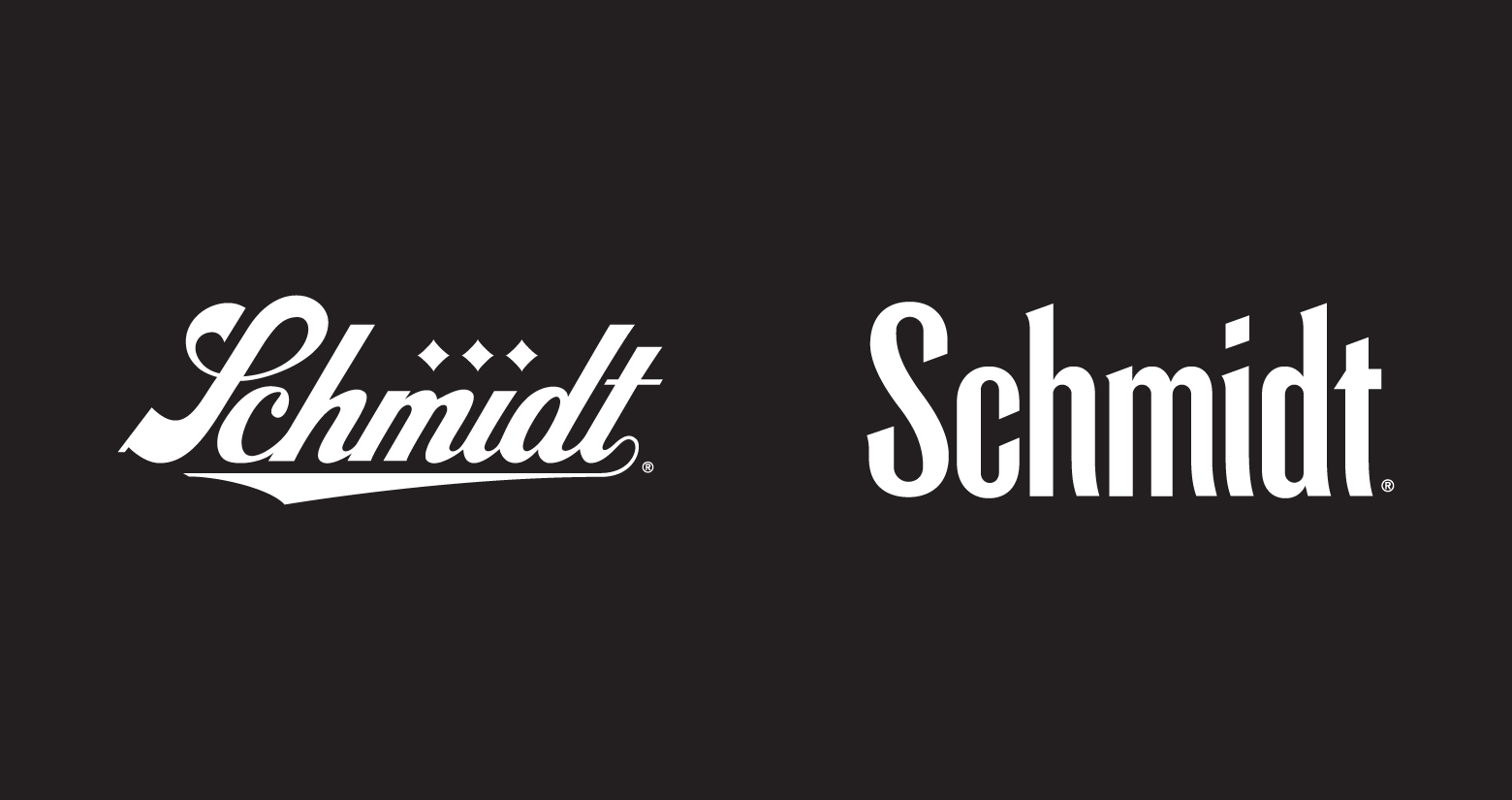
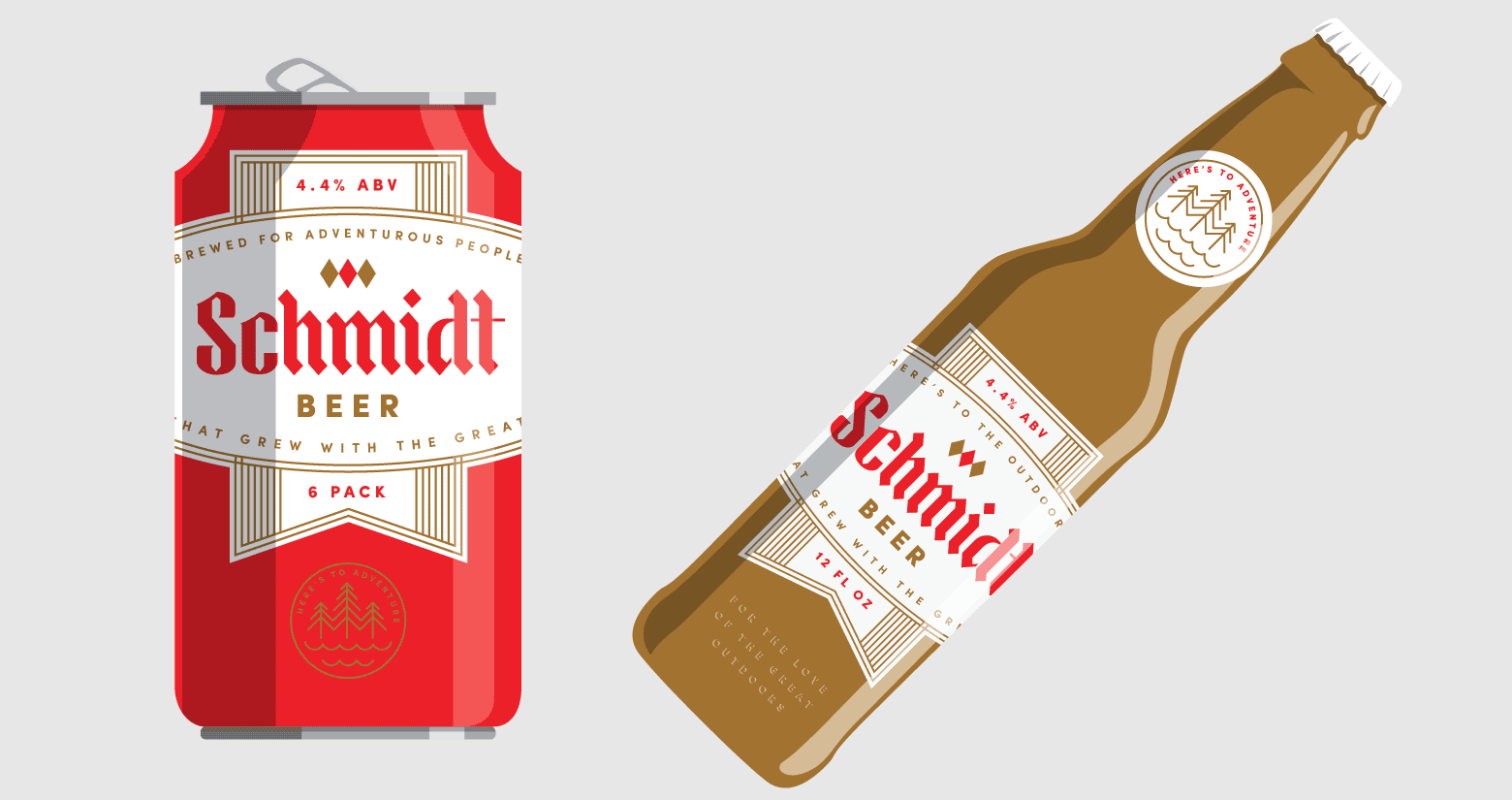
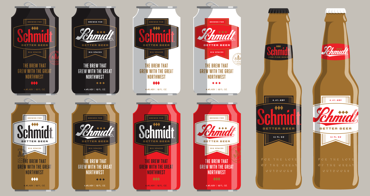
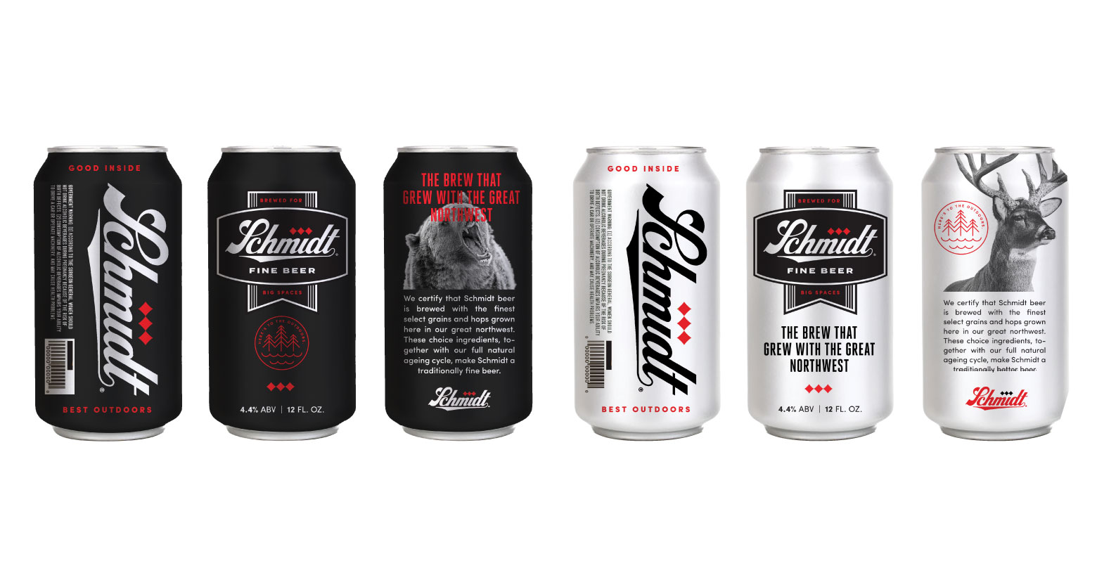
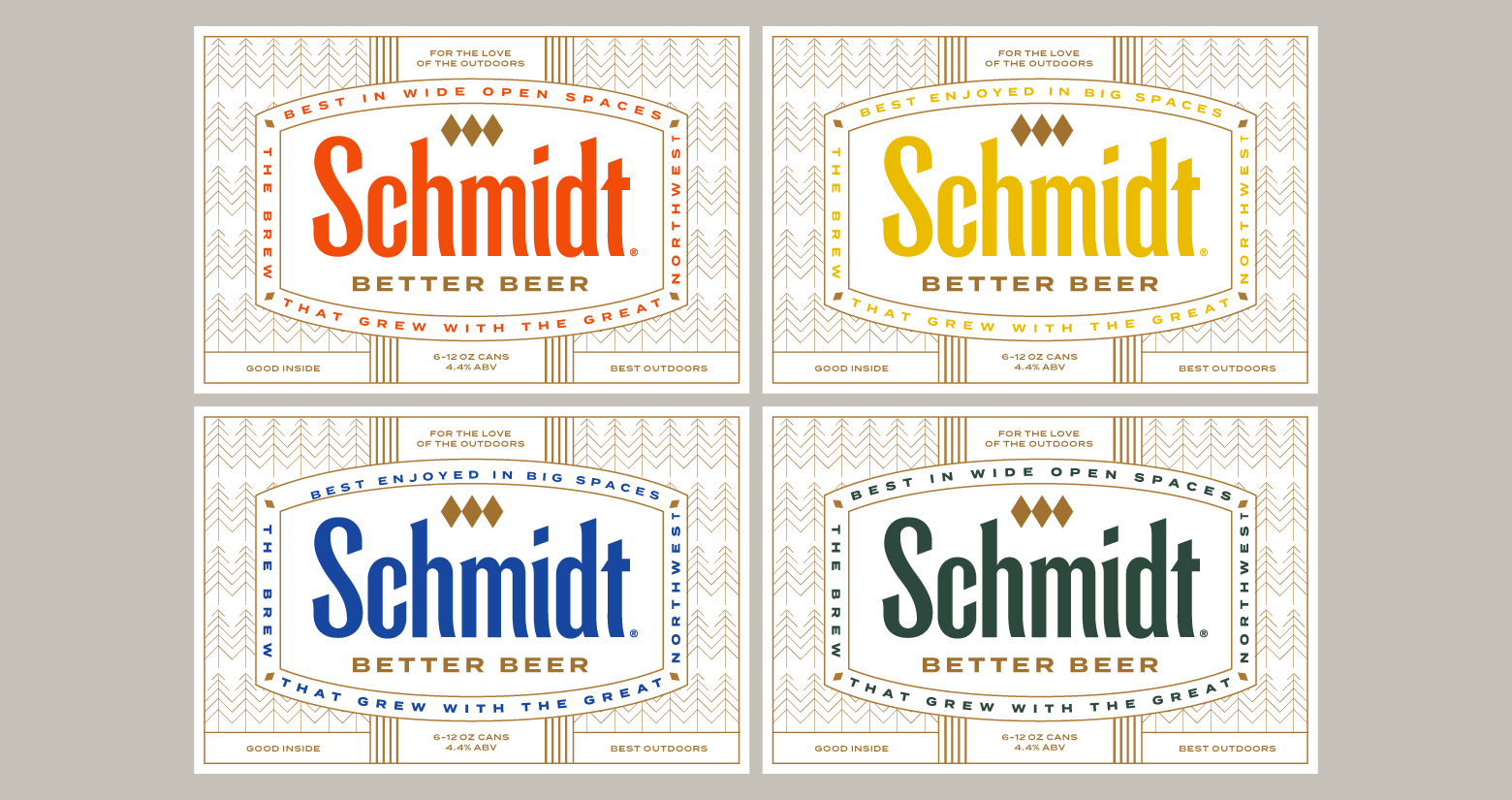
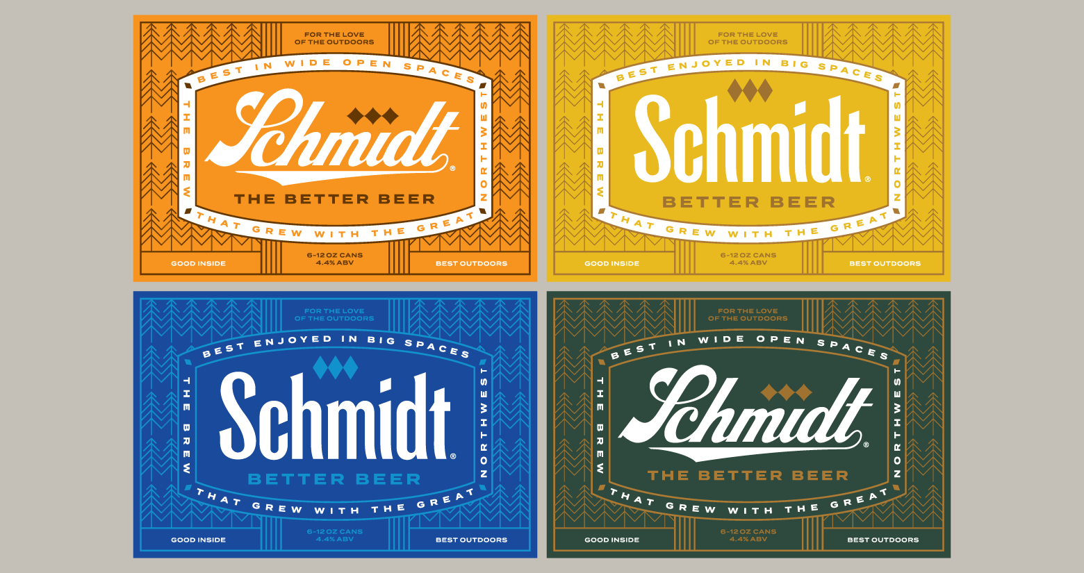
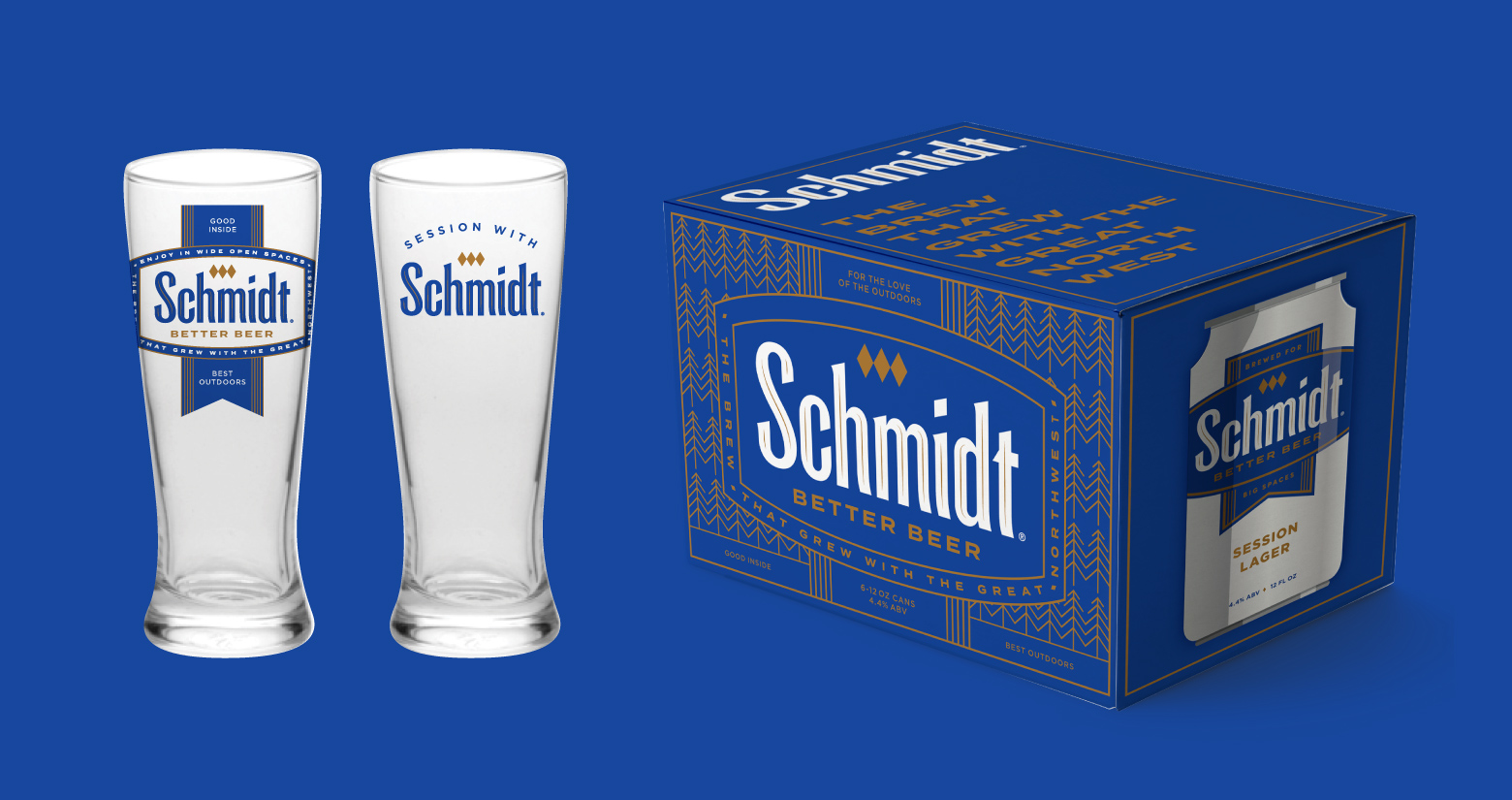
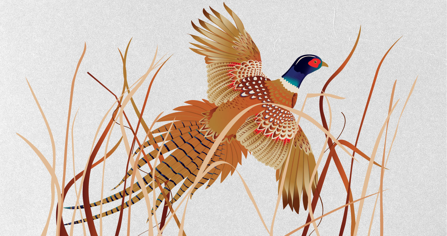
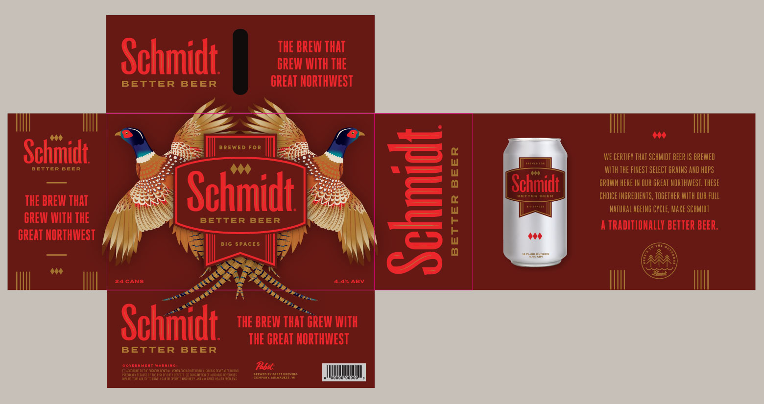
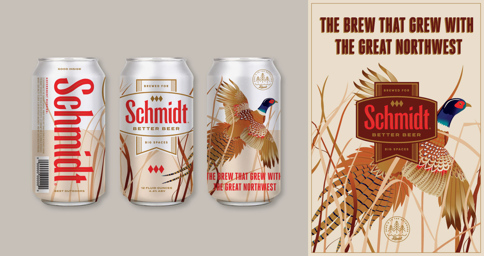
Schmidt is a brand that’s been around for awhile so of course we were honored to give it a facelift. With over 150 years of rich heritage celebrating the great outdoors, we had plenty of inspiration to draw from. This eventually led to revising two of the brand’s historic logotypes as well as bringing back it’s iconic badge. Outdoor photography adorned the current packaging along with a heavy dose of red and black that didn’t help reflect the light, crisp flavor of the beer. It became clear early on that illustration was needed. We were inspired by the 1960’s era Les Kouba cans and created a purely Schmidt, pheasant illustration, which adorns both the cans and the 30 packs. Removing any sort of background illustration gives the pheasant and branding room to breath, and a lightness that reflects this clean, crisp 4.5% abv brew.